

You walk into your kitchen to prepare breakfast, look at the wall of bulky upper cabinets pressing down over your head, and feel an immediate wave of spatial claustrophobia.
The counters are crowded with appliances, dark shadows hide the corners, and even though you have decent square footage, the room feels boxed in, heavy, and disconnected from the rest of your home. You sigh, adjust a cutting board to clear twelve inches of prep space, and think: Do I really need to knock down structural walls just to make this room feel breathable?
Here is the truth about residential architecture: making a kitchen feel more open doesn't require adding a single square foot or tearing out structural load-bearing walls.
A room feels cramped when sightlines are blocked, visual boundaries are chopped up with high-contrast finishes, and light fails to reach perimeter corners. By systematically lowering visual weight, using continuous surface finishes, and expanding light reflection, you can trick the human brain into perceiving your space as wide, airy, and expansive. If you're planning a wider renovation, our guide on refreshing your kitchen without a full demolition pairs well with the steps below. Here is how to transform your kitchen's spatial atmosphere step by step.
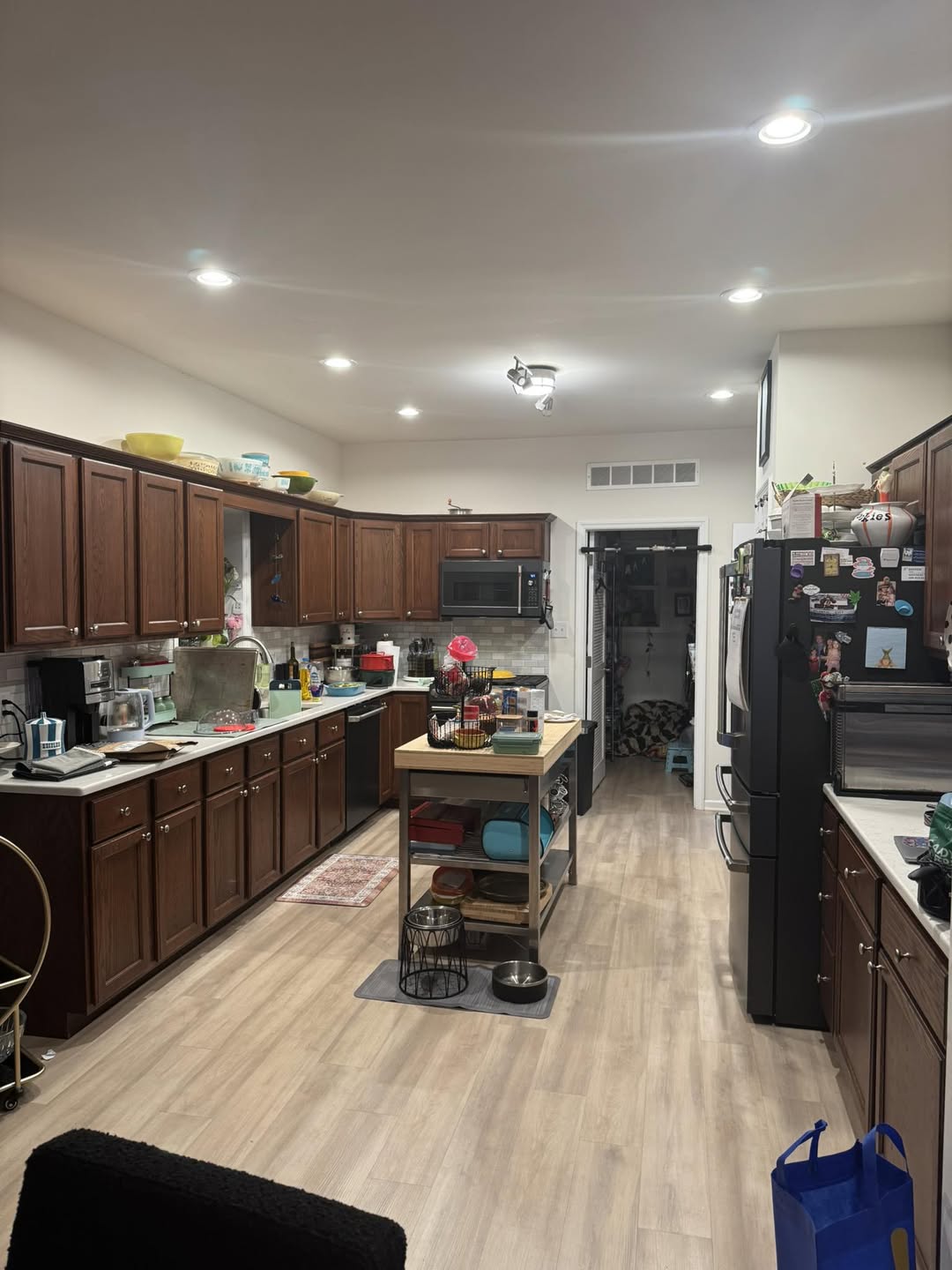
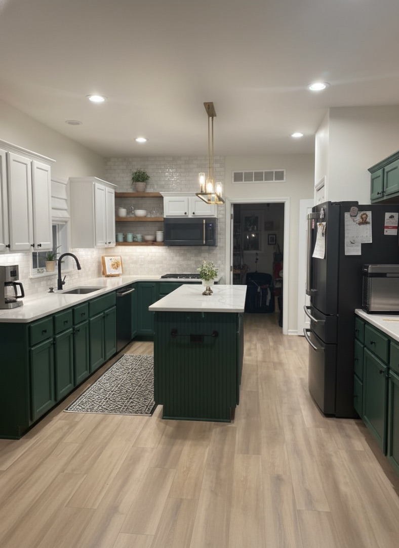
1. How to Make a Kitchen Feel More Open Without Expanding It
Before taking a sledgehammer to your drywall or looking at expensive contractor estimates, stop and examine how your eyes navigate your room.
Perceived spatial volume is entirely controlled by two visual mechanics: unbroken sightlines and light distribution.
High-Contrast Transitions
Deep Shadows
Glass Reflectivity
Unobstructed Windows
Focus on these foundational open-design principles:
- Reduce Visual Mass: Swap heavy, solid upper cabinet runs for open floating shelving, glass-front doors, or low-profile cabinetry.
- Create Continuous Material Flow: Eliminate abrupt color breaks between countertops, backsplashes, and wall paint so the eye glides seamlessly across surfaces.
- Maximize Vertical Daylight: Keep window thresholds completely clear of tall cabinets or dark drapery so natural daylight streams uninterrupted across the floor.
2. Find What's Making Your Kitchen Feel Closed In
When a kitchen feels tight, homeowners often assume the floor plan is simply too small. In reality, specific visual obstacles are actively shrinking your room's perceived dimensions.
Identifying what is causing spatial compression allows you to fix real issues rather than guessing. To dig deeper into how your daily routine affects perceived space, read our workflow audit for a higher-performing kitchen.
Run a 2-minute diagnostic pass across your space:
- Check your eye-level sightlines: When standing at the entry doorway, do tall upper cabinets or dark refrigerator walls block your view of the furthest window?
- Audit your finish contrast: Does your dark countertop cut a stark, high-contrast black line across crisp white lower cabinets?
- Evaluate floor continuity: Does your kitchen flooring stop abruptly at a thick transition strip right where it meets the adjoining living room?
3. Clear the Sightlines That Make the Kitchen Feel Smaller
Sightlines are the visual pathways your eyes follow from the doorway to the outer boundaries of a room. When sightlines hit dark, solid barriers early, your brain perceives the room as small and enclosed.
Creating a open-concept atmosphere relies on clearing visual pathways across work zones.
|
[ Tall Solid Pantry Cabinet ] <--- Block!
|
[ Hidden Window ]
|
[ Low Counter / Glass Unit ]
|
[ Clear View to Window Daylight ]
Strategies to open sightlines:
- Relocate Tall Cabinetry: Move full-height pantry towers and integrated refrigerator columns to outer perimeter walls away from the main entry doorway.
- Use Glass-Front Cabinet Doors: Replace solid wood upper cabinet doors with clear or fluted glass inserts. Being able to see inside the cabinet frame adds several inches of visual depth.
- Open Up Peninsula Pass-Throughs: If you have a half-wall or peninsula cabinets overhead, remove the upper hanging cabinets above the counter to link your kitchen visually with the adjoining dining room.
If you are planning spatial flow across connected rooms, explore our guide on flowing open-plan layouts that connect cooking and gathering zones to align work zones with adjacent living spaces seamlessly.
4. Choose Cabinet Styles That Don't Overwhelm the Room
Cabinets account for up to 70% of the visible surface area in a kitchen. Heavy, ornate raised-panel doors in dark wood stains absorb light, creating a heavy visual weight that makes ceilings feel low and walls feel close.
Selecting the right open kitchen cabinet ideas is about choosing clean, low-profile door profiles. For coordinating door tones with your wall palette, see our cabinet color selection guide for light-reflecting finishes.
Smart cabinet styling choices:
- Opt for Flat-Panel Slab Doors: Minimalist flat-panel slab doors reflect light evenly and eliminate shadows created by heavy decorative moldings.
- Paint Upper Cabinets to Match Walls: Paint your upper wall cabinets in the exact same shade as your perimeter walls (using a satin or eggshell finish). This makes upper storage blend into the background.
- Integrate Recessed Cabinet Pulls: Swap bulky, dark door knobs for sleek, integrated J-pull handles or touch-latch mechanisms to keep cabinet faces smooth and clutter-free.
5. Use Light Kitchen Colors Without Making Everything Look Plain
It is a well-known interior design fact that light colors to make a kitchen look bigger work by reflecting daylight across work surfaces. However, painting every single surface stark, unpigmented white can leave your room feeling clinical, cold, and sterile.
Building an airy kitchen color ideas palette requires balancing soft light-reflecting neutrals with warm organic undertones. For specific shade recommendations, see our warm paint palettes for tight kitchen walls.
   Neutral Foundation (60%): Warm Off-White or Pale Greige Perimeter Walls
   Cabinet Palette (30%):    Creamy Taupe or Soft Sage Green Cabinets
   Accent Depth (10%):       Natural Wood Floating Shelves & Brushed Brass Hardware
Color application rules:
- Select Warm Undertones: Choose warm off-whites, creamy greiges, soft taupes, or muted sage greens with warm yellow or green undertones. Warm pigments reflect ambient light without looking cold under LED lamps.
- Use Two-Tone Cabinetry (Tonal Division): Paint lower base cabinets a grounding tone (like warm taupe or slate gray) while keeping upper cabinets or floating shelves light cream or soft white.
- Keep Ceilings Crisp White: Paint your ceiling a flat, bright ceiling white to reflect light downward and increase perceived vertical height.
For technical guidelines on non-toxic paint finishes, low-VOC certifications, and sustainable material standards, visit the Sustainable Furnishings Council (SFC).
6. Make Better Use of Natural Light to Open Up the Kitchen
Natural daylight is the ultimate spatial expander. A dark, shadowed room feels restrictive, whereas a sunlit space feels open, breathable, and welcoming.
Maximizing natural daylight requires clearing window thresholds and using light-diffusing window treatments. For homes with limited sun exposure, our brightening palettes for dim corners complements the daylight tactics below.
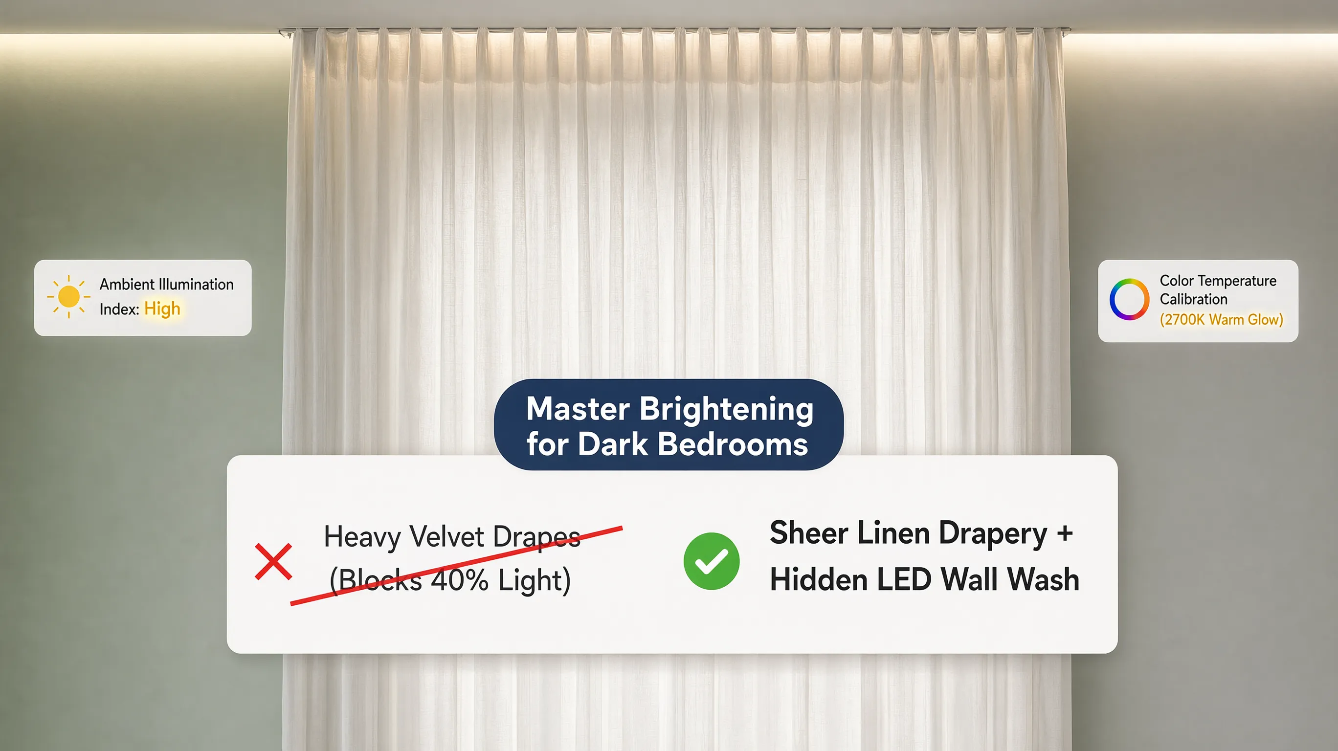
Daylight-maximizing tactics:
- Ditch Heavy Top Valances: Remove dark fabric valances or wooden window headers that cover the top third of your glass. The top portion of a window casts daylight furthest into a room.
- Place Reflective Surfaces Near Windows: Position polished quartz countertops, glossy glazed backsplash tiles, or stainless steel appliances adjacent to windows to bounce incoming sunbeams across dark corners.
- Keep Sill Thresholds Clear: Avoid cluttering window sills with tall plant pots or dish soap bottles that block incoming light rays.
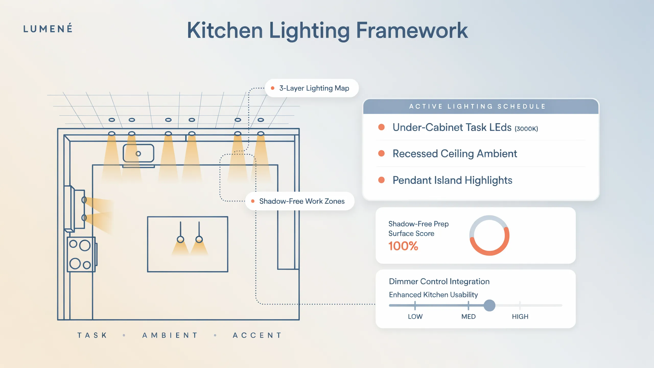
7. Use Kitchen Lighting to Brighten the Corners and Shadows
Relying on a single central ceiling light fixture leaves your perimeter counters in pitch darkness, creating deep corner shadows that shrink your room visually.
Building an effective lighting plan requires layering task, ambient, and accent fixtures to eliminate dark gaps. For a deeper dive into layered fixture placement, read our layered lighting plan for shadow-free counters.
  [ Layer 1: Recessed Ambient Ceiling Cans ] ===> Fills general floor volume (3000K)
                 |
  [ Layer 2: Under-Cabinet LED Task Tape  ] ===> Floods counters with shadow-free light
                 |
  [ Layer 3: Inside-Cabinet Glass Lighting ] ===> Adds internal depth to wall cabinets
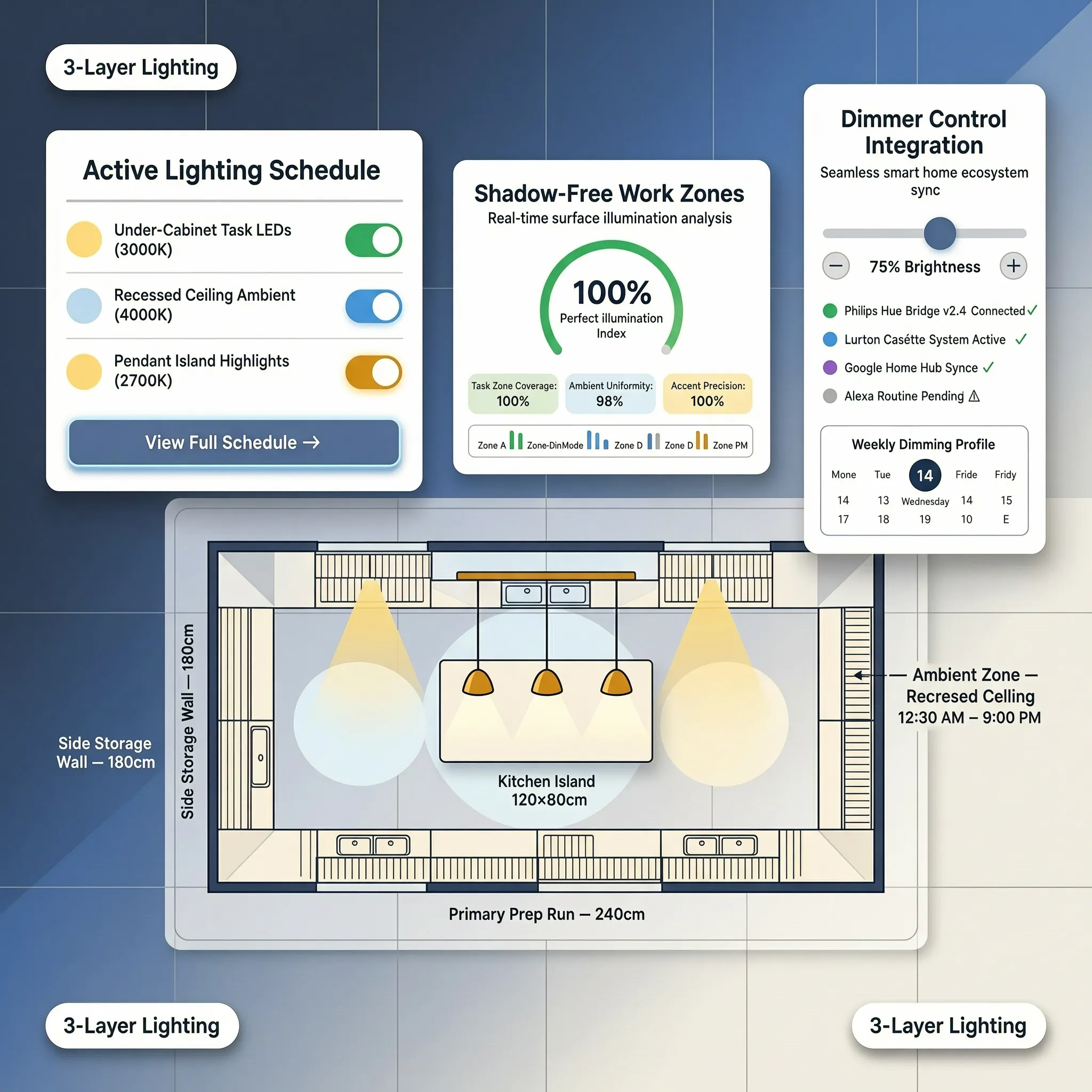
Lighting design guidelines:
- Install Under-Cabinet LED Strip Lights: Mount continuous LED tape lighting to the underside of upper wall cabinets. Flooding your primary preparation surfaces with shadow-free light instantly expands perimeter boundaries.
- Equip Fixtures with 2700K–3000K LEDs: Choose warm-white LED bulbs rated between 2700K and 3000K (Kelvin) with a High Color Rendering Index (CRI 90+). Warm light makes food look appealing and eliminates sterile blue glare.
- Add Toe-Kick Accent Strips: Install low-voltage LED strip lights along cabinet base toe-kicks. The subtle floor glow makes lower cabinets appear to float off the floorboards.
For official technical specifications on residential lighting standards, color rendering metrics, and glare prevention, consult the Illuminating Engineering Society (IES).
8. Choose Countertops and Backsplashes That Create Visual Continuity
When a kitchen features dark granite counters, a high-contrast patterned backsplash tile, and bright white cabinets, the visual field is chopped up into small, competing blocks.
Creating an open feel relies on establishing continuous material transitions across work surfaces.
- Busy Mosaic Tile Backsplash
- Dark Grout Lines
- Matching Quartz Slab Backsplash
- Seamless Vertical Continuity
Surface continuity rules:
- Extend Counter Materials Up the Wall: Carry your countertop slab material (such as subtle veined white quartz) straight up the backsplash to the upper cabinet line. Eliminating horizontal grout seams creates an unbroken, elegant plane.
- Match Grout to Tile Shade: If using subway tile, choose a grout color that matches the tile exactly. High-contrast dark grout creates a grid pattern that visually busy walls.
- Choose Low-Sheen or Honed Finishes: Honed or satin countertop finishes diffuse light softly without creating blinding glare reflections from overhead lamps.
9. Make the Floor Feel More Continuous From One End of the Kitchen to the Other
Your floor plan is the largest horizontal plane in your kitchen. Interrupting your floorboards with dark tiles or thick transition strips shrinks perceived floor space.
Selecting continuous flooring expands horizontal sightlines from the entryway to adjacent dining or living areas. For material selection guidance, see our continuous flooring options for open-plan layouts.
Flooring expansion tactics:
- Extend Flooring into Adjoining Rooms: Run the exact same flooring material (like wide-plank light oak hardwood or water-resistant LVP) continuously from the kitchen straight into the dining and living spaces without metal threshold breaks.
- Lay Planks Parallel to Long Walls: Install wood planks or rectangular tiles running parallel to the longest wall run to draw the eye along the room's length.
- Avoid Small, Busy Tile Patterns: Steer clear of small checkerboard or intricate mosaic floor patterns in compact rooms, as dense patterns create visual noise.
10. Choose Furniture and Seating That Leave More Visual Breathing Room
Overcrowding a kitchen peninsula with bulky, high-backed barstools or installing a heavy, boxy central island turns a functional room into an obstacle course.
Selecting scaled furniture maintains clear walking paths and preserves open floor space.
- Solid skirted base island
- Blocks eye-level sightlines
- Open-frame island with exposed legs
- Tucks completely under counter overhang
Furniture selection rules:
- Use Backless Counter Stools: Choose backless barstools that slide completely beneath the countertop overhang when not in use. Keeping stool backs below counter height preserves clear horizontal sightlines.
- Opt for Open-Frame Furniture: Select island tables, carts, and chairs featuring slender metal or turned-wood legs that allow light and sightlines to pass right through.
- Maintain 42-Inch Walkway Clearances: Ensure there is a minimum clearance of 42 to 48 inches between island edges and surrounding perimeter cabinets so people can walk past without squeezing.
If you are evaluating appliance clearances and island proportions, review our complete appliance clearance and island proportion rules.
11. Reduce Countertop Clutter Without Hiding Everything You Use Every Day
Leaving coffee makers, knife blocks, spice racks, and paper towel stands on your worktops consumes primary preparation zones, making your whole kitchen feel unorganized and cramped.
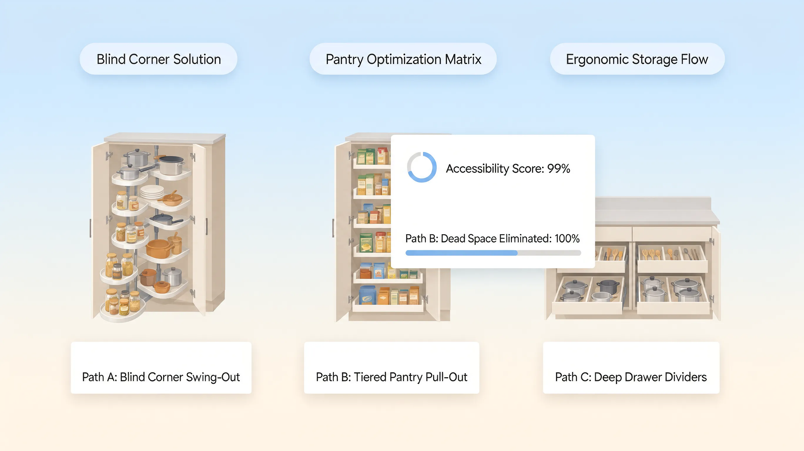
Achieving an uncluttered look relies on point-of-use organization: keeping daily tools accessible while clearing flat surfaces. To retrofit interiors for hidden appliance storage, see our roll-out hardware guide for tucking everyday tools out of sight.
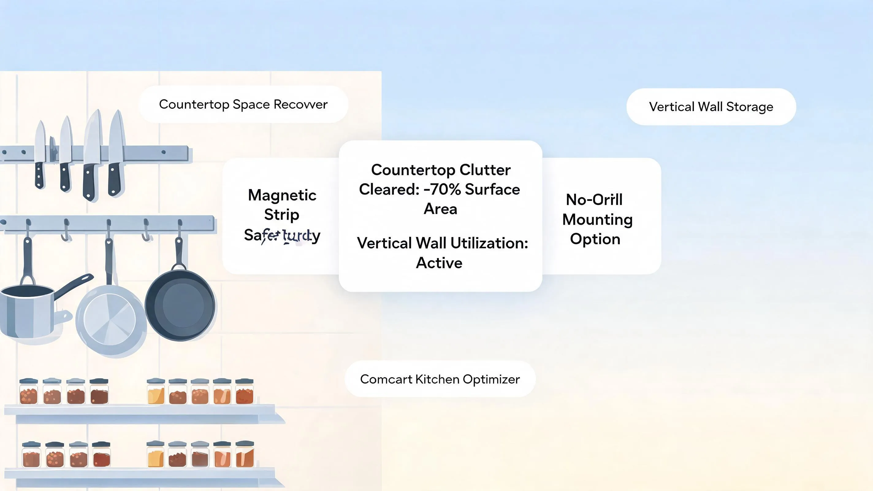
Counter-clearing tactics:
- Protect the 36-Inch Hero Prep Zone: Select the continuous counter span located between your sink and stove. Keep this specific surface 100% clear of appliances, food items, and loose mail.
- Mount Tools Vertically: Hang chef knives on a sleek magnetic backsplash strip, and mount paper towel holders beneath upper cabinets to free up worktop space.
- Group Daily Essentials on Trays: If you must keep daily cooking items on the counter (like olive oil and sea salt), place them on a single marble tray beside the stove to turn visual clutter into an intentional display.
If you are organizing cabinet interiors, explore our step-by-step guide on streamlining cabinet interiors for clutter-free counters.
12. Bring the Changes Together in a Kitchen That Feels Open and Connected
Ready to transform your cramped, dark kitchen into an airy, beautifully open culinary space?
Before buying paint swatches, ordering cabinet fronts, or hiring contractors, combine these spatial improvements into a clear, actionable plan. To preview the result before demolition, read our digital preview workflow for testing layouts before spending a dollar.
  [ Step 1: Audit Sightlines & Clear Overhead Cabinet Mass ]
                               |
  [ Step 2: Select Warm Neutral Paint & Light Counter Materials ]
                               |
  [ Step 3: Layer Under-Cabinet LED Task & Accent Lighting ]
                               |
  [ Step 4: Extend Continuous Flooring into Adjoining Rooms ]
                               |
  [ Step 5: Execute Open Kitchen Layout with Total Confidence ]
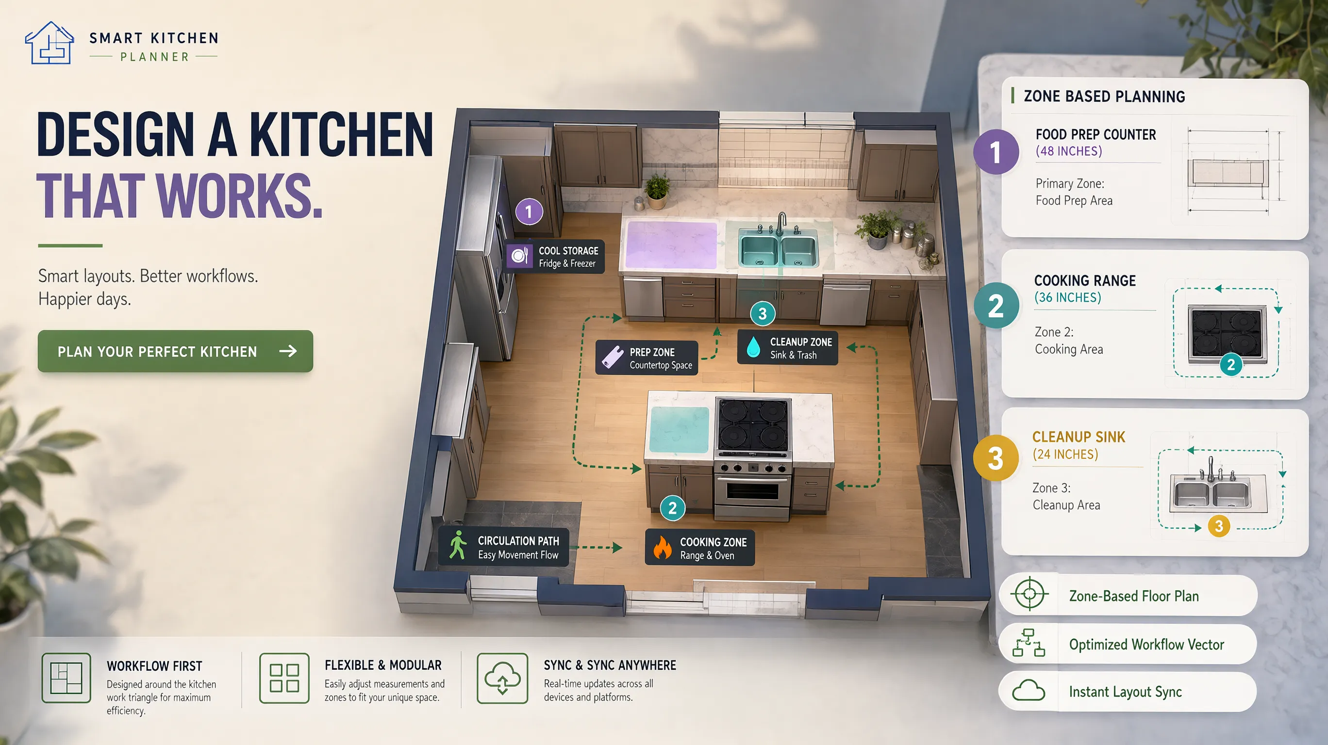
The Ultimate Open Kitchen Sign-Off Checklist:
- [ ] Clear Entry Sightlines: Relocate tall pantries and integrated refrigerators away from primary entrance doorways.
- [ ] Incorporate Light Neutral Finishes: Use warm off-white or soft greige paint for walls, paired with clean, low-profile cabinet doors.
- [ ] Layer Shadow-Free Lighting: Install hardwired under-cabinet LED tape lights rated between 2700K and 3000K.
- [ ] Unify Surfaces: Carry countertop slab materials up the backsplash to eliminate high-contrast horizontal grout lines.
- [ ] Preserve Walkway Clearances: Maintain at least 42 inches of open floor space around peninsulas, islands, and dining setups.
- [ ] Clear Primary Prep Counters: Keep the primary 36-inch chopping surface between your sink and stove 100% free of small appliances and clutter.
Step Into Your Ideal Open Kitchen Today
Why risk spending thousands of dollars on structural demolition, custom cabinetry, or trial-and-error paint colors without seeing how your kitchen will actually look and function?
Designing an open, beautifully connected space should be an exciting and fulfilling experience. You don't need to hire expensive architects or struggle with complicated CAD tools to plan a breathtaking kitchen layout.
With DesignHome, you can simply upload a picture or floor plan of your room to test layout ideas, experiment with light-reflecting paint palettes, compare open shelving configurations, check appliance clearances, and unlock custom spatial possibilities tailored to your exact floor plan.
Eliminate design guesswork—visualize, refine, and bring your complete open kitchen design vision to life with total confidence using DesignHome today!
External Resources & Industry Standards
To explore deeper technical insights into residential space planning, trade safety, and building codes, consult these authoritative industry resources:
- National Kitchen & Bath Association (NKBA) – Official guidelines for kitchen planning standards, ergonomic work triangle rules, and spatial clearances.
- International Code Council (ICC) – Residential building codes, load-bearing wall removal rules, and structural safety standards.
- Illuminating Engineering Society (IES) – Residential lighting standards, color temperature guidelines, and task lighting metrics.
- Sustainable Furnishings Council (SFC) – Official guidelines for non-toxic natural textiles, low-VOC paint finishes, and eco-friendly wood furniture.
Frequently Asked Questions About Open Kitchen Design
What paint colors make a small kitchen feel bigger and more open?
Light neutrals with warm undertones—such as warm off-white, creamy greige, pale taupe, and soft sage green—reflect natural daylight and make walls recede visually. Painting baseboards, trim, and upper cabinets the same color as the walls erases boundary lines, making the room look significantly taller and wider.
Do open shelves actually make a kitchen look bigger than upper cabinets?
Yes. Replacing bulky, deep upper cabinets with open floating shelves removes solid eye-level mass, exposing more wall surface and allowing daylight to travel freely across the room. This adds several inches of visual depth, making a tight space feel significantly airier.
How do I make a kitchen feel open without knocking down walls?
Clear entry sightlines by relocating tall pantries, use light-reflecting neutral paint, replace solid upper cabinet doors with glass-front panels, carry countertop slabs up the backsplash to eliminate grout lines, install under-cabinet LED strip lights, and run continuous flooring directly into adjoining rooms.
How much space is needed around a kitchen peninsula to keep it feeling open?
Maintain a clearance walkway of at least 42 inches (for single cooks) or 48 inches (for multi-cook homes) between peninsula edges and surrounding perimeter walls or cabinets. This clearance ensures people can walk past comfortably while someone is cooking or seated on a barstool.
Should kitchen countertops be lighter or darker than cabinets to feel spacious?
Choosing countertops that match or are slightly lighter than your lower cabinets creates a continuous, uninterrupted visual field that expands spatial volume. High-contrast combinations—like black countertops on bright white cabinets—chop up the room visually, making it feel smaller and busier.


