

You step back from your living room doorway, coffee mug in hand, looking across a sea of safe beige sofa cushions, off-white walls, and plain oak flooring.
Nothing looks broken or messy, yet the entire space feels like an anonymous hotel lobby—polite, predictable, and completely drained of personal energy. You pick up a bright rust pillow at a store, hesitate at the checkout counter, and ask yourself: My home looks clean and fine, yet everything feels flat and overly plain—how do I inject real color and personality without making my rooms clash or feel chaotic?
Here is the unvarnished architectural truth of residential color layering: using accent colors at home isn't about scattering random bright objects into every corner—it is about applying the 60-30-10 spatial ratio, matching new pigment undertones to your fixed flooring and cabinetry, and repeating one signature hue across three visual touchpoints per room.
A neutral interior stalls out when homeowners buy isolated colorful decor on impulse without checking undertones, overload a single table with five competing bright shades, or stop at one lonely accent pillow that looks accidental. By anchoring your palette with color-wheel harmony, introducing bold hues through swappable textiles or one statement armchair, and threading subtle color echoes from room to room, you transform a sterile backdrop into an expressive, deeply inviting residence.
Whether you are waking up an all-white living area or adding tailored warmth to a quiet bedroom, here is how to plan, layer, and execute your accent color scheme step by step.
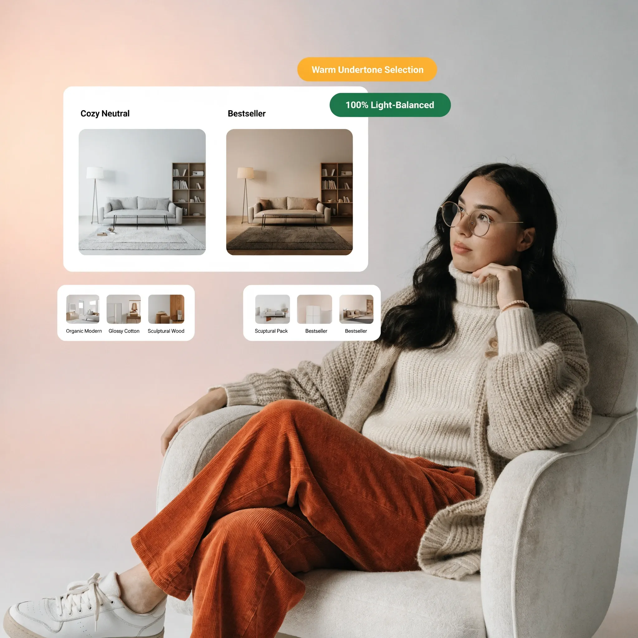
1. Using Accent Colors at Home to Make Neutral Rooms More Interesting
Before buying cans of bold paint or ordering colorful velvet upholstery, pause and recognize why neutral rooms crave controlled contrast rather than total color saturation.
Most neutral interiors feel flat because every surface sits within the exact same pale tonal range, giving the human eye nowhere to rest and zero architectural rhythm to follow.
To master using accent colors at home, apply accent colors in interior design, and unlock high-impact home accent color ideas, anchor your room around three foundational rules:
- Follow the 60-30-10 Proportion Rule: Keep 60% of the room in your calm foundational neutral (walls and large rugs), 30% in a supporting medium tone (upholstery and drapery), and restrict vivid accent colors to a crisp 10% punch.
- Repeat Every Accent Color Three Times: Never introduce a bold shade in just one spot; echo your chosen accent across at least three points—such as a sofa pillow, framed artwork, and a ceramic vase—so the choice looks deliberate.
- Vary Texture Within the Same Color: Combine matte linen, brushed velvet, glazed ceramic, and woven wool in your accent shade so the color feels rich rather than flat.
Explore our architectural strategies for choosing interior wall colors to ensure your foundational wall palette gives bold accent shades a clean, supportive backdrop.
2. Choose Accent Colors That Work With Your Existing Color Scheme
Bringing a vibrant emerald chair or terracotta rug into a room without checking the hidden undertones of your wood floors and wall paint creates instant visual friction.
Mastering choosing accent colors, finding accent colors for neutral walls, and matching accent colors with existing decor starts with reading the fixed surfaces already in your home.
Follow this 3-step diagnostic before selecting any accent shade:
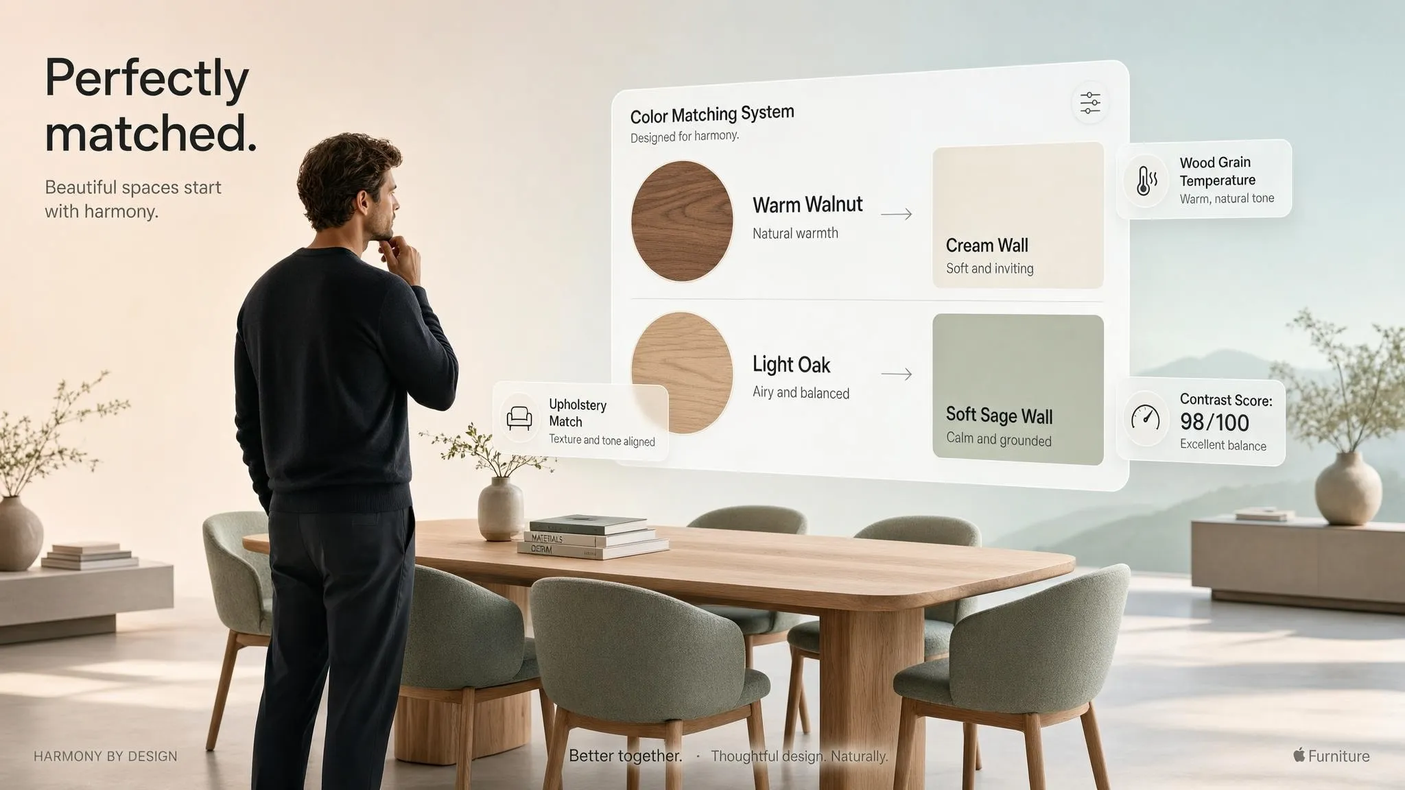
- Audit Fixed Flooring and Countertops First: Honey oak floors and warm travertine stone naturally flatter warm rust, sage, and navy accents, whereas cool gray tile pairs cleanly with dusty blue, berry, or crisp charcoal.
- Pull One Quiet Thread From Existing Art or Rugs: Look closely at a multi-colored Persian rug or framed painting you already love and extract its second or third most subtle hue to serve as your room's signature accent.
- Test Undertone Temperature Side-by-Side: Hold fabric swatches or paint chips directly against your sofa fabric in natural daylight to confirm warm-with-warm or balanced contrast before purchasing.
3. Use the Color Wheel to Find Complementary and Contrasting Accent Colors
Guessing which shades belong together often leads to timid, washed-out combinations or jarring clashes that tire your eyes after a week.
Using the color wheel for interior design, pairing complementary accent colors, and applying contrasting colors in interior design gives you a foolproof mathematical formula for color harmony.
• Creates calm, soothing flow in bedrooms
• Low visual tension; effortless to blend
• Generates vibrant energy in living rooms
• Mute 1 shade (dusty blue + burnt terracotta)
Color-wheel pairing rules:
- Use Complementary Opposites for Energy: Colors sitting directly opposite each other on the wheel—such as deep navy blue and warm burnt orange, or forest green and muted terracotta—create high-impact visual excitement.
- Choose Analogous Neighbors for Calm: Combining three shades sitting side-by-side on the wheel—like sage green, eucalyptus, and soft teal—delivers serene, nature-inspired depth ideal for bedrooms.
- Desaturate Bold Pairs for Sophistication: Instead of pairing bright primary red with bright kelly green, soften both tones into muted brick clay and earthy olive so your room feels tailored rather than cartoonish.
For educational resources on color perception, Munsell hue-value-chroma systems, and human visual response to pigment combinations, explore the Pantone Color Institute or educational color theory archives at the Cooper Hewitt, Smithsonian Design Museum.
4. Add Accent Colors Through Furniture and Statement Pieces
Swapping out a safe beige armchair for a rich cognac leather lounge chair or placing a deep emerald credenza along a neutral wall transforms an entire room in minutes.
Integrating accent color furniture, selecting colorful accent chairs, and placing statement furniture for living rooms anchors your color scheme with sculptural authority.
Statement furniture guidelines:
- Limit Bold Furniture to One Anchor Piece Per Zone: Let a single colorful velvet armchair or painted sideboard command the room while keeping your primary three-seat sofa in a timeless neutral fabric.
- Balance Bold Color With Classic Silhouettes: When choosing a vibrant hue like mustard gold or deep emerald, pick a clean-lined, tailored furniture frame so the piece ages gracefully.
- Echo the Furniture Color Across the Room: Tie a colorful armchair into the layout by repeating its exact shade in a framed print or ceramic bowl on the opposite side of the room.
5. Use Cushions, Throws, Curtains, and Rugs to Introduce Accent Colors
If committing to a colorful sofa or painted cabinet makes you nervous, soft textiles let you test bold pigments immediately and swap them out effortlessly with the seasons.
Layering accent colors in home decor, styling colorful cushions and throws, hanging accent color curtains, and grounding floors with accent rugs delivers zero-regret color flexibility.
Textile layering tactics:
- Build a Trio of Contrasting Pillows: Combine three cushions on your sofa in varying scales—a large patterned floral or geometric print, a medium striped weave, and a solid bouclé or velvet pillow sharing your accent color.
- Frame Windows With Colored Drapery Panels: Hanging floor-to-ceiling curtains in muted olive, dusty blue, or warm terracotta draws the eye upward and wraps perimeter walls in soft color.
- Anchor the Floor With a Patterned Area Rug: Choose a multi-toned wool rug woven with subtle flecks of your accent shade to tie every piece of furniture in the room together effortlessly.
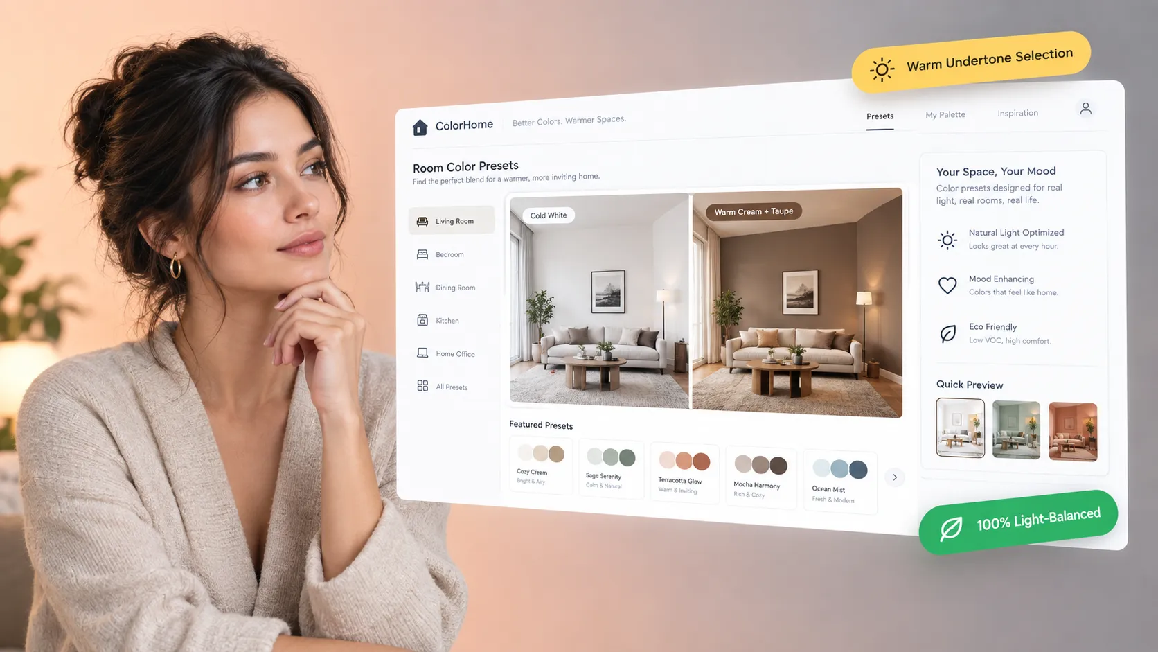
Bring energy, warmth, and personality into plain neutral rooms without costly guesswork. Upload a photo or floor plan of your space to DesignHome, and experiment with Using Accent Colors at Home in interactive 3D—testing statement armchairs, colorful textiles, feature walls, and whole-room color repetition so your home looks extraordinary and feels unmistakably yours.
Test Your Accent Color Palette in 3D Today with DesignHome →Preview Your Accent Colors Across Your Real Room in 3D
Holding a single colorful cushion or paint chip in your hand makes it hard to tell whether a bold emerald chair, patterned rug, or feature wall will elevate your space or overwhelm your neutral furniture. You shouldn't have to buy and return heavy decor pieces just to see how a new color palette feels in your home.
Warm Living Room
Terracotta + sage accents · 420 sq.ft
Whole-Home Palette
2 signature accents · 1,650 sq.ft
Studio Color Loft
Bold feature wall · 550 sq.ft
6. Create an Accent Wall Without Overpowering the Room
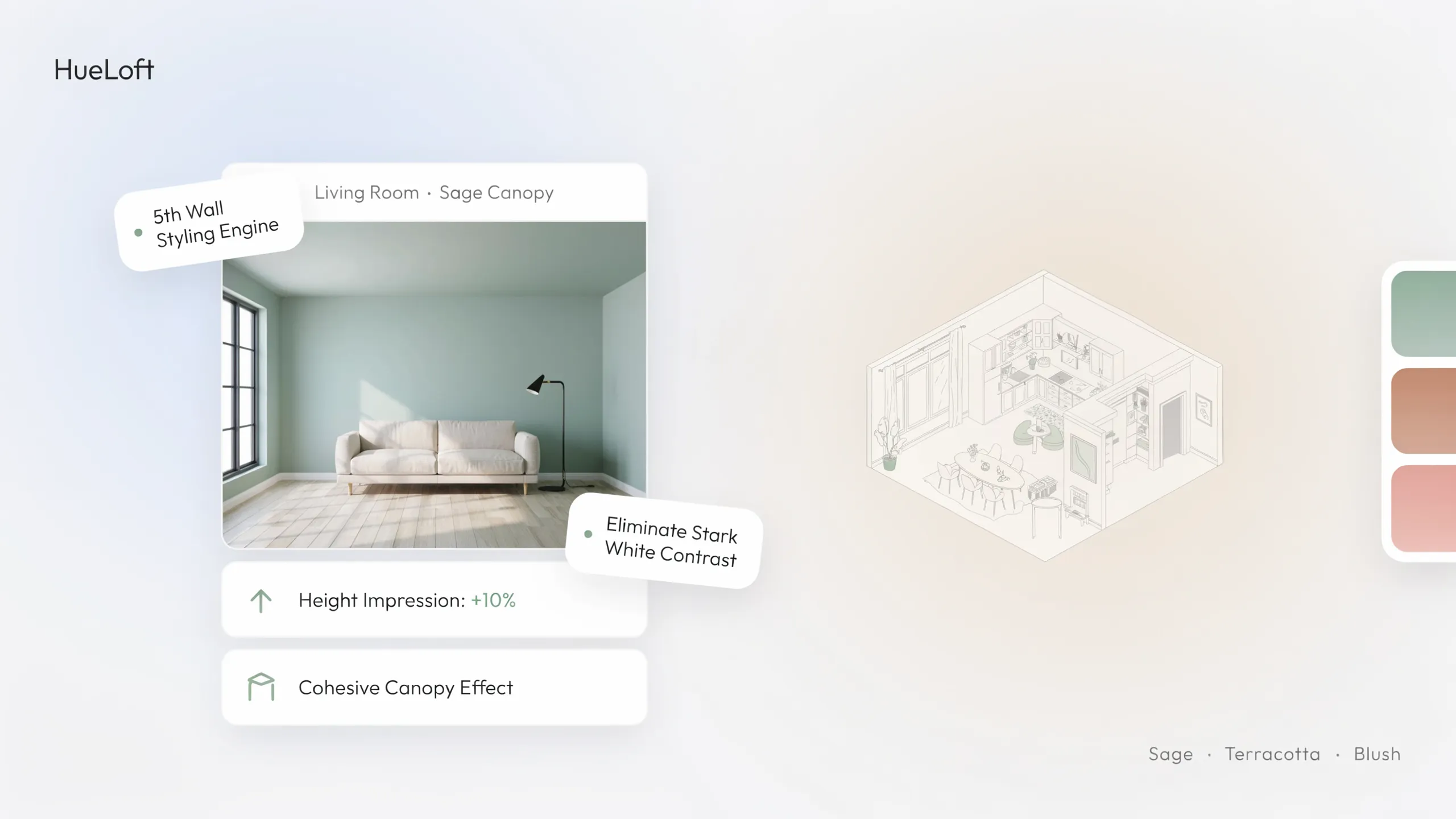
Painting one solid wall a rich, saturated hue adds immediate architectural depth, yet choosing the wrong wall makes a room feel lopsided and awkward.
Executing smart accent wall color ideas, selecting accent wall paint colors, and designing feature wall colors ensures bold wall paint enhances your architecture.
• Loud neon shade disconnected from decor
• Leaves adjacent walls feeling bare
• Deep earthy shade echoed in sofa pillows
• Framed with wood trim or built-in shelving
Feature wall placement rules:
- Choose a Solid, Unbroken Focal Wall: Apply accent paint exclusively to walls with natural architectural purpose—such as the wall behind your bed headboard, a fireplace chimney breast, or dining room wainscoting—never a wall chopped up by doors or closets.
- Consider Architectural Wood Trim Over Flat Paint: Installing vertical wood slats or board-and-batten molding before painting your accent wall adds rich shadow lines and designer texture.
- Keep Remaining Walls Warm and Supportive: Pair a deep navy or forest green feature wall with soft warm off-white on adjacent walls rather than stark, jarring gallery white.
Explore our guide on make an open plan home feel cozy to see how warm accent tones and textured wall treatments soften expansive living spaces.
7. Bring Accent Colors Into Your Living Room With a Clear Focal Point
Because your living room hosts conversation, relaxation, and entertaining, scattered colorful trinkets on every surface quickly create visual clutter instead of welcoming style.
Curating living room accent colors, layering living room color accents, and applying accent color ideas for living rooms builds a cohesive, magnetic gathering space.
Living room focus tactics:
- Start With One Oversized Piece of Artwork: Hang a large framed print or canvas above your sofa and extract two colors from the artwork to guide your throw pillows, rug, and decorative objects.
- Cluster Colorful Objects in Odd Numbers: Group a terracotta vase, a stack of linen-bound books, and a brass candle holder on your coffee table tray rather than spreading tiny colorful items across every shelf.
- Balance Bold Accents With Warm Lighting: Aim warm 2700K table lamps and picture lights onto colorful artwork and velvet textiles so evening shadows enhance richness rather than muting it.
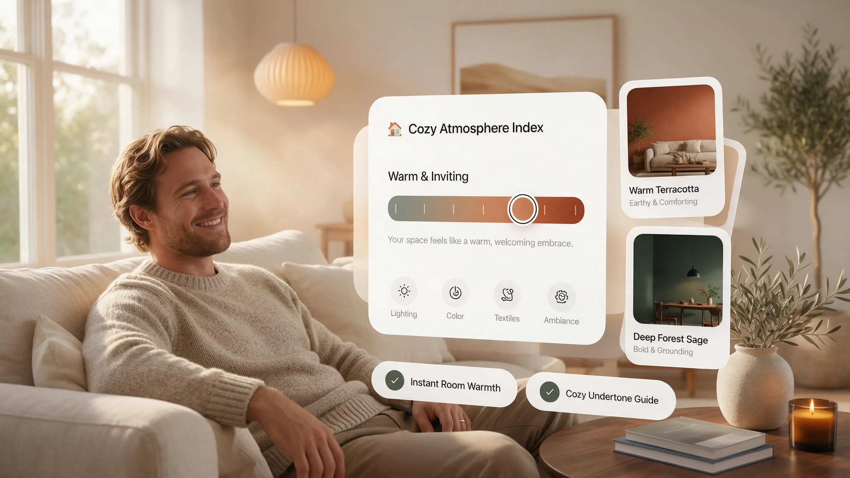
8. Use Accent Colors in Bedrooms to Create a Relaxed but Personal Look
Your bedroom needs personal warmth and visual interest, yet overly bright, high-energy accent shades can overstimulate your eyes right when you are trying to unwind for sleep.
Selecting bedroom accent colors, layering bedroom color accents, and choosing accent wall colors for bedrooms balances calm restfulness with individual character.
Bedroom color guidelines:
- Favor Muted, Restorative Shades Over Neon Brights: Choose dusty eucalyptus, muted indigo, warm clay, or soft ochre in bedrooms—shades softened with gray or brown undertones that calm the nervous system.
- Layer Color Across the Bed Foot: Drape a textured rust or olive quilted throw across the lower third of crisp white bedding and top pillows with one long lumbar cushion in a matching pattern.
- Upholster Your Headboard in a Signature Hue: A channel-tufted headboard in deep forest green or warm camel immediately anchors the entire bedroom without needing loud paint on four walls.
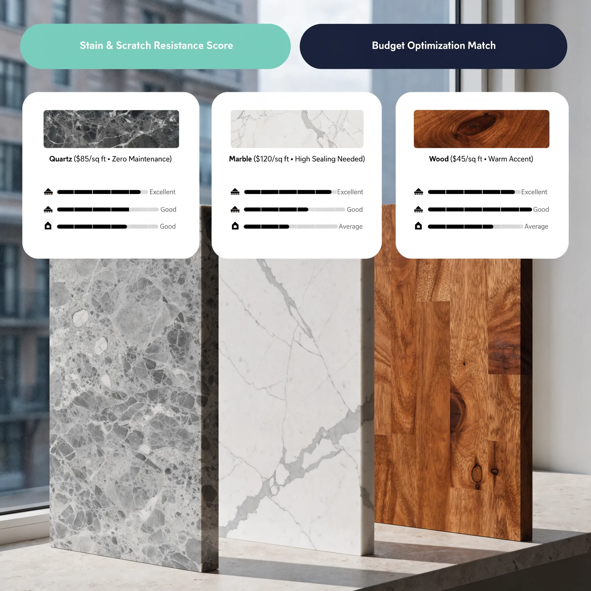
9. Add Accent Colors to Kitchens and Bathrooms Through Cabinets and Details
Kitchens and bathrooms often suffer from sterile expanses of white tile, stainless steel, and stone countertops—making thoughtful color accents essential for warmth and charm.
Incorporating kitchen accent colors, styling bathroom accent colors, installing colorful kitchen cabinets, and adding bathroom color accents elevates utilitarian spaces.
Kitchen and bath accent tactics:
- Paint Only the Kitchen Island or Lower Cabinets: Keep upper cabinets crisp warm white to preserve openness while painting your kitchen island base in muted sage, slate blue, or deep charcoal for grounded contrast.
- Introduce Color Through Handmade Backsplash Tile: Swap flat white subway tile for glossy zellige or hand-glazed ceramic tiles in soft seafoam, warm cream, or earthy green that shimmer under cabinet lights.
- Elevate Bathrooms With Colored Vanities and Turkish Towels: Pair white bathroom walls with a painted olive-green vanity cabinet, warm brass sconces, and heavyweight waffle bath towels in terracotta or ochre.
For guidance on non-toxic, low-VOC cabinet enamels, sustainable tile materials, and eco-friendly home textiles, consult the Sustainable Furnishings Council (SFC).
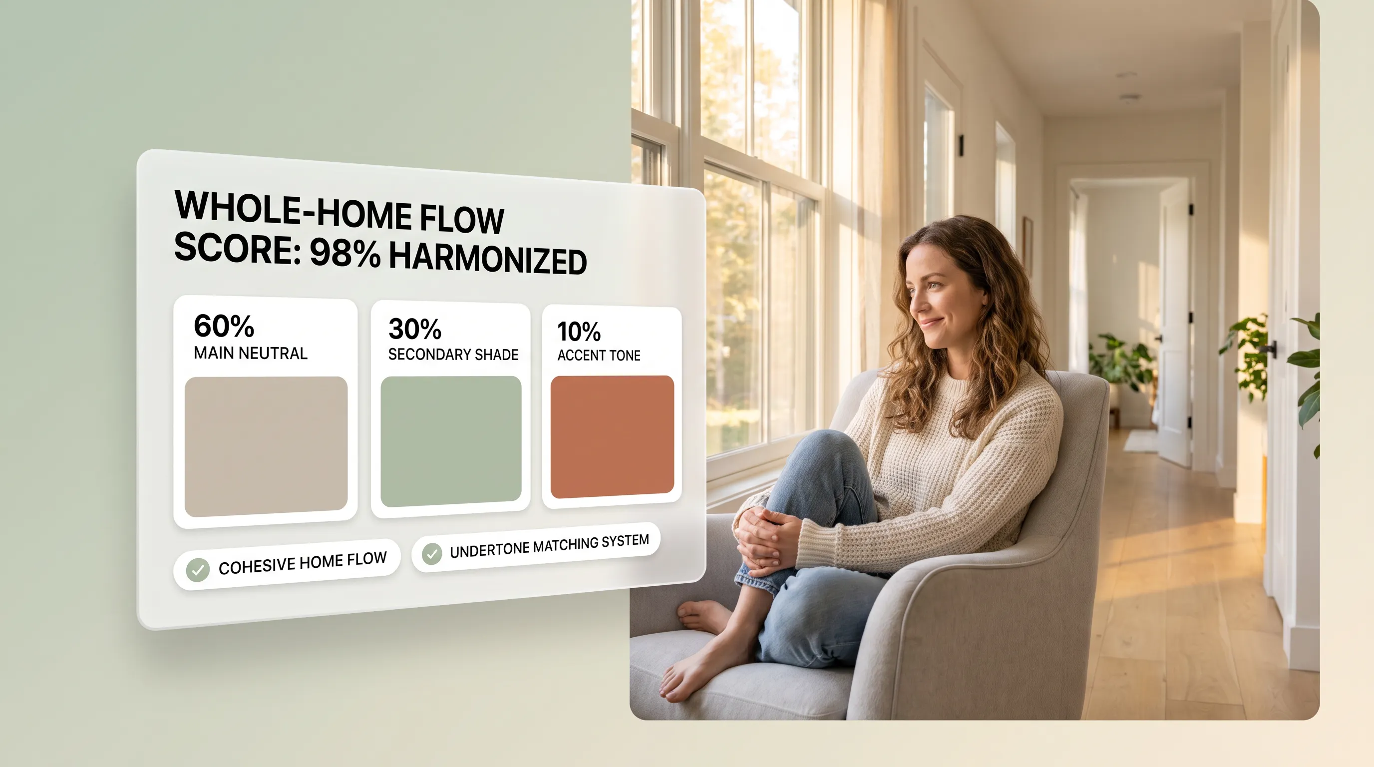
10. Repeat Accent Colors Across Rooms to Create a Connected Home
Using bright teal in the living room, neon yellow in the kitchen, and purple in the bedroom makes a home feel fragmented, whereas subtle color echoes connect every doorway effortlessly.
Threading accent colors throughout the home, building a whole house accent color scheme, and maintaining a cohesive home color palette creates architectural flow.
• Hallways feel sterile & empty
• Walking between rooms feels jarring
• Living room pillow color appears in dining art
• Rooms vary color intensity while staying linked
Whole-home repetition guidelines:
- Pick Two Signature Accent Colors for the Entire House: Choose one warm accent (like terracotta or warm ochre) and one cool accent (like slate blue or sage green) to weave subtly through every room.
- Shift Roles From Room to Room: Let sage green star as your kitchen island color, then reappear quietly as a throw pillow in the living room and a striped bath towel down the hall.
- Use Hallways as Visual Bridges: Hang artwork in your connecting corridors that blends the accent tones of the rooms on either side so transitions feel seamless.
Explore our architectural strategies for separate rooms without walls to see how repeated accent shades unite open living, dining, and study zones visually.
11. Balance Accent Colors With Neutrals, Patterns, and Natural Materials
Even the most gorgeous accent color becomes overwhelming if you pile six different bold patterns onto every chair without giving the eye quiet neutral breathing room.
Learning how to balance accent colors in interior design, pair accent colors with neutrals, and master mixing colors and patterns keeps your rooms refined and inviting.
Visual balance rules:
- Protect Negative Space Around Bold Color: When you place a vivid emerald sofa or bright red painting in a room, keep surrounding walls, rugs, and side tables calm and neutral so the focal piece shines.
- Vary Pattern Scale When Combining Prints: Never pair two patterns of the exact same size; combine one large-scale organic print, one medium geometric stripe, and one small solid weave in matching colors.
- Ground Pigments With Natural Organic Textures: Pair colorful textiles with warm white oak, woven jute rugs, cognac leather, and matte travertine stone so vibrant hues feel earthy and timeless.
For technical specifications on residential Color Rendering Index (CRI) and how artificial lighting temperatures preserve true accent color fidelity after sunset, visit the Illuminating Engineering Society (IES).
12. Plan a Home Accent Color Scheme That Feels Balanced and Personal
Bringing the 60-30-10 color ratio, undertone-matched furniture, swappable textiles, architectural feature walls, and whole-home color repetition together turns a plain neutral house into an extraordinary sanctuary.
Finalizing a cohesive home accent color scheme, building an accent color palette for home, and perfecting your interior accent color combination gives you complete decorating confidence.
Your Home Accent Color Sign-Off Checklist:

Turn Plain Neutral Rooms Into an Expressive Home You Love Walking Into
You shouldn't have to live inside a sterile, all-beige box—or risk expensive decorating mistakes—just to bring warmth, contrast, and personality into your rooms. When you match accent undertones to your permanent finishes, follow the 60-30-10 proportion rule, and repeat signature hues across textiles, art, and statement furniture, your home comes alive with effortless beauty.
Which plain room in your house—an all-neutral living room, a quiet bedroom, or a sterile white kitchen—is ready for a signature splash of color right now? Share your room photos with DesignHome, preview custom accent color palettes, statement chairs, and textiles in interactive 3D, and craft a vibrant, deeply personal home that looks extraordinary and feels wonderful to live in.
Frequently Asked Questions About Using Accent Colors at Home
My home looks neat and orderly, yet everything feels like a polite, plain beige box. How do I add color so my rooms actually have personality?
Here is the raw truth: a room feels dull not because you lack square footage or expensive furniture, but because every surface sits inside the exact same pale tonal band with zero visual contrast or rhythm to catch the eye.
Mastering using accent colors at home isn't about scattering random bright trinkets into every corner—it is about introducing controlled contrast through the 60-30-10 rule and repeating one signature hue across three visual touchpoints per room. Applying thoughtful accent colors in interior design and exploring home accent color ideas turns a flat, forgettable backdrop into an expressive space that feels warm and alive.
I don't want my living room to look like a color clash nightmare. How do I pick accent shades that work with my existing floors and walls?
Bringing a bold chair or rug into a room without checking the hidden undertones of your wood planks, stone counters, and wall paint creates immediate visual friction.
Smart choosing accent colors starts by reading the permanent finishes already in your home and pulling a subtle secondary shade from artwork or rugs you already love. Matching accent colors for neutral walls and matching accent colors with existing decor ensures every new hue flatters your existing architecture rather than fighting against it.
Which colors actually look good together, and how can I pair bold shades without guessing?
Picking colors randomly often leads to timid, washed-out combinations or loud clashes that tire your eyes after a few days.
Using the color wheel for interior design lets you pair complementary accent colors—like deep navy and warm rust—for high-energy contrast, or analogous neighbors—like sage green and soft teal—for serene harmony. Desaturating bold pairs slightly into earthy, muted tones helps contrasting colors in interior design feel tailored and sophisticated rather than harsh.
Can one bold piece of furniture completely change the mood of my room without repainting or replacing everything?
Swapping out a safe neutral armchair for a rich cognac leather lounge piece or placing a deep emerald credenza against a plain wall shifts the entire visual weight of a room in minutes.
Adding accent color furniture and selecting colorful accent chairs creates a confident focal anchor while keeping your main sofa in a timeless neutral fabric. Pairing statement furniture for living rooms with clean silhouettes and echoing that shade in small decor pieces makes the bold choice look completely intentional.
I want to experiment with vibrant color, but I don't want to make a permanent commitment I might regret next year. Where should I start?
If committing to a colorful sofa or painted cabinet feels risky, soft textiles let you introduce rich color immediately and refresh the look whenever your tastes evolve.
Layering accent colors in home decor through colorful cushions and throws, hanging accent color curtains, and grounding floors with accent rugs gives you effortless, low-commitment flexibility. Mixing varied fabric weaves and patterns in your chosen accent shade adds instant warmth and depth without locking you into a permanent change.
Would painting one colorful accent wall make my room look stylish, or just make one side feel too loud?
Painting a random wall a loud shade just to add excitement often throws room proportions off balance and draws attention to awkward corners.
Smart accent wall color ideas anchor accent wall paint colors and feature wall colors to genuine architectural focal points—such as a fireplace wall or bed headboard wall—rather than chopped-up walls broken by doors. Repeating that exact feature color in cushions or artwork across the room keeps the drama balanced across the whole space.
My living room needs more warmth and character, but I have no idea where to start decorating with color.
When a living room hosts daily lounging and entertaining, spreading tiny bright objects across every shelf creates clutter instead of a clear design story.
Focusing living room accent colors around one bold piece of artwork, living room color accents on a coffee table tray, and cohesive accent color ideas for living rooms gives the eye a clear place to rest. Grouping colorful ceramics, books, and textiles in odd numbers under warm evening lamp light makes the room feel welcoming and composed.
I want some inviting color in my bedroom, yet I worry bright shades will keep me awake instead of helping me relax.
Bedrooms need personal charm and warmth, but overly bright, high-energy colors can feel jarring when you are trying to wind down at night.
Choosing soft, desaturated bedroom accent colors—like dusty sage, warm clay, or muted slate—creates bedroom color accents and accent wall colors for bedrooms that feel soothing rather than loud. Layering an earthy throw blanket across the foot of crisp bedding or choosing a textured upholstered headboard brings calm character right into your personal retreat.
How do I add color to kitchens and bathrooms without making utilitarian spaces look dated or overly busy?
All-white tile, stainless steel, and stone counters can make kitchens and bathrooms feel cold and sterile without a touch of thoughtful color.
Introducing kitchen accent colors, bathroom accent colors, colorful kitchen cabinets, and bathroom color accents through a painted island base, handmade zellige tile, or rich woven towels warms up hardworking rooms cleanly. Keeping upper cabinets or main walls calm while adding color to lower cabinetry or textiles keeps the look fresh and timeless.
How do I connect different rooms across my house with color without making every room look identical?
Using completely unrelated bright colors in every room creates visual whiplash as you walk down the hall, while copying one exact look everywhere feels repetitive.
Carrying accent colors throughout the home as part of a whole house accent color scheme builds a cohesive home color palette where two signature shades repeat in different ways from room to room. Letting a warm tone star as a living room cushion and reappear quietly as a dining print or bath towel links your home naturally.
How much accent color is the right amount before a room starts feeling crowded or visually noisy?
Even a gorgeous color palette loses its charm when too many competing patterns and bright items crowd every corner without open breathing room.
Learning how to balance accent colors in interior design means surrounding bold hues with calm neutral space, varying pattern scales when mixing colors and patterns, and grounding bright shades with natural wood and stone. Keeping accent colors with neutrals disciplined ensures every color choice feels rich, restful, and uncluttered.
How can I preview different accent colors, statement chairs, and textiles together before spending money on decor?
Trying to picture how bold cushions, feature walls, or colorful furniture will look in your actual room from small swatches often leads to expensive trial and error.
With DesignHome™ Synthesis Spatial Engine, you can upload your room photos or floor plan to test home accent color scheme ideas in interactive 3D, compare accent color palette for home options against your real lighting and furniture, and preview every interior accent color combination so your home looks better and feels wonderful to live in before buying a single piece.


