

You step into your sunlit living room at noon expecting a breezy, uplifting sanctuary, only to find yourself squinting against blinding wall glare as your "subtle cream" paint turns into the inside of a stick of butter.
Strong afternoon sun floods across the floorboards, washing out delicate pastel shades, intensifying hidden yellow undertones, and making every surface feel overly hot and washed out. You shield your eyes from the window reflection, look at your walls, and ask yourself: My south-facing room gets gorgeous natural light all day long, so why do half the paint colors I try look blindingly bright, harsh, or overwhelmingly yellow?
Here is the unvarnished reality of residential daylighting: selecting paint colors for south-facing rooms isn't about fighting your sunshine—it is about harnessing intense, golden directional light with cool-leaning undertones, lower-sheen matte or eggshell finishes, and saturated blues, greens, or balanced greiges that hold their depth without washing out.
A bright room loses its composure when homeowners pick warm yellow-based creams that double down on golden sunbeams, apply glossy finishes that bounce harsh glare into your eyes, or choose ultra-pale pastels that turn stark white at noon. By anchoring your walls with cool grays, misty blues, earthy sage greens, or moody charcoals, you turn blazing afternoon sun into a rich, flattering glow that makes your home shine.
Whether you are taming a sun-drenched great room or balancing a bright corner bedroom, here is how to plan, test, and execute your south-facing paint palette step by step.
1. Paint Colors for South-Facing Rooms That Look Balanced in Bright Light
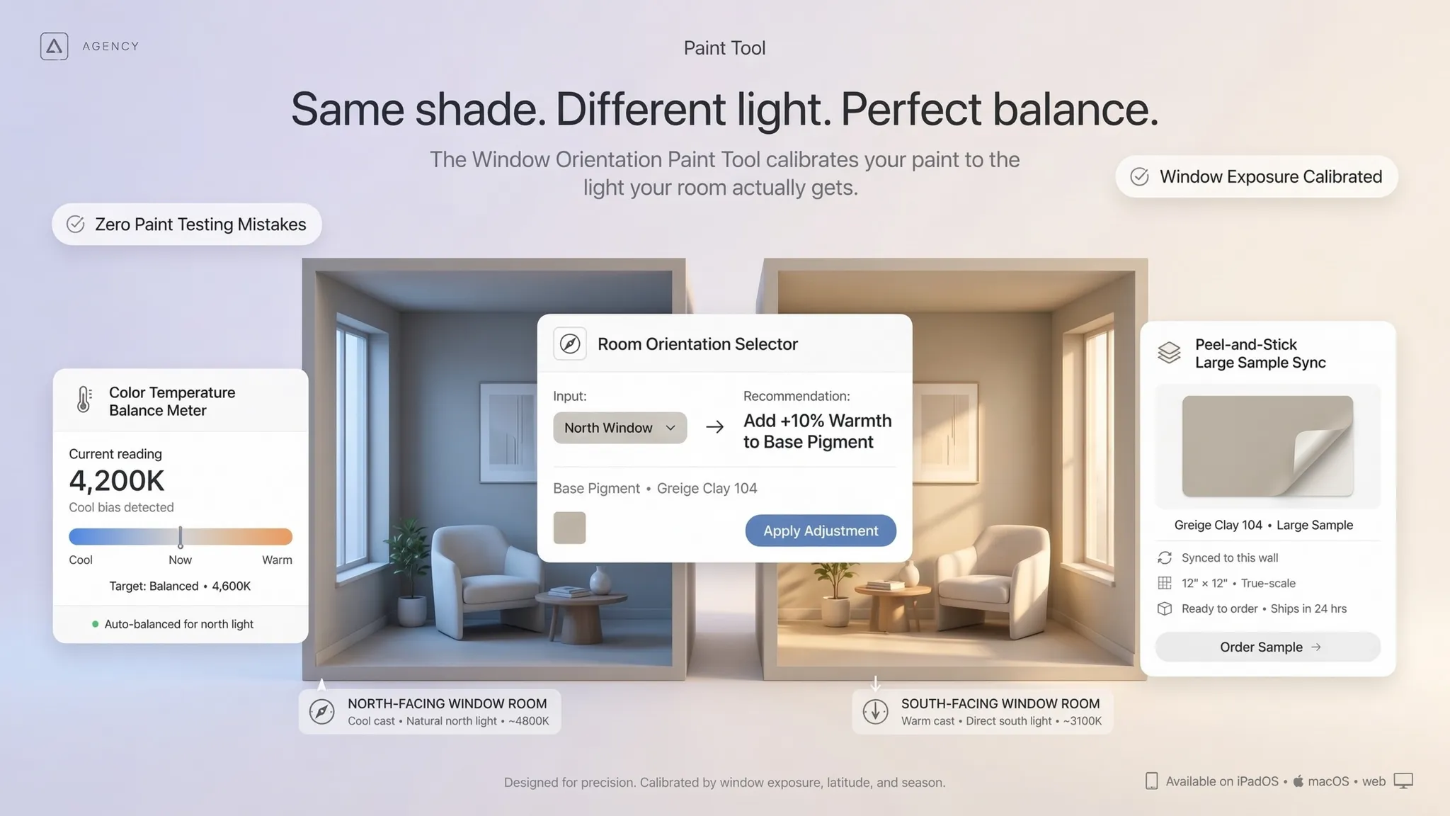
Before buying sample cans of pale off-white or trendy warm beige, pause and recognize that southern exposure delivers the longest, warmest, and most intense natural daylight of any compass direction.
Most homeowners struggle with paint colors for south-facing rooms because they pick shades designed to brighten dark spaces, accidentally turning their sun-filled rooms into glaring, overly warm boxes.
To master south-facing room paint colors and implement high-impact south-facing room color ideas, anchor your selection process around three foundational rules:
- Counteract Golden Light With Cool or Neutral Undertones: Because southern sunlight naturally casts a warm, yellow-orange glow across surfaces, cool-leaning grays, blues, greens, and balanced neutral whites look crisp and grounded rather than icy.
- Step Down One Shade Darker on the Paint Strip: Intense daylight visually lightens paint colors by one to two shades; choosing a slightly deeper, more saturated version prevents your walls from washing out into blank white at midday.
- Avoid High-Gloss Wall Finishes: Keep walls in low-luster matte or velvety eggshell finishes so direct sunbeams diffuse softly across drywall rather than bouncing mirror-like glare across the room.
Explore our architectural strategies for choosing interior wall colors to see how directional compass light and fixed flooring finishes dictate every shade in your house.
2. Understand How Direct Sunlight Changes Interior Paint Colors
The exact same gallon of paint can look cool and serene at 8:00 AM, blindingly bright at 1:00 PM, and rich golden-amber at 5:30 PM as the sun arcs across your windows.
Understanding south-facing room natural light, how sunlight and paint colors interact, and how sunlight affects wall colors stops you from picking a shade based on a single fleeting moment of the day.
Follow this 3-step diagnostic to read your room's light accurately:
- Distinguish Direct Beams From Bounce Light: Walls hit directly by sunbeams through unshaded glass look dramatically brighter and warmer than adjacent walls illuminated only by reflected room light.
- Account for Exterior Reflections: Green lawns, red brick patios, or neighboring tan stucco walls outside your window bounce colored light straight onto your interior drywall.
- Check Light Reflectance Value (LRV): Look at the LRV rating on the back of your paint swatch; in heavily sunlit rooms, shades with an LRV between 50 and 72 deliver bright airiness without blinding glare.
For technical specifications on residential solar illumination, spectral reflectance, and glare control metrics, visit the Illuminating Engineering Society (IES).
3. Choose Cool Undertones to Balance the Warmth of Strong Sunlight
In dark north-facing rooms, cool gray and blue paints often feel chilly and depressing—yet inside a sun-drenched south-facing room, those exact cool undertones come alive with crisp sophistication.
Selecting cool paint colors for south-facing rooms, identifying cool undertones for walls, and comparing cool neutral paint colors tames intense afternoon heat visually.
• Peach-white walls feel overly hot & loud
• Rooms lose architectural contrast
• Soft eucalyptus green feels fresh & airy
• Warm wood furniture pops against cool walls
Cool undertone selection rules:
- Look for Blue, Green, or Violet Bases: Inspect the darkest color at the bottom of your paint strip to expose whether a neutral carries a cool blue, slate green, or soft violet undertone that neutralizes golden sun.
- Pair Cool Walls With Warm Wood Floors: A cool slate-gray or pale misty blue wall creates stunning contrast against honey oak or warm walnut hardwood floors, letting both surfaces shine.
- Avoid Stark Ice-Blue Pastels: Choose muted, grayed-down cool shades rather than bright baby blues so your walls look tailored and architectural instead of nursery-bright.
4. Find the Right White Paint Colors for South-Facing Rooms
Painting a bright south-facing room in pure, brilliant gallery white often creates so much reflected glare that sitting in the room during midday feels uncomfortable.
Selecting the right white paint colors for south-facing rooms, finding the best white paint for bright rooms, and testing neutral white wall colors preserves clean brightness without harsh eye strain.
White paint guidelines for sunny spaces:
- Choose Softened, Neutral Whites Over Stark Gallery Whites: Pick whites tinted with a whisper of gray or umber—such as classic alabaster or soft dove white—which absorb just enough light to eliminate harsh glare.
- Skip Heavy Yellow-Cream Whites: Even creamy whites that look subtle in the store can turn distinctly buttery yellow when bathed in six hours of direct southern sunshine.
- Use Eggshell or Matte Sheen on Sunny White Walls: Never use satin or semi-gloss white on broad walls facing south windows, as direct sun reflections will highlight every drywall seam.
5. Use Gray, Greige, and Beige to Create a More Balanced Interior
Neutral walls remain the backbone of timeless residential design, yet strong sunlight mercilessly exposes whether a neutral leans muddy pink, sickly yellow, or crisp stone.
Comparing neutral paint colors for south-facing rooms, testing gray paint colors for bright rooms, and selecting greige paint colors ensures your backdrop stays steady from dawn till dusk.
Neutral palette guidelines:
- Embrace True Grays Without Fear: While gray can feel dreary in dim rooms, south-facing sunlight warms gray up into a luminous, architectural stone hue that pairs effortlessly with white trim.
- Pick Green-Gray "Greiges" Over Pink-Beiges: Greiges with subtle green or slate undertones stay grounded and sophisticated in bright light, whereas pink-undertone beiges can look fleshy or peachy at sunset.
- Test Mid-Tone Neutrals for Depth: Don't shy away from medium-value stone or putty shades; intense sunlight prevents mid-tone neutrals from feeling dark while keeping walls rich and substantial.
Preview Your South-Facing Wall Colors in Realistic 3D Sunlight
Staring at tiny paper swatches taped beside a bright window makes it nearly impossible to predict how a shade will wrap around four walls, shift from morning to sunset, and pair with your floors. You shouldn't have to gamble on gallons of paint just to stop your sunny room from looking washed out or overly yellow.
Stop guessing how bright daylight will transform your walls. Upload a photo or floor plan of your sunlit room to DesignHome, and craft your Paint Colors for South-Facing Rooms easily—testing real-time sunlight exposure, comparing cool undertones and rich hues against your exact furniture and flooring, and making your home shine effortlessly before opening a single paint can.
Preview Your South-Facing Room Colors in 3D Today with DesignHome →
6. Explore Blue, Green, and Other Colors for Sunlit Rooms
Because south-facing spaces receive abundant natural illumination all year long, they are the single best rooms in your house for introducing rich, saturated color without making the space feel gloomy.
Exploring blue paint colors for south-facing rooms, testing green paint colors for bright rooms, and curating colors for sunlit rooms brings vibrant personality into your home.
Color exploration tactics:
- Cool Down Bright Spaces With Slate and Chambray Blues: Muted blues with gray undertones thrive in southern exposure, creating a serene, breezy coastal or classic atmosphere that never feels cold.
- Echo Outdoor Greenery With Sage and Eucalyptus: Soft gray-greens bridge the visual transition between sunlit windows and backyard foliage, staying restful even at peak noon brightness.
- Enjoy Rich Sunset Glows With Earthy Clay: If you love warm hues, choose desaturated terracotta or dusty rose tones that glow dramatically during late afternoon golden hour without looking neon.
For guidance on zero-VOC interior paints, low-emission pigments, and sustainably crafted home finishes, consult the Sustainable Furnishings Council (SFC).
7. Consider Dark Paint Colors for a More Relaxed South-Facing Room
Most homeowners assume dark walls belong only in tiny powder rooms, yet a sun-flooded south-facing room has more than enough natural light to keep deep charcoal, navy, or forest green looking rich rather than cave-like.
Testing dark paint colors for south-facing rooms, styling dark green walls, and exploring dark blue paint colors for bright rooms turns blinding glare into dramatic, gallery-grade intimacy.
• Artwork & architectural trim fade away
• Room can feel exposed and overly bright
• Crisp white trim & brass frames pop dramatically
• Sunbeams highlight rich velvet & wood textures
Dark color execution guidelines:
- Absorb Excess Glare With Deep Navy or Forest Green: Saturated, moody shades soak up harsh afternoon reflections, transforming an overly bright room into a grounded, relaxing lounge or library.
- Highlight Architectural Molding and Artwork: Deep walls create an extraordinary backdrop that makes crisp white crown molding, warm oak furniture, and framed art stand out with museum-like clarity.
- Choose Ultra-Matte or Velvet Finishes: Deep colors show surface texture and light reflections more easily than pale tones, so specify a scrubbable matte finish for a velvety, glare-free result.
8. Match Wall Colors With Flooring, Furniture, and Window Treatments
Even the most balanced south-facing paint color will look wrong if its undertone fights with your honey oak hardwood planks, stone fireplace, or linen drapery.
Coordinating wall colors with wood floors, pairing paint colors with furniture, and building south-facing room color schemes unites every surface in your room.
Surface coordination rules:
- Tame Warm Wood Floors With Cool Walls: If your south-facing room features warm oak or pine flooring, choose a cool gray, muted blue, or sage green wall color to stop the room from feeling overly orange.
- Account for Window Treatments Filtering Light: Sheer white linen curtains diffuse harsh midday sunbeams into a soft, even glow, whereas woven bamboo shades cast warm amber light across walls.
- Match Wall Undertones to Large Upholstery: Hold your shortlisted paint swatches directly against your sofa fabric and area rug fibers to ensure undertones harmonize seamlessly.
Explore our architectural strategies for make an open plan home feel cozy to see how warm textiles and natural wood tones balance bright, wide-open floor plans.
9. Choose Ceiling, Trim, and Accent Colors That Work With Bright Walls
Leaving ceilings and baseboards in stark, factory-default white while painting walls a soft neutral can create jarring contrast—or make your walls look muddy by comparison.
Selecting ceiling paint colors for bright rooms, pairing trim colors for south-facing rooms, and choosing accent colors for sunlit rooms polishes every architectural edge.
Trim, ceiling, and accent guidelines:
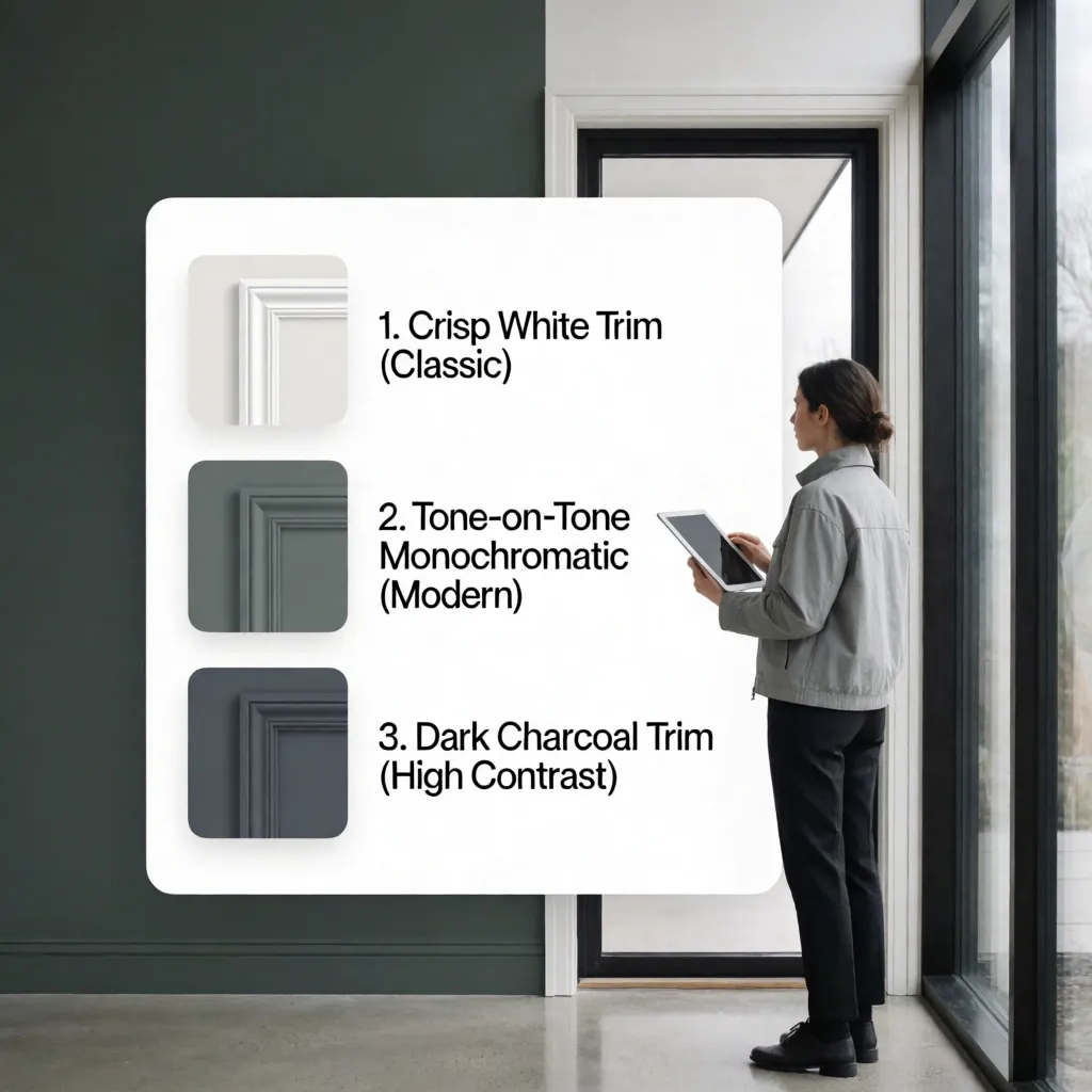
- Match Trim Undertones to Wall Undertones: Pair cool grays, blues, and greens with crisp, pure white trim so millwork looks sharp and clean rather than dingy yellow.
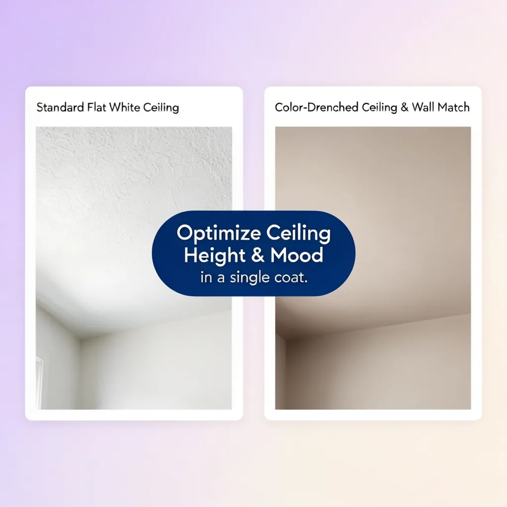
- Soften Ceiling Glare With Flat Finish: Always paint south-facing ceilings in a dead-flat finish so low-angle afternoon sunlight bouncing upward doesn't highlight drywall tape lines.
- Anchor Bright Rooms With Rich Accent Tones: Use deep navy, rust, olive, or matte black in throw pillows, window hardware, and ceramic lamps to ground airy sunlit walls.
10. Select Paint Colors for South-Facing Living Rooms, Bedrooms, and Kitchens
A shade that feels energizing in a sunlit morning kitchen might feel far too bright when you are trying to unwind in a bedroom or watch television in a living room.
Tailoring south-facing living room paint colors, restful south-facing bedroom paint colors, and crisp south-facing kitchen paint colors optimizes every room for its daily rhythm.
Room-by-room selection tactics:
- Control Screen Glare in Living Rooms: Choose mid-tone greige, dusty olive, or moody charcoal in south-facing living rooms to reduce harsh screen reflections during afternoon viewing.
- Cool Down Sunny Bedrooms: Use desaturated slate blues or misty greens in south-facing bedrooms so bright morning sunlight feels calm and restorative rather than blinding.
- Keep Sunlit Kitchens Crisp and Fresh: Pair neutral soft whites or pale stone walls with natural wood accents and brushed brass hardware for a timeless, light-filled culinary hub.
Explore our guide on create zones in an open plan home to see how cohesive paint transitions connect sunlit kitchens, dining tables, and living lounges effortlessly.
11. Test Paint Samples Under Strong South-Facing Sunlight
Never trust a tiny paper paint chip held in your hand—intense southern sunlight changes paint shades so dramatically that testing full-size samples in real conditions is mandatory.
Knowing how to test paint colors in south-facing rooms, evaluate south-facing room paint samples, and master how to choose paint colors prevents costly repainting mistakes.
Foolproof south-facing sample testing steps:
- Test on Both Direct-Sun and Shadowed Walls: A south-facing room has two completely different lighting zones—the wall opposite the windows gets blasted with direct sun, while the window wall itself sits in shadow.
- Use Large Movable Foam Boards: Paint two coats onto large white poster boards rather than directly onto colored drywall so your existing wall color never distorts your eye.
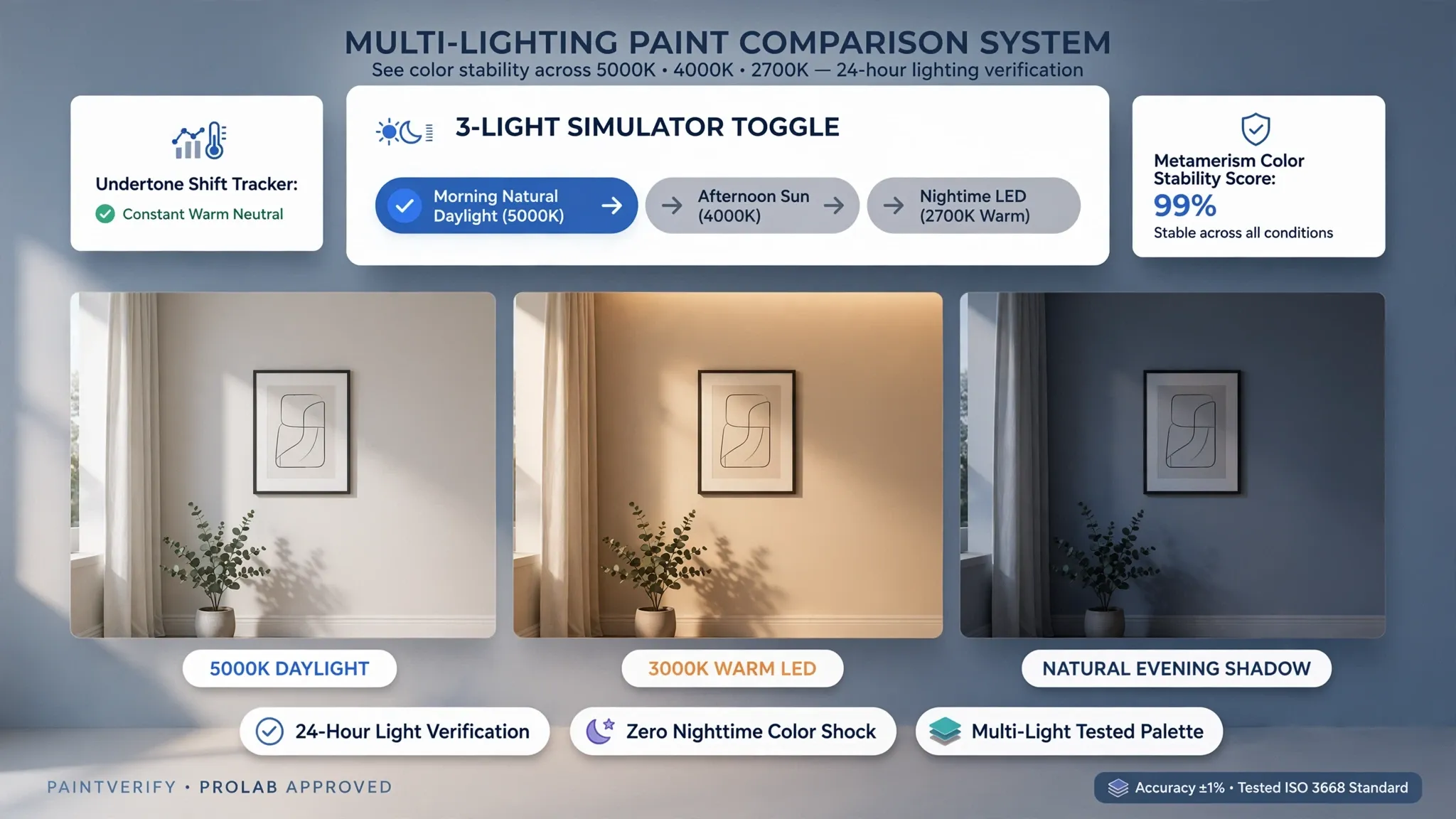
- Observe Under Artificial Evening Bulbs: Check how your shortlisted cool or neutral shades look after sunset under warm 2700K lamps to ensure they don't turn dreary at night.
For official residential indoor air quality standards, low-VOC emission guidelines, and safe surface preparation practices, consult the International Code Council (ICC).
12. Create a South-Facing Room Color Scheme That Feels Comfortable
Combining cool-leaning wall shades, glare-free matte finishes, crisp trim whites, natural wood floors, and rich accent textiles turns intense southern sunshine into your home's greatest asset.
Finalizing balanced south-facing room color schemes, building a cohesive south-facing room color palette, and selecting the right interior paint colors for south-facing rooms ensures effortless beauty all year long.
Your South-Facing Room Color Sign-Off Checklist:

Turn Blinding Afternoon Glare Into Luminous, Effortless Beauty
You shouldn't have to keep your blinds drawn all afternoon or settle for walls that look washed out and overly yellow just because your windows face south. When you harness abundant natural light with cool-leaning undertones, velvety glare-free finishes, and balanced neutral or saturated hues, your south-facing room becomes the brightest, most inviting space in your entire home.
Which south-facing space—a sun-drenched living room, a bright corner bedroom, or an open kitchen—is giving you the hardest color choice right now? Share your room photos with DesignHome, test custom south-facing wall colors under realistic daylight and furniture in interactive 3D, and make your entire home shine with effortless confidence.
Frequently Asked Questions About Paint Colors for South-Facing Rooms
My living room gets tons of sunshine, yet several paint colors I try look way too bright or overly warm. Which shades actually look balanced in strong light?
Here is the candid truth: south-facing rooms don't suffer from a lack of light—they suffer from intense, golden sunlight that washes out delicate tints and turns already warm shades into glaring yellow walls.
Picking smart paint colors for south-facing rooms isn't about hunting for brighter paint—it is about choosing shades with enough pigment depth and subtle cool or neutral balance to handle strong afternoon sun. Thoughtful south-facing room paint colors and south-facing room color ideas let abundant daylight flatter your walls instead of overwhelming your eyes.
Why does my wall color look completely different at noon than it does early in the morning or later in the afternoon?
Direct sunlight moves across a southern exposure with shifting intensity and angle, changing how pigments reflect light from hour to hour.
Understanding south-facing room natural light helps you predict how sunlight and paint colors interact as the day unfolds. Paying attention to how sunlight affects wall colors—including glare on sunny walls versus softer light on shaded sides—saves you from picking a shade that surprises you at peak sun.
Would choosing cooler paint colors stop my south-facing room from looking so warm or yellowish?
Adding cool-leaning undertones can calm golden sunlight, though not every sunny room needs an icy palette to feel right.
Exploring cool paint colors for south-facing rooms and spotting cool undertones for walls—like soft slate, muted blue-green, or crisp neutral bases—helps counter excessive warmth. Pairing those shades with cool neutral paint colors can keep bright walls looking clean and composed without making the room feel chilly.
Will a bright white wall look blindingly harsh when strong sunlight hits it directly?
Crisp, high-reflectance white walls can bounce a surprising amount of glare when direct sunbeams hit them straight on.
Choosing white paint colors for south-facing rooms means looking for the best white paint for bright rooms and softer neutral white wall colors that take the edge off intense light. A gently softened white with a touch of gray or neutral balance stays easy on the eyes while keeping the room airy.
I want a neutral room, but how do I pick a shade that won't turn overly yellow, flat, or cold in bright light?
Neutral shades behave differently under strong daylight depending on whether their base leans warm, cool, or balanced.
Comparing neutral paint colors for south-facing rooms, testing gray paint colors for bright rooms, and considering greige paint colors helps you find steady neutrals that hold their character. A balanced greige or soft gray-taupe can keep walls grounded without swinging too warm or looking washed out.
Can I use stronger colors like blue or green in a room that already gets plenty of natural sunlight?
Abundant daylight actually gives you freedom to explore richer hues because natural light keeps deep or muted shades from looking heavy.
Testing blue paint colors for south-facing rooms and green paint colors for bright rooms opens up fresh possibilities among colors for sunlit rooms. Muted blues, soft sage greens, and sea-inspired tones often look remarkably rich and calm when bathed in steady daylight.
"Should I avoid dark paint in a bright south-facing room, or can deeper shades make the space feel more relaxed?"
Strong natural light can keep deeper shades lively while turning a bright room into a calmer, more intimate place to unwind.
Exploring dark paint colors for south-facing rooms lets you weigh dramatic contrast against airy openness depending on how you use the space. Using dark green walls or dark blue paint colors for bright rooms can bring a grounded, restful mood to a sunlit lounge or reading room.
The paint color looks nice on its own, but how do I tell if it works with my wood floors, furniture, and curtains?
In a sunlit room, strong light highlights every surface at once, making clashing undertones between walls, wood grain, and upholstery easy to spot.
Coordinating wall colors with wood floors and paint colors with furniture helps build south-facing room color schemes that feel naturally connected. Checking how warm wood tones, textiles, and window treatments sit beside your wall shade keeps the entire room harmonious.
Should I keep my ceiling white in a bright room, or would another shade make the room look more finished?
Ceiling and trim choices shape how bright walls meet the rest of the architecture, especially when sunlight bounces across upper surfaces.
Planning ceiling paint colors for bright rooms alongside trim colors for south-facing rooms and accent colors for sunlit rooms helps you decide between crisp contrast and softer blends. Matching trim tones or giving accents a clear role makes the room feel complete from edge to edge.


