

You walk into a sun-drenched room, coffee mug in hand, expecting a warm and inviting space. Instead, the white walls hit you with a blinding, harsh glare that makes you want to put on sunglasses indoors. Or worse, that gorgeous creamy beige you picked out in the store now looks like a mud stain under direct sunlight.
Having a room packed with natural sunlight feels like a jackpot. But decorating it? That is where things get tricky.
Sunlight acts like a giant magnifying glass. It takes whatever undertone is hiding in your paint and turns the volume up to maximum. A subtle yellow hint becomes a neon lemon. A soft gray turns into a cold, clinical blue.
Here is the good news: you do not have to settle for a space that feels like a hospital operating room or an washed-out beige box.
By picking shades built to work alongside raw daylight, you can turn bright rooms into comfortable, stunning spaces you actually want to spend time in. Let’s break down how to choose the right shades step by step.
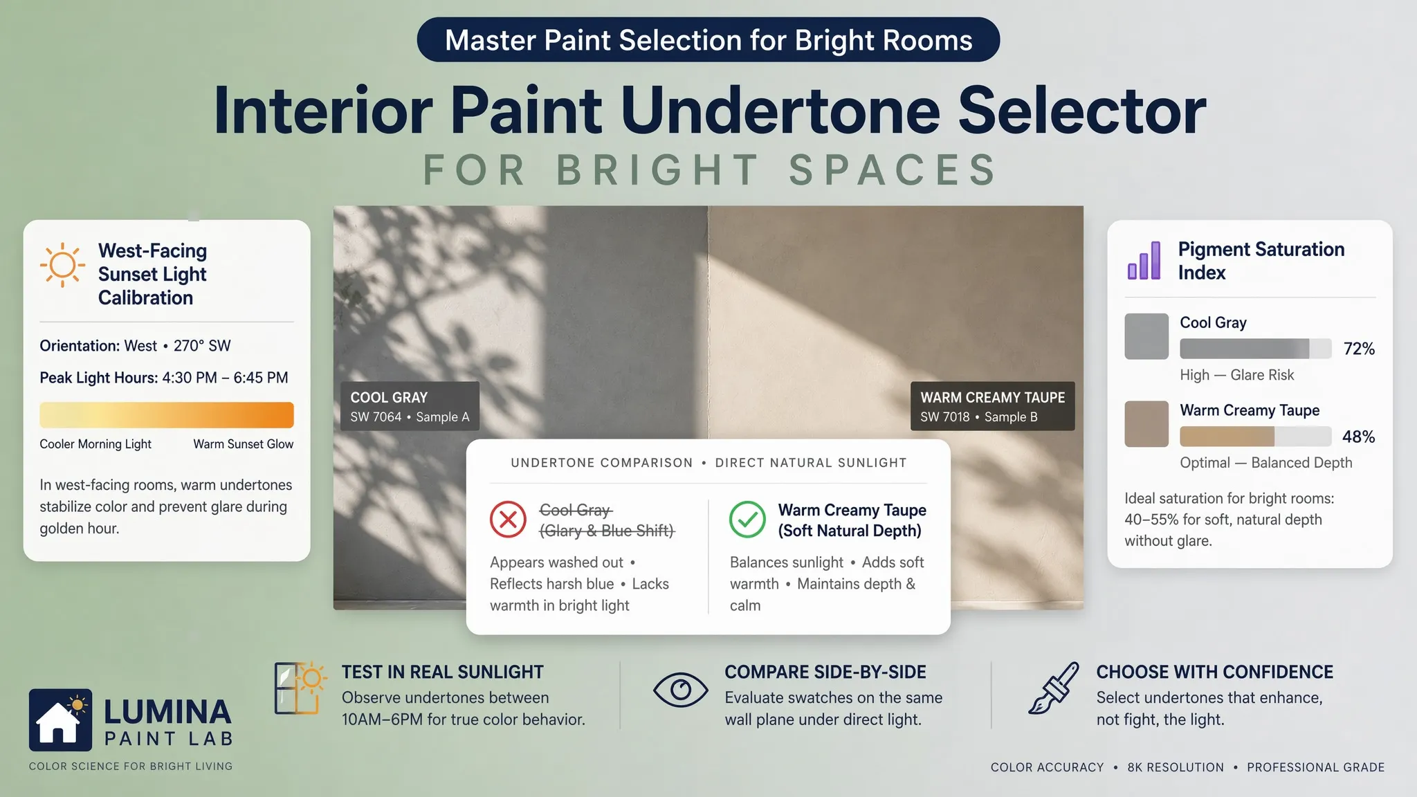
1. Decide What You Want the Sunlight to Bring Out in Your Room
Before grabbing paint swatches or taping up samples, ask yourself one simple question:
How do you want this room to feel when the sun hits it?
Direct sunlight does not just illuminate a room. It changes the atmosphere completely. If you do not direct that energy, the light will dictate how the room feels for you.
Here is how to set the right direction:
- For a fresh, crisp, and airy vibe: Look for cool whites or pale, muted greens. These shades absorb excess heat from the sun and keep the space feeling open and breezy.
- For a cozy, grounded feel: Lean into warm neutrals, soft terracotta, or warm taupe. The daylight will highlight the deep, earthy tones, making large, bright spaces feel intimate.
- For high contrast and dramatic beauty: Do not be afraid of charcoal, deep navy, or forest green. Sunlight breaks through heavy pigments, keeping dark walls from feeling like a cave.
Here is the secret: sunlight magnifies whatever emotion the paint carries.
When you align your paint choice with the room's main purpose, bright daylight becomes your best tool rather than your biggest headache.
Need to see your ideas before touching a paintbrush?
Instead of guessing how a shade feels across an entire room, you can upload a photo of your space to DesignHome to instantly preview different wall colors, furniture setups, and full layouts in realistic light.
2. Choose Whites That Stay Soft Instead of Looking Harsh in Bright Sunlight
White is the most popular choice for sunny spaces. It is also the easiest one to mess up.
Pure, bright white paint lacks pigment. When intense daylight hits an unpigmented wall, the light bounces around relentlessly. The result? High-wattage glare, squinting eyes, and an uncomfortably sterile atmosphere.
   [ Pure Bright White ] + [ Direct Sunlight ] = Harsh Glare & Eye Strain
   [ Warm / Soft White ] + [ Direct Sunlight ] = Balanced, Inviting Glow
To keep your walls looking soft and welcoming, you need whites that contain tiny hints of pigment to absorb that raw energy.
Warm Whites
Look for whites with subtle yellow, peach, or warm beige undertones. In strong daylight, these undertones balance out the brightness, turning what could be a harsh glare into a soft, inviting glow.
Off-Whites with a Gray or Green Base
If your room faces south or west and gets hit with intense afternoon heat, a warm white might feel a bit too golden. Choose a soft off-white with a tiny hint of gray or green. This subtle cool base counteracts intense solar heat without making the room feel cold.
If you are trying to make a compact, bright room feel open without blinding yourself, exploring how to make a small house feel bigger will help you balance paint color with visual space.
3. Find a Neutral That Won't Turn Too Yellow, Gray, or Washed Out
Neutrals are notorious shapeshifters.
That warm beige swatch that looked earthy and rich in the home improvement aisle? Under direct midday sun, it can suddenly look like mustard. That sleek, sophisticated gray? It might turn into a dull, washed-out blue by 2:00 PM.
Why does this happen? Direct sunlight washes out pale pigments and highlights secondary undertones.
To lock in a neutral that stays grounded:
- Avoid ultra-pale neutrals: Daylight will eat right through them, leaving your walls looking faded and lifeless. Pick a shade that is one or two steps darker on the paint chip than you think you need.
- Look for "Greige" (Gray + Beige): Greige shades are ideal for bright rooms. The gray element tempers the warmth of yellow sunlight, while the beige element keeps the room from feeling chilly.
- Check your flooring: Neutrals bounce light directly off your floor. If you have warm oak floors, a cool gray wall will fight against it all day long.
If you are planning a full home refresh and want every room to flow smoothly into the next, take a look at our guide on how to create a whole house color palette.
4. Use Soft Greens and Blues to Balance a Bright, Sunlit Room
Want to add real personality to a bright space without making it feel chaotic? Soft blues and greens are your best friends.
Botanical and coastal shades naturally balance the natural warmth of sunbeams. Because sunlight carries a warm, yellow-gold tint, pairing it with cool greens and blues creates an effortless, harmonious balance.
- Sage Green: Sage contains cool gray undertones that absorb heavy sunlight. It grounds a bright room and brings a relaxing, organic feel inside.
- Muted Slate Blue: A crisp slate blue cuts through intense heat and glare, making bright living rooms or bedrooms feel cool, calm, and collected.
- Dusty Aqua or Soft Eucalyptus: These shades look fresh in the morning light and comfortably muted as the afternoon rolls in.
When picking blues and greens for bright spaces, avoid ultra-bright or electric tones. Direct sunlight will make them feel overwhelming. Always opt for shades with a hint of gray, smoky brown, or dust mixed in.
5. Make the Most of South-Facing Rooms Without Overheating the Color Palette
South-facing rooms are the crown jewels of home lighting. They get steady, intense, golden sunlight from morning until sunset.
But there is a catch.
Because south-facing light is consistently warm, painting a south-facing room in warm yellows, bright oranges, or heavy creams can make the space feel hot and uncomfortable.
                  [ South-Facing Sunlight (Warm Golden Tint) ]
                                      |
            +-------------------------+-------------------------+
            |                                                   |
    [ + Warm Paints ]                                   [ + Cool/Muted Paints ]
            |                                                   |
    (Overheated, Too Yellow)                             (Balanced, Crisp, Elegant)
To make the most of a south-facing space:
- Embrace cool undertones: Cool grays, soft blues, crisp teal, and muted greens thrive in south-facing light. The warm sunlight softens their cool edge, making them look balanced and elegant.
- Try soft lavender or plum-toned grays: These shades neutralize heavy yellow light, turning an overly hot room into a serene retreat.
- Watch out for golden tans: A tan paint with strong yellow undertones will look twice as intense in a south-facing room.
If your south-facing layout features connected living and dining areas, check out these open-plan living room furniture layout ideas to see how light flow and furniture placement work together.
6. Choose Colors That Work With Morning or Afternoon Sun
Not all daylight is created equal. The direction your windows face completely alters the color of light entering your room throughout the day.
       East-Facing Windows                      West-Facing Windows
   (Bright, cool morning light)            (Hot, golden afternoon sunlight)
                |                                        |
     Needs: Warm undertones                   Needs: Cool/Muted undertones
   to combat blue morning shade            to tone down evening glare
East-Facing Rooms (Morning Light)
East-facing spaces get strong, bright light early in the day. This morning light leans slightly cool and blue. As the afternoon comes, east-facing rooms fall into shadow.
The Fix: Choose paint with subtle warm undertones—like soft peach, warm ivory, or gentle terracotta. These undertones fight off the chilly morning shade and keep the room inviting after the sun moves away.
West-Facing Rooms (Afternoon Light)
West-facing rooms start the day in cool shade, then get hit with hot, deep golden sunlight in the late afternoon.
The Fix: Avoid heavy warm tones unless you want the room to feel fiery at 5:00 PM. Choose soft neutrals, muted sage, or cool greige to absorb that late-day heat while keeping the room bright in the morning.
If you are working with connected spaces that receive light from multiple directions, learn how to handle choosing colors for adjoining rooms without creating harsh visual breaks.
7. Go Beyond Pale Colors: Use Richer Shades in Rooms With Plenty of Daylight
Here is a common myth that ruins great rooms: "If a room gets lots of light, you have to paint it white or light pastel."
That is simply not true.
In fact, bright rooms are the best places to experiment with deep, rich colors.
In dark rooms, moody colors can sometimes feel heavy or gloomy. But in a sunlit room, abundant daylight brings dark pigments to life. It highlights subtle undertones and creates rich contrast without making the room feel small.
Look at these rich options for sun-drenched spaces:
- Deep Navy: Direct sunlight keeps navy from looking black, pulling out rich blue undertones.
- Forest Green: Daylight brings out natural, earthy warmth, creating an energetic feel.
- Charcoal Slate: Sunlight reflects off charcoal walls to give them a sleek, stone-like texture.
- Warm Terracotta: Sunlight turns terracotta into a sun-baked, inviting backdrop.
If you are redesigning a high-sunlight living area and want to balance bold wall choices, explore these living room focal point ideas to pull the space together seamlessly.
8. Check How Your Paint Color Looks Beside Floors, Curtains, and Furniture
Paint does not exist in a vacuum.
Sunlight hits your walls, bounces down to your flooring, bounces across your sofa, and reflects onto your window treatments. Every surface in your room bounces tint back onto your walls.
                        [ Direct Sunlight ]
                                 |
                                 v
                        ( Hits Flooring )
                                 |
                                 v
      [ Warm Wood Floor ] ---------------> [ Bounces Orange Light ]
                                 |
                                 v
                        ( Hits Wall Paint )
Before committing to a paint shade, look at how it interacts with the non-negotiable elements in your room:
- Hardwood Flooring: Warm oak and cherry floors bounce orange and yellow light upward. If you pair them with a cool blue-gray wall, the bottom half of your wall may look muddy where the light reflects off the floor.
- Large Windows & Greenery: If your windows look out onto a lush green lawn or trees, sunlight bouncing off the grass will cast a subtle green tint inside.
- Dark Furniture: Heavy dark wood or dark leather furniture absorbs light. You may need a slightly lighter wall shade to keep the room feeling open.
If you are picking out new flooring alongside your wall updates, dive into our practical guide on choosing flooring for your home to avoid undertone conflicts.
9. Use Light Reflectance Value to Narrow Down Your Paint Choices
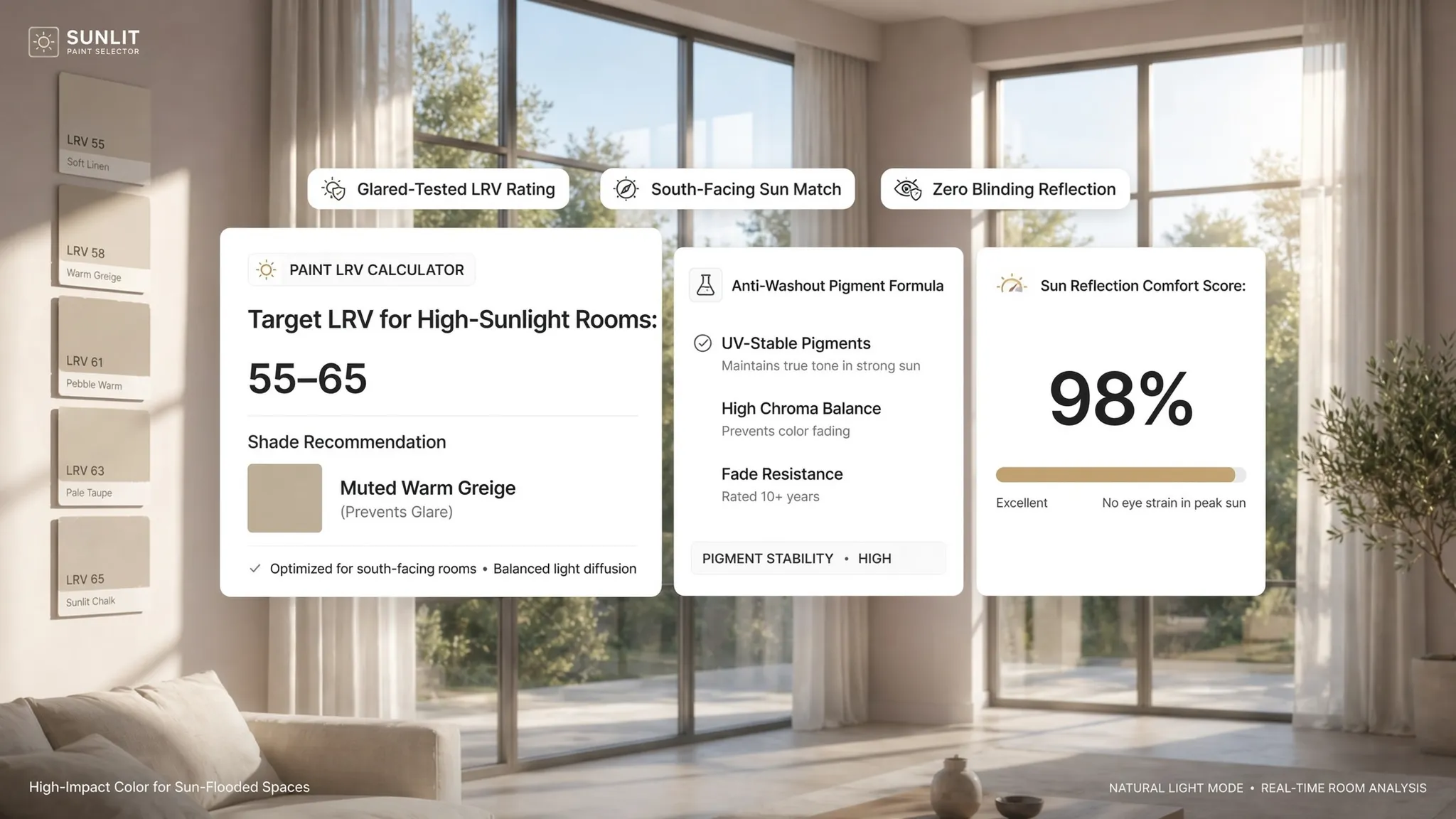
Want a reliable way to predict how a paint color will react to daylight? Look at its Light Reflectance Value (LRV).
You can find the LRV number on the back of almost every paint swatch or on the manufacturer's website. It is measured on a scale from 0 to 100:
  0 (Absolute Black) <------------------------------------> 100 (Pure White)
                          [ Ideal Range: 55 - 75 ]
                     (Perfect for natural daylight)
LRV 0: Absolute black (absorbs all light).
LRV 100: Pure white (reflects all light).
What LRV Should You Target for Bright Rooms?
- To eliminate glare: Look for colors with an LRV between 55 and 75. These shades reflect enough daylight to keep the room bright without creating intense glare.
- To create depth with darker shades: Target an LRV between 25 and 40. In a bright space, this range creates a rich, cozy atmosphere without feeling gloomy.
- Avoid LRVs above 85 in direct sun: Anything higher than 85 in direct sunlight will likely produce uncomfortable glare.
10. Test Your Favorite Colors Before Painting the Entire Room
Never buy gallons of paint based on how a tiny swatch looks under store lighting. Retail stores use artificial fluorescent lighting that looks nothing like the sunlight streaming into your home.
Here is a simple, foolproof testing method:
   [ Step 1: Paint 12"x12" Sample Boards ]
                      |
   [ Step 2: Move Board Across 3 Walls ]
                      |
   [ Step 3: Observe at 9 AM, 1 PM, and 6 PM ]
Paint sample boards: Apply two coats of paint onto large sample boards (at least 12x12 inches) rather than painting directly onto your current wall.
Move them around: Move the boards across different walls throughout the day. Place one near a window and another in a shaded corner.
Observe at three key times:
- 9:00 AM: Check for cool or pale undertones in morning light.
- 1:00 PM: Check for harsh glare or washed-out pigment under bright midday sun.
- 6:00 PM: Turn on your artificial lamps and check how the shade feels as daylight fades.
If you are comparing multiple paint samples across connected spaces, see our guide on how to compare paint colors in different light to make your decision effortless.
11. Match the Paint Finish to the Room's Light and Everyday Use
The shade of paint is only half the battle. The finish you choose determines how sunlight bounces off your walls.
If you pick a shiny finish for a sunlit wall, every tiny bump, drywall patch, and imperfection will stand out immediately.
Matte or Flat
Matte paint absorbs light rather than reflecting it. It hides imperfections perfectly and completely eliminates sunlight glare. It is ideal for ceilings and low-traffic living areas.
Eggshell
Eggshell is the sweet spot for sunlit spaces. It offers a soft, velvety sheen that handles daylight smoothly without creating harsh highlights, and it is easy to wipe clean.
Satin
Satin reflects a bit more light than eggshell. It works well in high-moisture, high-traffic areas like sun-drenched kitchens or bathrooms.
Semi-Gloss and Gloss
Avoid using gloss finishes on main walls in bright rooms. High sheen creates mirror-like glare when direct sunlight hits it. Reserve gloss finishes for trim, baseboards, and interior doors.
12. Narrow Your Options to Three Shades Before You Buy
Standing in the paint aisle staring at hundreds of swatches is a recipe for decision paralysis.
To pick your final color with complete confidence, use this simple checklist to narrow your choices down to just three candidates:
                          [ All Paint Swatches ]
                                     |
                       ( Filter by LRV: 55 - 75 )
                                     |
                       ( Filter by Window Direction )
                                     |
               ( Match to Floor & Furniture Undertones )
                                     |
                                     v
                           [ Final 3 Candidates ]
- Pick your undertone path: Based on your window direction (east, west, south, or north), decide whether you need cool or warm undertones.
- Filter by LRV: Eliminate anything with an LRV over 85 to prevent glare, and drop anything below 20 if you want to keep the space feeling light.
- Align with fixed elements: Cross off any shade that clashes with your flooring or major furniture.
- Test the final three: Buy sample pots for those top three options, paint your test boards, and watch how they respond to sunlight over 24 hours.
Stop Guessing and Start Visualizing
Tired of taping paint swatches to your walls and trying to imagine the final result?
With DesignHome, you can instantly generate and visualize complete room designs, wall colors, floor plans, and layouts. Describe your ideal layout or upload your space to test different look-and-feel options before spending a single dollar on paint or materials.
Frequently Asked Questions About Paint Colors for Homes With Natural Light
Does natural sunlight mean I can just paint every room pure white?
Slapping pure, bright white paint onto walls drenched in sunlight is actually a recipe for intense glare. Raw daylight bounces off unpigmented white paint relentlessly, making your living area feel like a harsh, sterile operating room. Instead of an unpigmented stark white, opt for soft warm whites or muted off-whites with subtle gray or beige bases. These tiny undertones absorb heavy light energy, transforming blinding sunbeams into a warm, inviting glow.
How do I know if my sunny room needs warm or cool paint undertones?
The secret comes down to checking which direction your windows face. South-facing rooms collect continuous warm, golden daylight all day long, meaning cool undertones like soft sage, slate blue, or muted greige balance out the heat. On the flip side, east-facing spaces get cool, bluish light in the morning, which calls for warm ivory or gentle peach undertones to prevent shadowed corners from feeling chilly. Matching your paint’s undertone to your room's natural sunlight keeps the color perfectly balanced from sunrise to sunset.
What is Light Reflectance Value (LRV), and what rating works best for bright rooms?
Light Reflectance Value (LRV) measures the percentage of light a paint shade reflects back into a space on a scale from 0 (absolute black) to 100 (pure reflective white). When picking paint colors for bright rooms, aiming for an LRV between 55 and 75 hits the sweet spot. Shades in this range bounce enough daylight to keep your home feeling open and spacious without creating uncomfortable glare. Anything above an 85 LRV under direct midday sun will likely cause squinting and eye strain.
Can I use dark or bold paint colors in a room with lots of natural sunlight?
Sun-drenched rooms are actually the best spaces in your house to experiment with rich, moody paint colors. While deep navy, forest green, charcoal, or warm terracotta can make dark spaces feel small, direct daylight brings heavy pigments to life. Abundant natural light pulls out hidden undertones and creates stunning contrast without making the walls feel like they are closing in on you.
Why does my neutral paint color look golden in the afternoon but gray in the morning?
Sunlight changes color and intensity as the earth rotates throughout the day. Early morning light carries a cool, blue-tinted cast that highlights cool pigments, while late afternoon golden-hour light pours intense yellow warmth onto your walls. To lock in a neutral paint color for sunny rooms that holds up all day, choose a well-balanced greige (a blend of gray and beige). The gray component tones down afternoon heat, while the beige base keeps morning shade from feeling cold.
How does my hardwood flooring affect the way paint looks under direct sun?
Daylight doesn't just hit your walls—it beams straight onto your floor and bounces directly upward. Warm oak, cherry, and pine floors reflect warm orange and yellow light back onto your lower walls. If you pair honey-oak flooring with a crisp blue-gray wall paint, that bounced warm light can turn the bottom half of your wall muddy. Always evaluate your wall color samples right beside your flooring, cabinets, and major furniture pieces under direct sun before committing.
Which paint finish handles direct sunlight best without showing wall flaws?
An eggshell or matte paint finish performs best in brightly lit spaces. Flat and matte finishes absorb light instead of reflecting it, hiding drywall imperfections, patch jobs, and seam lines effortlessy. High-gloss and semi-gloss paints act like mirrors under direct sun, highlighting every tiny bump and casting distracting highlights across the room. Save glossy finishes strictly for doors, baseboards, and architectural trim.
How can I test wall paint samples accurately before buying gallons of paint?
Never judge a paint shade using a tiny paper swatch pinned flat on a table under store lights. Paint two coats of your candidate color onto a large 12x12-inch poster board, leaving a small white border around the edges. Tape the board vertically onto different walls throughout the room, and check it at 9:00 AM, 1:00 PM, and 7:00 PM. Observing a vertical sample board under morning daylight, midday sun, and evening lamps prevents expensive repainting mistakes.
Will soft greens and blues make my sunlit room feel cold?
Soft greens and blues do not make sunny spaces feel cold—they keep them from feeling uncomfortably hot. Because natural sunbeams carry a warm, yellow-gold tint, pairing them with botanical greens, sage, or muted slate blue creates an effortless visual balance. To keep cool colors looking organic and cozy, pick shades with a subtle touch of gray or earthy dust mixed in rather than electric, high-saturation pastels.
How do I narrow down dozens of paint swatches without getting choice paralysis?
Sorting through a mountain of paint chips quickly causes eye fatigue and confusion. Cap your selection at three candidate shades by eliminating anything with an LRV over 85 or any shade that fights your floor undertones. Once you have your top three, use a simple side-by-side process of elimination: compare Shade A directly against Shade B, discard the loser, and test the winning shade against Shade C until your final winner stands out naturally.


