

You pick up a handful of paint swatches from the local home improvement store, hold them against your kitchen table, and point to a gorgeous, warm greige. "This is it," you think. It looks soft, inviting, and completely balanced.
Fast forward to the weekend: you roll two coats onto your living room wall, step back to admire your handiwork, and freeze.
The paint is drying into a dull, muddy lavender. By 8:00 PM under your ceiling lights, it looks bright yellow.
What went wrong? You did not pick a bad paint—your room's lighting completely hijacked it.
Paint color is a chameleon. The exact same gallon of paint looks like three completely different shades depending on the time of day, window placement, light bulbs, and surrounding furniture.
If you do not test your top choices directly under your room's real-life lighting, picking a paint color becomes an expensive gamble. Here is how to test, compare, and lock in the perfect shade with total confidence before buying your first gallon.
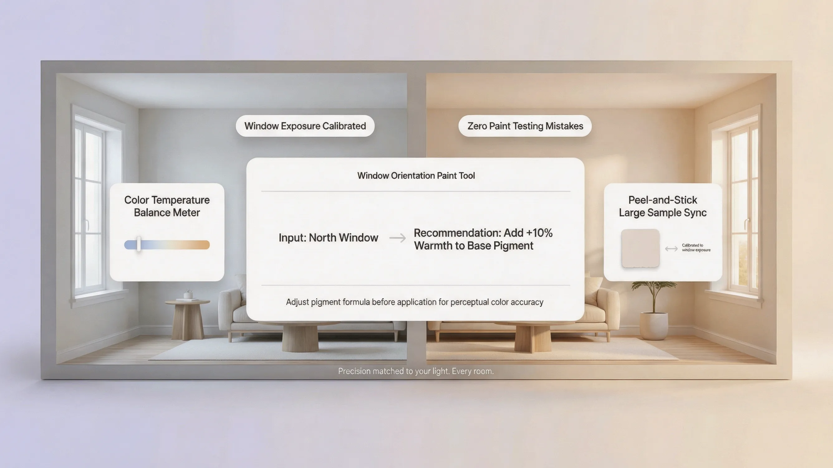
1. Put Your Paint Samples Where the Final Color Will Actually Go
The biggest mistake people make happens before they even touch a paint can: they judge swatches on a kitchen counter, on a phone screen, or pinned flat against a table.
Light hits horizontal surfaces (floors and tables) completely differently than vertical surfaces (walls).
When you lay a paper swatch flat on a table, daylight bounces off it at a flat angle, washing out the pigment and making undertones hard to see.
[ Sunlight ] ===> [ Swatch on Table ] ===> False Impression
[ Sunlight ] ===> [ Vertical Wall Board ] ===> Accurate Color
To see what a color will actually look like in your space:
- Paint large sample boards: Apply two thick coats of paint onto 12x12-inch drywall scraps or heavy poster boards rather than painting directly over your existing wall color.
- Tape them up vertically: Use painter's tape to stick the boards directly onto the wall you plan to paint.
- Leave a white border: Keep a white border around your sample board so your existing wall color does not trick your eyes into seeing wrong undertones.
If you are painting a small or dark room and need to pick shades that make the space feel bigger, read our practical guide on how paint colors make small rooms feel larger to pair lighting tests with space-saving color choices.
2. Compare the Same Shades in Morning, Afternoon, and Evening Light
Sunlight is not a static white light. It shifts in color, warmth, and intensity every single hour as the sun moves across the sky.
A paint shade that feels soft and airy at 9:00 AM can feel stark and cold by 2:00 PM, or muddy and heavy as dusk sets in.
To run a clean side-by-side test, track your sample boards at three key check-ins:
- Morning Check (9:00 AM): Look for hidden cool or blue undertones as crisp morning light streams through the windows.
- Midday Check (1:00 PM): Check if direct sun washes out the color completely or creates intense glare on the wall.
- Late Afternoon Check (5:00 PM): See if golden-hour light turns your neutral shade overly yellow, orange, or peach.
If you are choosing paint for rooms that receive strong, direct sunlight all day long, review our guide on picking paint colors for sunlit spaces to balance intense daylight without creating glare.
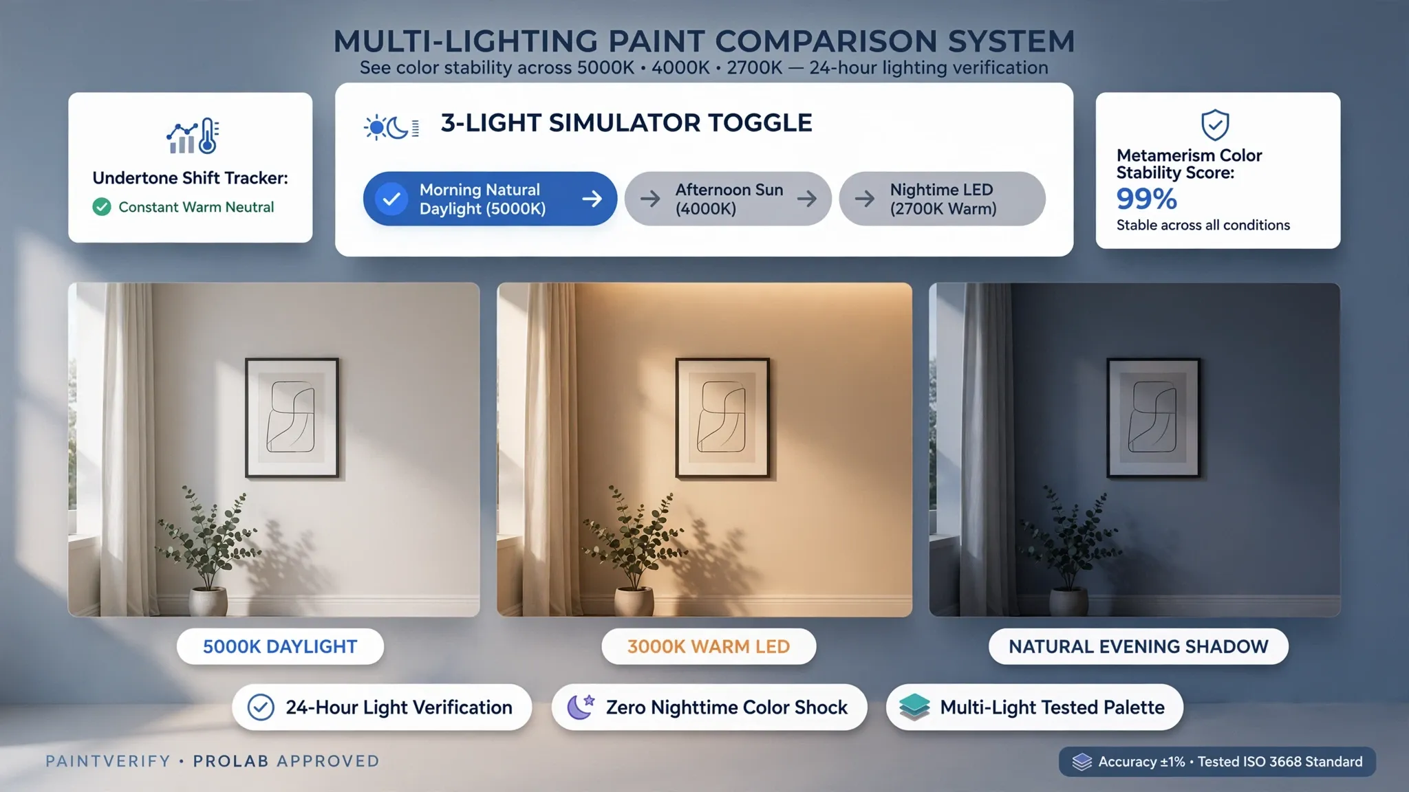
3. Check What Happens When You Turn on Your Usual Lights
Once the sun goes down, your windows stop matters. Your artificial light bulbs take full control of how your walls look.
If your paint sample looks fantastic during the day but completely wrong at night, your light bulbs are likely projecting a strong color cast over the wall.
   Daylight View: [ Soft Neutral Greige ]
                          |
                          v (Sun sets / Lamps turn on)
                          |
   Warm Incandescent (2700K) ===> [ Turns Paint Golden Yellow ]
   Cool White LED (4000K)    ===> [ Turns Paint Slate Blue ]
Pay close attention to how your artificial lighting changes the room's mood:
- Warm White Bulbs (2700K–3000K): Emit a golden glow that amplifies yellow, peach, and brown undertones while turning cool grays slightly green.
- Cool White Bulbs (3500K–4000K): Project a crisp, white light that keeps neutrals true to color but can make warm creams feel a bit sterile.
- Daylight Bulbs (5000K+): Emit a strong blue-tinted light that makes cool blues and grays pop, but can make warm whites feel harsh and clinical.
Check your paint samples under the exact lamps, sconces, and overhead fixtures you use every evening so there are no surprises after dark.
4. Find Out Why One Shade Looks Better on One Wall Than Another
Have you ever painted a room with a single can of paint, only to feel like the window wall and the corner wall belong in two different houses?
You are not imagining things.
The direction your wall faces determines how much direct light it receives and how deep the shadows sit.
[ Window Facing Wall ] =====> Receives Direct Light =====> Looks 1-2 Shades Lighter
[ Corner / Recessed Wall ] ====> Receives Bounced Shadow ==> Looks 1-2 Shades Darker
Move your test boards around the room to see how location changes the shade:
- Direct-Light Walls (Opposite Windows): Direct sunlight beams hit these walls head-on, making paint colors look significantly lighter and brighter.
- Window Walls (Surrounding Windows): Because light streams past these walls rather than onto them, they sit in shadow and make colors look richer and darker.
- Dark Corners & Alcoves: Recessed areas collect heavy shadows that magnify gray, green, or muddy undertones.
If you are painting a room that gets zero direct daylight, check out our guide on choosing paint colors for dark rooms to pull light back into shadowed corners.
5. Compare Undertones Before Choosing Between Similar Neutrals
Neutrals like white, beige, gray, and taupe are famous for hiding secondary pigments that only show up under specific lighting.
That soft gray swatch might contain hidden blue, green, or purple pigments that stay invisible under store lights, but show up clearly on your wall.
   Base Neutral + Hidden Pigment  ===> Light Source ===> Visible Result
   ------------------------------------------------------------------
   Gray         + Hint of Blue    ===> Morning Light ===> Sky Blue Wall
   Beige        + Hint of Red     ===> Evening Sun   ===> Pink/Mallow Wall
   Greige       + Hint of Green   ===> Warm LED Bulb ===> Olive Tint Wall
Use these quick tricks to uncover hidden undertones:
- Place it against pure printer paper: Hold your neutral sample board against a sheet of bright white printer paper. The stark white background forces hidden pink, green, or yellow undertones to stand out immediately.
- Compare similar shades side-by-side: Line up three shades of greige next to each other. Comparing them side-by-side reveals which one leans warm, cool, or neutral.
- Check color wheel relationships: To double-check how lighting and undertones interact across complex spaces, consult lighting and color tools provided by the Paint Quality Institute.
If you want your wall colors to flow naturally from room to room, read our guide on connecting paint palettes across adjoining rooms to avoid undertone clashes along shared doorways.
6. Test Paint Colors Beside Your Flooring, Cabinets, and Furniture
Paint does not exist on an island. Daylight bounces off your flooring, reflects onto your furniture, and casts tinted light directly back onto your walls.
If you test a wall color in an empty room, it will look completely different once you bring your rug, sofa, and curtains back in.
                        [ Window Light ]
                               |
                               v
                      ( Hits Wood Floor )
                               |
                               v
   [ Warm Oak Flooring ] -------------> [ Bounces Golden Light onto Wall ]
Test your color samples against the fixed elements in your room:
- Wood Floors & Trim: Honey oak, cherry, and walnut floors bounce warm orange and yellow light upward onto your lower walls.
- Large Sofas & Accent Chairs: A dark velvet sofa or bright rug casts its own accent color onto adjacent walls.
- Kitchen Cabinets & Countertops: In kitchens, daylight bounces off glossy countertops and cabinet doors, altering how your wall color looks near prep areas.
Before buying paint, hold your sample boards directly against your floorboards, trim, and sofa cushions to make sure the undertones work together smoothly.
7. Compare Colors Fairly Instead of Trusting Your First Impression
Staring at six different paint swatches taped to a wall at the same time is a guaranteed path to choice overload.
When you look at too many colors at once, your eyes get fatigued, and surrounding swatches distort how you perceive each individual shade.
[ Sample A ] [ Sample B ] [ Sample C ] [ Sample D ] ===> Confusion
[ Sample A ] vs [ Sample B ] ===> Winner vs [ Sample C ] ===> Final Pick
To narrow your choices down without driving yourself crazy:
- Cap your choices at three: Never test more than three candidate shades at once on the same wall.
- Use process of elimination: Compare Sample A against Sample B. Keep the winner, throw away the loser, and then compare the winner against Sample C.
- Take photos at different times: Snap photos of your samples on your phone at 9 AM, 1 PM, and 8 PM. Looking at photos later helps you spot light changes objectively.
If you are updating your wall colors as part of a broader budget refresh, explore our guide on decorating and designing a home on a budget to spend your money on high-impact updates.
8. Check Whether Your Bulbs Are Making the Color Look Wrong
Before you discard a paint shade you loved in the store, ask yourself one crucial question:
Is the paint color actually wrong, or is an outdated light bulb ruining it?
Replacing an old incandescent or ultra-yellow LED bulb with a modern bulb is often far cheaper and faster than repainting an entire room.
How to match your light bulbs to your paint choices:
- To fix an overly yellow wall: Swap out 2700K bulbs for 3500K neutral white bulbs to neutralize excess yellow cast.
- To soften a cold, stark wall: Replace 4000K bulbs with 3000K warm white LEDs to add cozy warmth to cool grays and crisp whites.
- Check the Color Rendering Index (CRI): Look for LED bulbs with a CRI rating of 90 or higher. High-CRI bulbs reveal a paint's true color pigments without distorting them. Learn more about lighting standards from the Illuminating Engineering Society (IES).
9. Choose the Shade That Works Best for the Room You Actually Live In
A paint shade does not need to look flawless 24 hours a day. It only needs to look great during the hours you actually use the room.
If you spend all day working in an office, how the room looks at 2:00 PM does not matter nearly as much as how it feels at 8:00 AM and 6:00 PM.
Prioritize your decision based on your daily routine:
- Living Rooms & Den Areas: Focus on how the color looks under warm lamp light in the evening when you are relaxing or watching TV.
- Home Offices & Kitchens: Prioritize how the color handles bright morning and midday sunlight when you need an energized space.
- Bedrooms: Pick a shade that feels calm and cozy under low bedside lighting at night.
10. Use a Simple Scorecard to Make Your Final Paint Choice
If you are torn between your final two paint choices and cannot decide, stop guessing.
Use this simple 3-step evaluation method to pick your winning shade objectively:
  [ Step 1: Score Daylight View (1-5) ]
                    |
  [ Step 2: Score Evening Light View (1-5) ]
                    |
  [ Step 3: Score Match with Flooring/Furniture (1-5) ]
                    |
                    v
         ( Highest Total Score Wins! )
- Rate Daylight Performance (1 to 5): Does the shade feel balanced under midday sun, or is it washed out and glary?
- Rate Evening Performance (1 to 5): Does the shade stay cozy under your lamps, or does it turn muddy and strange?
- Rate Surroundings Match (1 to 5): Does the shade complement your flooring, trim, and major furniture?
Add up the scores for each candidate shade. The paint color with the highest total score is your clear, winner.
Visualize Your Colors and Lighting Instantly
Want to see how different wall colors, finishes, and room layouts work together before picking up a paintbrush?
With DesignHome, you can test complete room designs, wall shades, and layout ideas directly on screen. Explore different color combinations, preview furniture arrangements, and map out your interior design vision with total confidence.
Frequently Asked Questions About Comparing Paint Colors in Different Light
Why does the exact same paint color look completely different in every room of my house?
The wall color on your paintbrush doesn't change, but the daylight hitting it does. Windows facing north receive cool, blue-tinted light that dulls warm paint, while south-facing windows cast a golden glow that makes neutrals look much warmer. On top of that, your flooring, trees outside, and ceiling lights bounce their own tinted light onto the walls. Testing interior paint samples on different walls is the only way to see how your room's unique natural lighting will react with the paint's hidden undertones.
What is Light Reflectance Value (LRV), and why should I care when comparing paint colors?
Light Reflectance Value (LRV) measures the exact percentage of light a paint color reflects back into a room. The scale runs from 0 (absolute pitch black) to 100 (pure reflective white). If you are picking paint colors for bright rooms, choosing a shade with an LRV over 85 will likely cause intense, blinding glare. For sun-filled spaces, targeting an LRV between 55 and 75 keeps your walls feeling bright and airy without overwhelming your eyes.
How big should a paint sample board be to get an accurate color test?
Tiny two-inch paper swatches simply don't give your eyes enough surface area to judge a color accurately. Instead, paint a 12x12-inch sample board using two full coats of paint, leaving a clean white border around the edge. That white border stops your existing wall color from tricking your eyes into seeing false undertones. Moving this large sample board across different walls lets you quickly see how the shade performs in deep shadows versus direct sunlight.
Why does my beige paint look pink, yellow, or green once it dries on the wall?
Neutrals like beige, gray, and ivory are made by mixing secondary colors like red, green, blue, or yellow into a white base. These hidden undertones stay invisible under bright store lights, but direct sun or warm lamps drag them out immediately. To catch tricky undertones early, hold your neutral paint sample flat against a piece of pure white printer paper. The stark white background exposes secondary pigments instantly so you don't end up with an unexpected pink living room.
Will LED light bulbs change how my wall paint looks at night?
Yes, light bulbs play a massive role in how paint pigments look after dark. Standard warm LED bulbs (2700K) cast a heavy golden light that turns cool grays slightly greenish and makes warm creams look bright yellow. Crisp white LED bulbs (3500K to 4000K) keep neutrals true to their natural tone without adding unwanted warmth. If a paint color feels wrong after dark, swapping out your light bulbs is often a much cheaper fix than buying new cans of paint.
Should I test paint colors on rainy or overcast days?
You should test your samples on both sunny and overcast days whenever possible. Cloudy weather projects a soft, diffused light that reveals how your paint shade will look on gloomy winter afternoons. If you only test paint samples during a blazing sunny morning, you might pick a shade that feels dark and depressing when the weather turns grey. Seeing how your top choices hold up under bad weather ensures you like the room every day of the year.
How do I stop direct sunlight from washing out my favorite wall color?
Direct midday sunlight carries intense raw light that eats right through pale paint pigments, making rich colors look flat and washed out. If your room gets hit with heavy sun, pick a paint shade that is one or two steps darker on the paint chip than you think you need. Dropping down to a slightly deeper shade gives the wall enough pigment depth to absorb raw sunlight while maintaining its richness throughout the day.
Which paint finish is best for handling harsh natural glare near large windows?
A matte or eggshell paint finish is ideal for bright, sun-drenched rooms. Flat and matte finishes absorb light rather than reflecting it back into your eyes, completely eliminating daylight glare while hiding drywall bumps. High-gloss and semi-gloss finishes act like mirrors under direct sun, highlighting every wall flaw and creating uncomfortable glare. Reserve shiny finishes for trim, doors, and window frames where subtle highlights look intentional.
Why does my paint color look great in the morning but muddy by 5:00 PM?
Morning light carries a crisp, blue-tinted tone that highlights cool undertones and keeps colors looking fresh. As the sun sets, late afternoon light shifts into deep, warm orange and creates long, heavy shadows across your room. Those late shadows mix with golden light, making light neutrals appear darker and muddier. Checking your wall paint samples at 9:00 AM, 1:00 PM, and 6:00 PM helps you pick a balanced shade that handles that daily shift smoothly.
How can I quickly narrow down dozens of paint swatches without getting overwhelmed?
Staring at ten different paint swatches taped to a wall causes immediate eye fatigue and choice overload. Cut your options down to just three top candidates before painting sample boards. Compare Sample A against Sample B side-by-side, discard the loser, and then test the winner against Sample C. This simple process of elimination keeps your eyes fresh and makes locking in your final choice fast, clear, and effortless.


