

Few design details impact a room as dramatically—or cause as much frustration—as getting your wall paint and trim color to agree. You can pick a stunning wall shade, but if the trim color clashes, the entire room suddenly feels awkward, unpolished, or unfinished.
Getting trim and wall color combinations right doesn't have to mean endless trips to the store for paint samples or taping up dozens of paper swatches on baseboards.
If you are ready to create a sleek, cohesive look throughout your home, this comprehensive guide explores every combination—from crisp contrast to seamless monochromatic palettes.
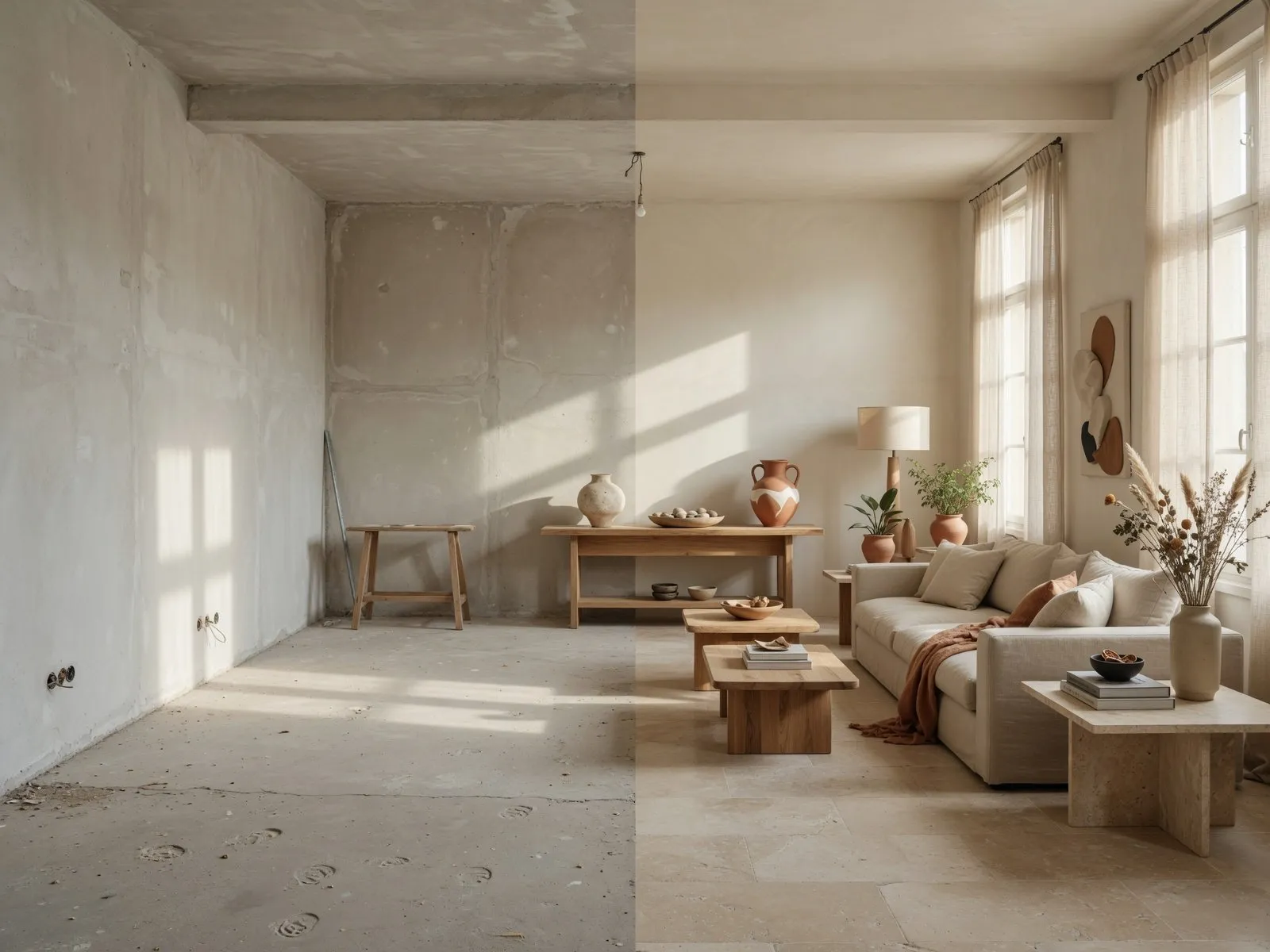
Trim and Wall Color Combinations That Work Together
Take a close look at your baseboards, door casings, and crown molding right now. Do they frame your walls with purpose, or do they look like an afterthought?
When a space feels visually off, the culprit is rarely the wall color alone—it is almost always an accidental disconnect between the walls and the surrounding woodwork. Trim acts as the architectural outline of your home. When chosen carefully, it defines room transitions, highlights window frames, and grounds your color scheme.
Here's the secret: wall and trim color combinations work best when they follow a clear visual relationship—either deliberate contrast or deliberate continuity.
When you explore curated trim color ideas and understand how to pair your wall color with trim, you achieve three immediate design benefits:
- Defined Architecture: Proper trim framing accentuates door arches, window casings, and high ceilings.
- Balanced Undertones: Matching the base pigments in your trim paint with your wall paint prevents accidental undertone clashes.
- Polished Finish: A thoughtful pairing transforms plain drywall into an architecturally custom environment.
To start evaluating your options, explore whether you should keep things uniform in Should Trim Be the Same Color as the Walls?.
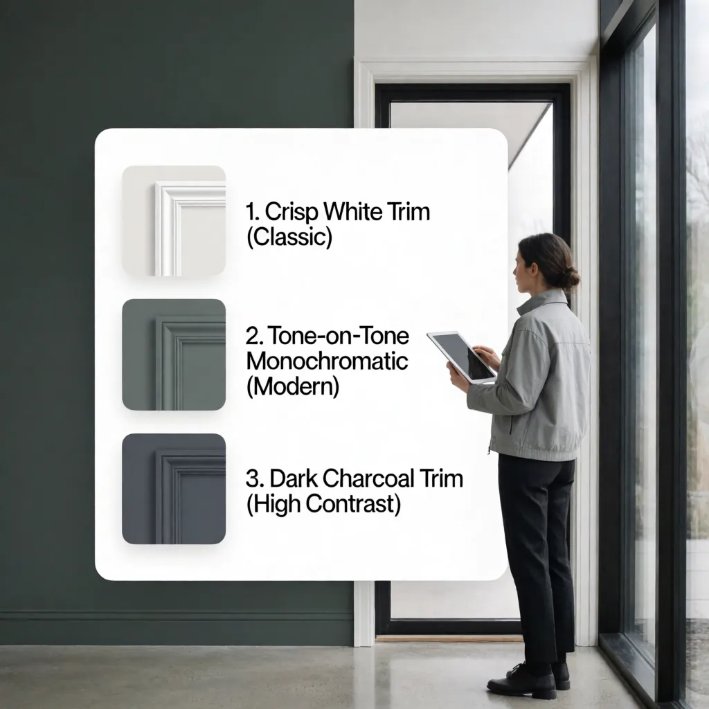
Should Trim Be the Same Color as the Walls?
For decades, standard builder practice dictated painting every inch of trim in semi-gloss bright white, regardless of wall color. But modern design has moved far beyond that rule.
So, should trim be the same color as the walls? The short answer is yes—when you want a clean, expansive, and contemporary aesthetic.
Design Tip: When opting for matching trim and walls, vary the paint sheen rather than the pigment. Use a flat or eggshell finish on the drywall and a satin or semi-gloss finish on the trim to create subtle texture and durability.
Choosing same color walls and trim creates a streamlined backdrop. Using monochromatic trim simplifies room geometry, hides irregular architectural lines, and allows your furniture and art to take center stage.
If you prefer a classic, high-definition look instead, jump to our breakdown of White Trim With Colored Walls.

White Trim With Colored Walls
If you love crisp architectural definition, pairing white trim with colored walls remains a timeless choice.
However, "white" is never just white. Selecting the wrong white trim paint can make warm walls look dirty or cool walls feel clinical.
Here's how to navigate white trim wall color combinations:
- Warm Wall Colors: Pair warm beige, terracotta, or sage walls with warm off-whites containing subtle cream undertones.
- Cool Wall Colors: Pair icy gray, blue, or violet walls with crisp, pure white trim paint to maintain a clean edge.
- Evaluating Wall Colors With White Trim: Ensure the white trim isn't so bright that it glows like neon under evening artificial light.
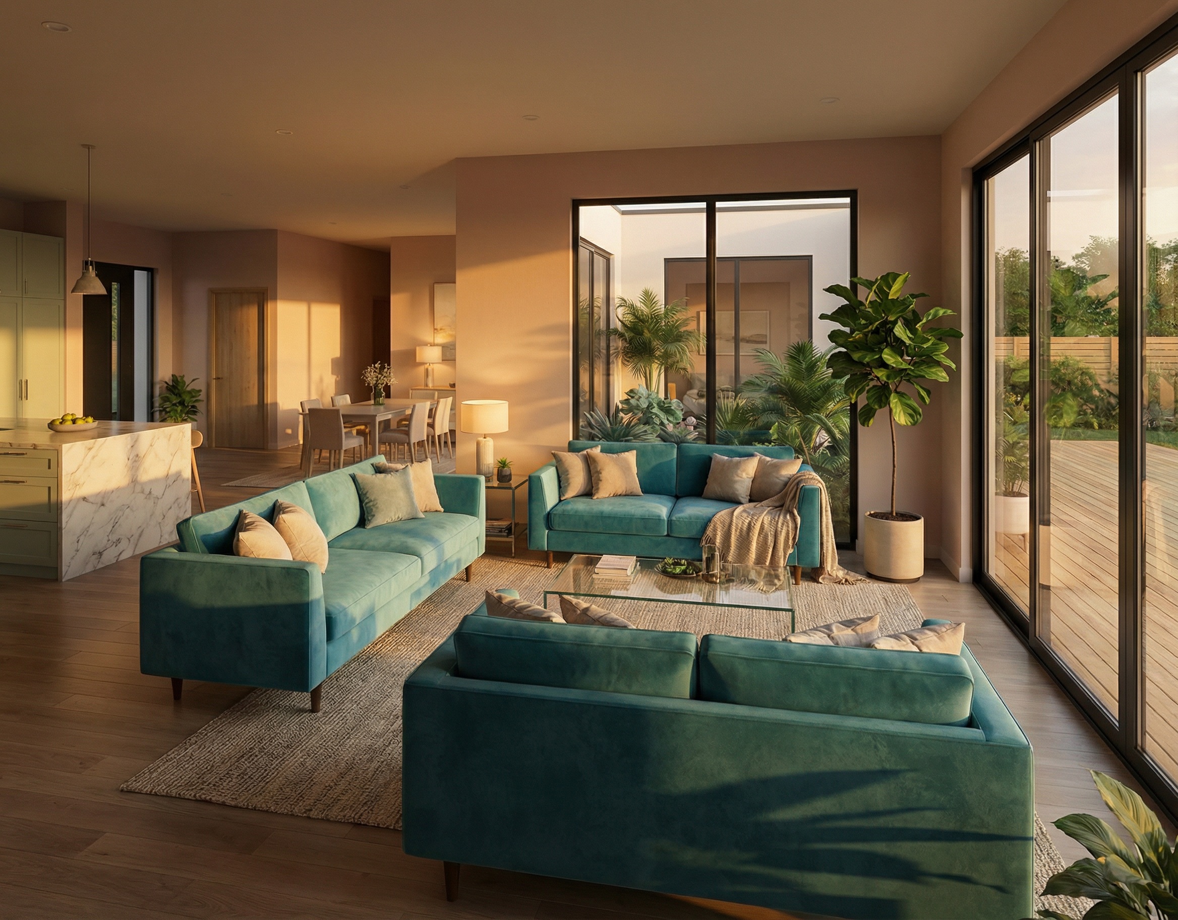
Matching Trim and Wall Colors for a Monochromatic Look
If you want your room to feel quiet, cocooning, and deeply restful, embrace monochromatic wall and trim colors.
By removing the hard contrast between the walls and baseboards, you eliminate harsh horizontal lines that break up your vertical space.
Here is how to execute tone-on-tone wall and trim schemes effectively:
- Enveloping Cozy Spaces: Using same color walls and trim in deep colors like navy, forest green, or charcoal turns small bedrooms or home offices into intimate sanctuaries.
- Expanding Open Layouts: Light neutral monochromatic room colors (such as warm cream on cream) make open floor plans feel expansive and uncluttered.
- Soft Contrast Variations: If you don't want an exact match, choose a trim shade that is just one step lighter or darker on the same paint color card.
For those who want to make a bolder architectural statement, consider Dark Trim With Light Walls.
Dark Trim With Light Walls
Flipping the traditional color dynamic by painting dark trim with light walls adds immediate personality, sophistication, and vintage character to a room.
Dark trim outlines the room's geometry, turning ordinary doors and windows into striking visual focal points.
Try these dark trim color ideas:
- Black Trim With White Walls: Creates a high-impact, graphic frame that pairs beautifully with modern minimalist decor.
- Rich Dark Wood Trim: Honoring original stained wood baseboards alongside light, warm plaster walls preserves historic warmth.
- Contrasting Trim Accent: Painting window casings in deep charcoal draws the view outdoors, acting as a natural frame for outdoor scenery.
Light Trim With Dark Walls
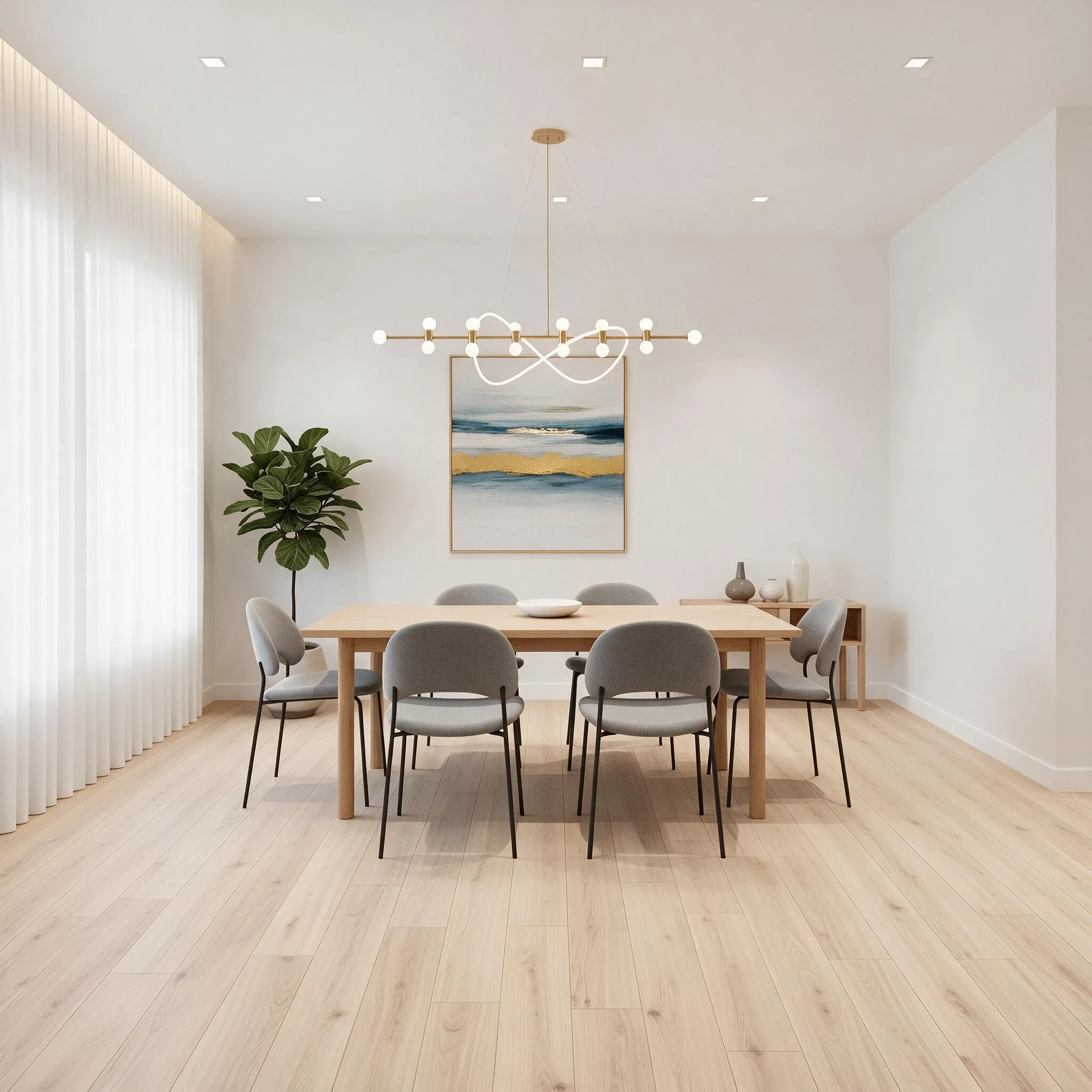
Do you love moody, dramatic wall colors like hunter green, dark navy, or charcoal, but worry the space will feel too enclosed?
Using light trim with dark walls anchors dark hues, keeping the space structured and bright around architectural boundaries.
Here's how to balance dark paint with white trim:
- White Trim With Dark Walls: A crisp white baseboard provides a clean line between dark walls and hardwood or carpeted floors.
- Softening the Edge: If bright white feels too harsh against deep dark wall light trim setups, opt for a soft warm stone or warm putty shade for the trim.
- Door Casing Balance: Keep door casings in the same light trim shade to ensure smooth transitions between dark rooms and lighter adjacent hallways.
Best Trim Colors for Beige, Gray, and Neutral Walls
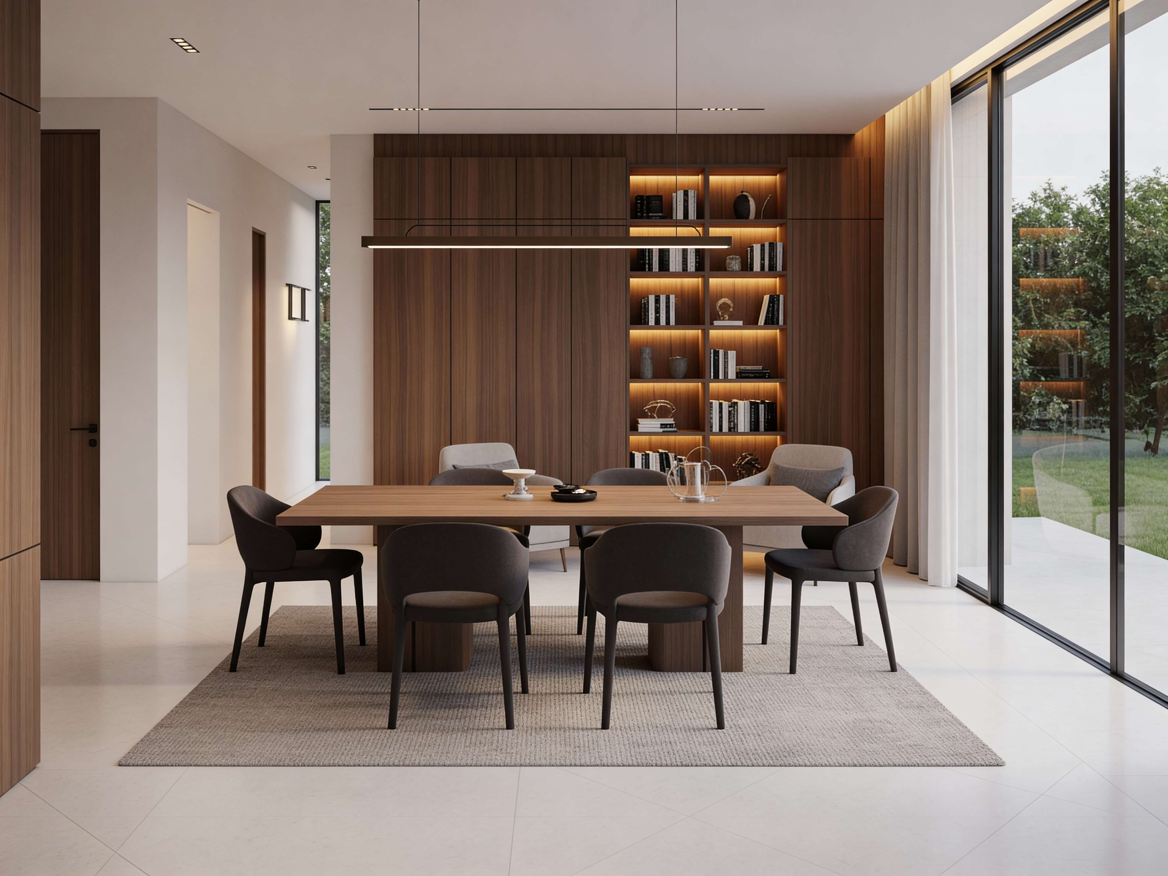
Neutral walls are among the most popular choices for living rooms and hallways, but picking the wrong trim shade can make neutral paint look washed out or dull.
To simplify your search, use this cheat sheet for trim colors for neutral walls:
- Trim Color With Beige Walls: Avoid icy blue-whites. Choose a soft warm white or rich ivory to maintain cozy warmth.
- Trim Color With Gray Walls: Identify the gray's base tone. Cool grays thrive with pure white trim, while warm taupe-grays pair best with soft alabaster.
- Neutral Wall Trim Combinations: Try painting trim a warm greige shade while keeping the walls a soft off-white for an inverted neutral palette.
To understand how these choices impact perceived room proportions, jump to How Trim Color Changes the Look of a Room.
How Trim Color Changes the Look of a Room
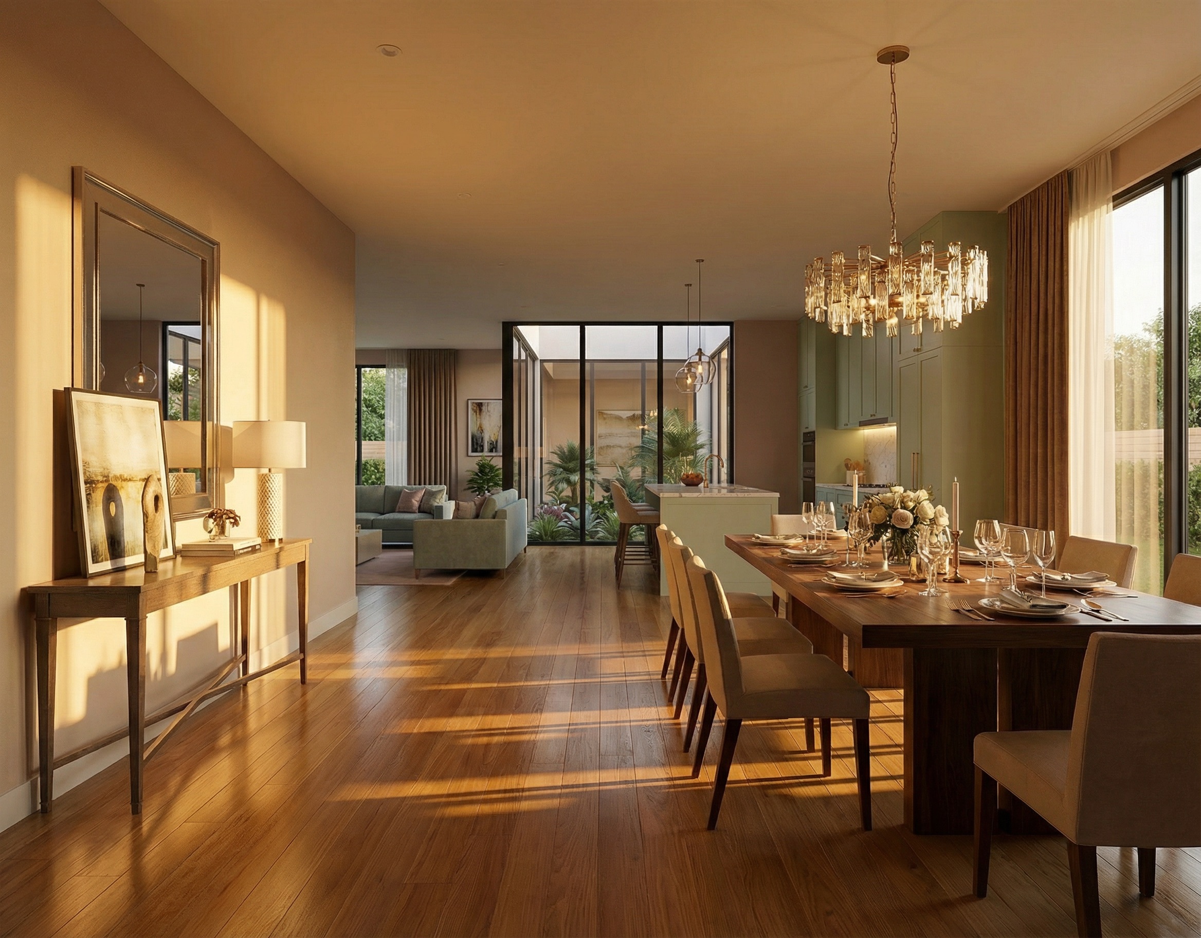
Trim color isn't just a decorative choice—it is a visual tool that alters how you perceive a room's size, ceiling height, and scale.
Understanding the overall trim color effect empowers you to solve common architectural layout challenges without structural renovations.
- Exploring Painted Trim Ideas: Painting crown molding the same shade as the ceiling makes low ceilings feel significantly taller.
- Analyzing Trim Color Room Effect: High-contrast baseboards cut the room horizontally, which grounds tall, cavernous spaces.
- Using Interior Trim Colors to Highlight Features: Darker trim around window frames draws the eye directly toward outdoor light sources.
How to Match Trim With Doors, Windows, and Baseboards
A common point of confusion during home updates is deciding whether baseboards, interior doors, window frames, and crown molding all need to match.
The short answer: consistency builds harmony, but strategic variation adds depth.
Follow these rules to match trim color with doors and windows:
- Door and Trim Color Combinations: Painting interior doors the same shade as surrounding trim creates a seamless look across hallways.
- Window Trim Colors: Keeping window frames aligned with baseboard colors maintains clean visual transitions across walls.
- Baseboard Color Ideas: If you choose contrasting baseboards, carry that exact shade across all door frames to keep your matching interior trim cohesive.
Trim and Wall Colors for Small and Large Rooms
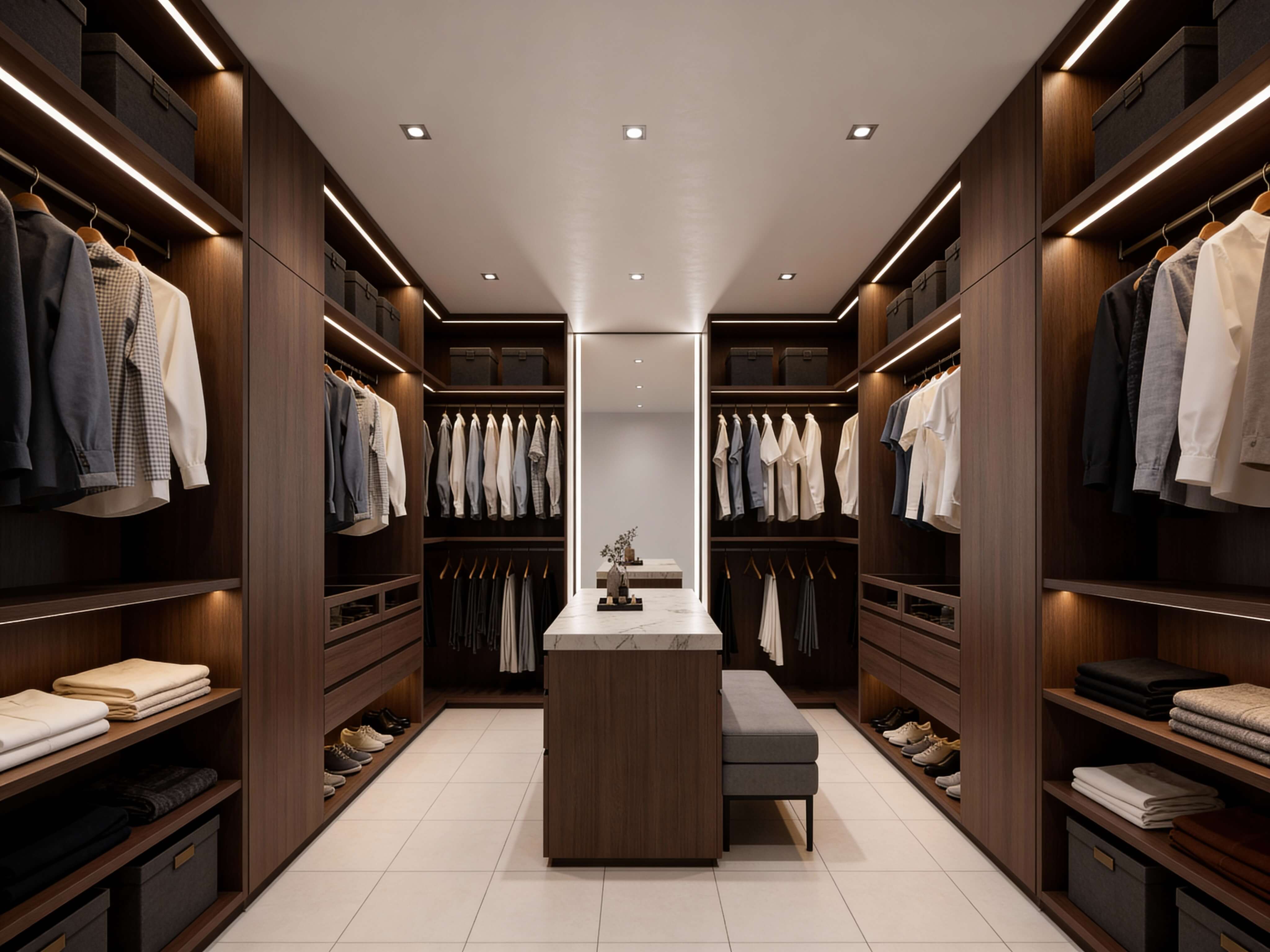
Room dimensions dictate how bold you can be with visual contrast.
Using the right palette balance adjusts the scale of both small and expansive spaces.
• Eliminates harsh horizontal lines that shrink wall height.
• Adds warmth and definition to prevent a cold, empty feel.
- Trim Color for Small Rooms: Use soft, low-contrast combinations or identical wall and trim colors to make tight bedrooms or powder rooms feel open and airy.
- Trim Colors for Large Rooms: Introduce contrasting dark trim or rich warm baseboards to frame wide walls and add cozy structure.
- Selecting Small Room Wall and Trim Colors: Stick with light warm neutrals on both surfaces to bounce ambient light effectively.
Before committing to cans of paint, explore how to test your choices in Test Wall and Trim Colors Before Painting.
Test Wall and Trim Colors Before Painting
Here is the biggest challenge when choosing paint: trying to guess how a wall shade and trim color will look side-by-side in real room lighting.
Traditionally, testing meant buying multiple sample cans, painting messy strips on baseboards and drywall, and guessing how artificial lighting would affect the undertones at night.
Manual photo editing software isn't much better—it takes hours of tedious masking, distorts light reflections, and leaves you second-guessing your choices.
You don't have to deal with messy paint testing or complicated software anymore.
• Paint test patches on baseboards
• Spend hours on manual editing
• High risk of undertone clashes
• Hit "Generate" for instant render
• Renders realistic lighting
• Zero mess, instant comparisons
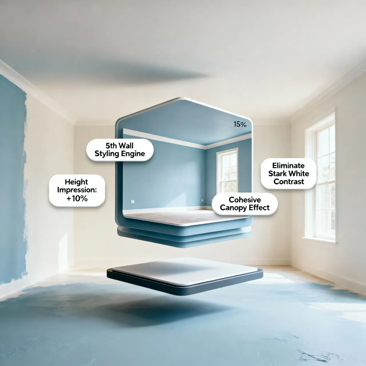
Instead of relying on generic tools that produce flat, unrealistic images, DesignHome Synthesis™ handles the details for you. Our spatial layout technology evaluates your uploaded room photo—analyzing actual baseboards, crown molding, door casings, window frames, and ambient lighting.
Simply upload an image of your room and hit generate.
In seconds, DesignHome Synthesis™ applies realistic wall and trim color combinations directly to your room's architecture. You can test crisp white trim, moody dark borders, or seamless monochromatic palettes instantly, giving you complete confidence before buying a single gallon of paint.
Create a Wall and Trim Palette That Fits the Room
Aligning your walls, trim, doors, and baseboards transforms your living space into a beautifully finished home.
Use this final checklist to confirm your choices:
By curating your wall and trim color palette with intent, you build a cohesive environment that brings out the best in your interior architecture.
Take the frustration out of paint selection, protect your budget, and enjoy a perfectly finished home you'll love every day.
FAQs About Architectural Woodwork and Wall Color Pairings
Should baseboards, window casings, and door frames always match?
While matching every piece of trim across a room creates classic consistency, it is not an absolute rule. Baseboards and door casings should generally share the same paint color to maintain clean visual lines along the floor. However, window trim or interior doors can be painted in a contrasting accent color—such as deep charcoal, olive green, or navy—to frame outdoor views and add custom architectural interest
Will painting trim the same color as the walls make my room feel larger?
Yes. Painting baseboards, crown molding, and walls in the exact same color eliminates the hard horizontal lines that cut a room into sections. Without harsh contrast boundaries, your eyes glide uninterrupted from floor to ceiling, making small bedrooms, narrow hallways, or low-ceilinged spaces feel significantly taller and more spacious.
What is color drenching, and how does it apply to trim and walls?
Color drenching is a modern interior technique where you paint every surface in a room—walls, baseboards, door casings, doors, windows, and even the ceiling—in a single color family. Instead of relying on paint color contrast, you create depth by varying the sheens (e.g., flat or eggshell on walls, satin or semi-gloss on trim and doors).
Should I use white trim with dark walls or choose a colored trim?
Both approaches offer distinct benefits depending on your desired mood:
- Crisp White Trim: Creates sharp architectural boundaries, bounces light around dark walls, and provides high-definition contrast.
- Muted / Colored Trim: Choosing a warm stone, gray-beige, or dark complementary trim shade softens the transition between dark walls and woodwork, creating a cozy, moody atmosphere.
How do I stop my white trim from looking yellow next to cold wall paint?
White trim looks yellow when its underlying warm pigments clash with cool wall paint. If your walls are cool gray, icy blue, or crisp white, choose a pure white trim formula free of yellow or cream additives. If you use oil-based paint on trim, it will naturally yellow over time—switch to a high-quality water-based acrylic enamel to retain bright white tones.
Should interior doors be painted the same color as the surrounding trim?
Painting interior doors the same shade as surrounding casings and baseboards creates a seamless, traditional look throughout hallways. However, painting doors a dark accent shade—such as black, deep espresso, or dark green—while keeping baseboards light turns ordinary interior doors into stylish design features.
How do I choose wall paint that matches natural dark wood trim?
When working with original oak, walnut, or mahogany woodwork, avoid cold gray paints that fight the wood's natural warmth. Instead, select earth-inspired wall colors like creamy off-white, warm greige, soft sage green, or dusty blue. These shades complement the organic grain without making the room feel dark.


