

Painting the outside of your home is a major investment. A single mistake doesn't just waste thousands of dollars—it forces you to pull up to a house you dislike every single day.
Here is the frustrating truth: a tiny 2-inch paper swatch from the store tells you almost nothing about how a shade behaves across an entire double-story exterior. What looks like a soft, sophisticated gray on a paper card can instantly turn into a harsh, glaring purple under direct afternoon sunlight.
Before you buy a single gallon of paint or hire a contractor, you need to see exactly how your choices look on your actual walls, trim, and roof.
+-----------------------------------------------------------------------+
|  STORE SWATCHES    --> High risk, static light, covers 2 inches        |
|  REAL VISUALIZATION --> Zero risk, accurate light, covers entire home |
+-----------------------------------------------------------------------+
Using a modern house paint color visualizer lets you test real shades on your property first. By uploading a photo of your home, you eliminate the terrifying guesswork, protect your wallet, and build a exterior palette you love.
See How Different Paint Colors Change the Look of Your House
The right paint does far more than cover raw siding—it completely alters how your property feels from the street.
A dark slate tone can turn a standard suburban home into a sleek, grounded modern sanctuary. A warm off-white can brighten a shaded lot and instantly double your home's curb appeal.
├── Crisp Off-White  --> Reflects natural light, expands perceived size
├── Charcoal Slate   --> Adds modern weight, grounds elevated architecture
├── Muted Sage       --> Blends home effortlessly with surrounding trees
└── Warm Beige       --> Softens hard masonry and brick accents
Instead of wondering if a dramatic color shift will pay off, test it first. Exploring house color ideas through an online preview tool shows you the transformation side by side before you commit to a single drop of paint.
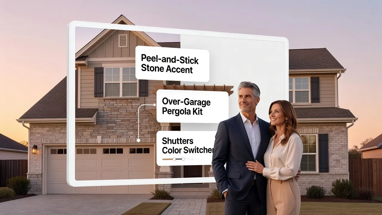
Start With Your Actual House, Not a Paint Color Chart
Most people start their project the wrong way: they scroll through Pinterest, fall in love with a photo of a coastal mansion, and try to slap those same shades onto their suburban split-level.
Then reality strikes. The color looks completely wrong.
Why? Because your house has unique roof lines, fixed stone textures, surrounding trees, and specific sun exposures. A shade that shines on a coastal cottage can look flat and dull on a shaded lot.
+-----------------------------------------------------------------------+
|  PINTEREST PHOTO: Ideal lighting, different roof, open coastal sun     |
|  YOUR REAL HOME:  Fixed roof shingles, brick base, shaded driveway   |
+-----------------------------------------------------------------------+
|  SOLUTION: Upload your actual photo to a paint color visualizer tool  |
+-----------------------------------------------------------------------+
When you visualize exterior house colors directly on a photo of your own property, you stop chasing unrealistic inspiration photos. You see how shades interact with your real siding, your actual roof, and your specific driveway.
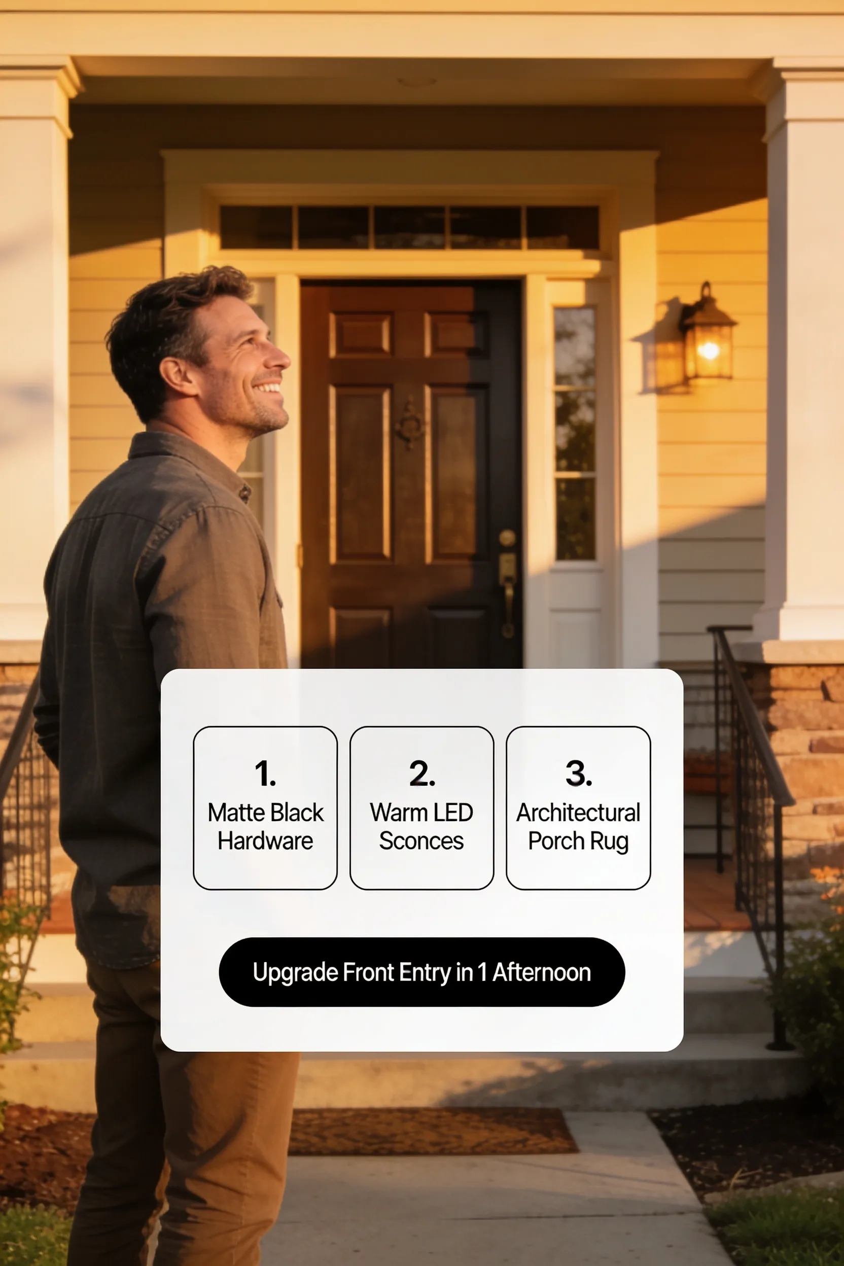
Compare Light, Dark, Warm, and Cool Exterior Colors Side by Side
When you open a paint catalog, staring at 1,000 distinct shades creates instant decision paralysis. Trying to choose between "Alabaster White" and "Cotton Wool" on page one will leave you exhausted before you even look at dark tones.
To save your sanity, step back and test broad color families first:
- Light Shades: Crisp whites, soft creams, and light ash tones that reflect sunlight and expand your home's presence.
- Dark Tones: Charcoal, deep navy, and graphite shades that add dramatic depth and modern elegance.
- Warm Palettes: Taupe, warm beige, and terracotta tones that pair naturally with brown roof shingles and warm brick.
- Cool Directions: Slate gray, dusty blue, and sage green shades that complement gray stone and dark metal roofs.
               [ START WITH 4 BROAD FAMILIES ]
                 /         |         |         \
           [ LIGHT ]    [ DARK ]   [ WARM ]   [ COOL ]
               |           |          |          |
   Test these broad directions on your home photo FIRST,
   then pick specific shades inside your winning family.
Sorting through exterior house color ideas in these four clear buckets narrows down your options in minutes instead of days.
Test More Than One House Color Before You Decide
Never settle on the first shade that looks "okay."
When you commit to a color too early, you miss out on combinations that could make your property look twice as valuable. What if that safe beige you picked looks dull, while a rich muted green would have transformed your front elevation?
+-----------------------------------------------------------------------+
|  OPTION A: Safe Standard Beige   --> Looks clean, but blends into block|
|  OPTION B: Deep Navy + White Trim--> High contrast, premium curb look  |
|  OPTION C: Soft Olive + Wood Door--> Warm, custom artisan feel        |
+-----------------------------------------------------------------------+
When you test house paint colors digitally, you can save five or six complete variations side by side. Showing these options to your family or contractor makes picking the winner simple and stress-free.
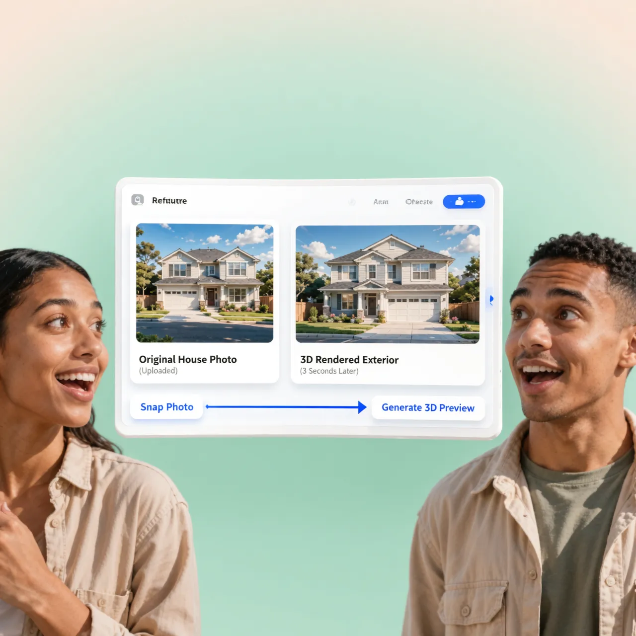
See What Happens When You Change the Main Exterior Color
Your main wall color takes up roughly 70% of your home's exterior surface area. It sets the tone for everything else.
If your base shade is wrong, no accent door or trim color can save the look.
├── Main Exterior Walls (70%) --> Dominates visual impression
├── Trim & Fascia (20%)       --> Frames the architecture
└── Front Door & Accents (10%)--> Directs the eye to the entrance
When testing main exterior house color options, focus entirely on how the primary siding shade sits against your permanent structures—like your driveway, chimney, and roofline. Once your base wall tone feels grounded, picking secondary accents becomes easy.
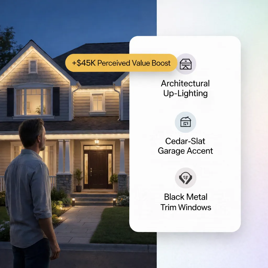
Visualize Trim, Doors, Shutters, and Accents With the Main Color
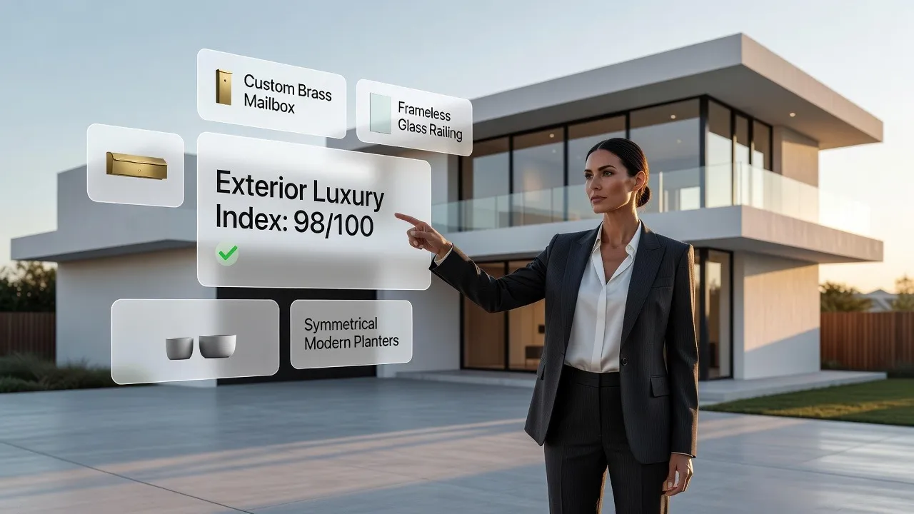
A main wall color only tells half the story. The real magic happens when your trim, front door, and accent shutters lock into place around it.
A dark charcoal siding choice can look heavy on its own—until you pair it with crisp white window trim and a natural stained wood front door that pulls the whole design together.
+-----------------------------------------------------------------------+
|  MAIN WALLS : Muted Slate Gray                                        |
|  TRIM & FASCIA : Pure Swiss Coffee White (Sharp border definition)   |
|  FRONT DOOR : Warm Honey Stained Wood (Inviting focal point)          |
|  SHUTTERS : Deep Iron Ore (Visual weight at window openings)          |
+-----------------------------------------------------------------------+
Testing exterior trim color ideas and front door accents together ensures every element supports the main shade rather than fighting it for attention.
Check Your Paint Colors in Sunlight, Shade, and Different Times of Day
Here is a costly trap that catches thousands of homeowners every year:
A color swatch that looks rich and warm under indoor store lights can look completely washed out under direct midday sun, or dark and muddy in evening shade.
Direct natural sunlight burns away color intensity. A soft gray can look plain white at noon, while a dark navy can turn completely black as the sun sets.
+-----------------------------------------------------------------------+
|  DIRECT MIDDAY SUN  --> Washes out color intensity by up to 30%       |
|  NORTHERN SHADE     --> Pulls out cool gray and blue undertones      |
|  EVENING SUNSET     --> Floods surfaces with intense warm yellow/red  |
+-----------------------------------------------------------------------+
Always check your choices against changing outdoor light conditions. Evaluating exterior paint colors in sunlight and shade protects you from surprises after the crew finishes spraying.
Find Exterior Colors That Work With Your Roof, Stone, Brick, and Landscaping
You can repaint your siding in a weekend, but replacing a roof, tearing out stone veneer, or breaking down red brick costs a small fortune.
Your permanent structural materials must dictate your paint palette—not the other way around.
├── Red or Orange Brick  --> Pair with sage green, warm cream, or deep navy
├── Brown Roof Shingles  --> Pair with warm beige, olive, or soft terracotta
├── Gray Slate Shingles  --> Pair with crisp white, cool gray, or charcoal
└── Honey Fieldstone     --> Pair with warm off-white, taupe, or soft brown
When selecting house paint colors with brick or unpainted stone, choose body shades that pull out subtle accent tones from the masonry. This creates a cohesive, custom look that feels built into the landscape.
Make a Small House Look Bigger With the Right Exterior Colors
If your home has a compact footprint or a low roofline, the wrong paint shade can make it look boxy and cramped. Dark siding paired with heavy, high-contrast trim draws dark lines around every wall, highlighting tight dimensions.
To make a compact home feel spacious and substantial:
- Use Light, Reflective Shades: Soft off-white, light greige, and pale ash reflect natural light, expanding visual boundaries.
- Paint Trim to Match Siding: Keeping window trim and fascia within one or two shades of your wall color removes harsh border breaks.
- Highlight the Front Door: Paint your entry door a bold, warm tone to draw eyes directly to the entrance, creating a clear focal path.
Using these smart exterior colors for small houses turns tight architectural footprints into open, welcoming street elevations.

Use a House Color Visualizer to Test the Final Combinations
At this stage, you have narrowed down your color families, checked your roof alignment, and accounted for daylight shifts. Now it's time to bring everything together in one realistic preview.
Guessing with physical paint pots on a 1-foot patch of wall is slow, messy, and incomplete.
Uploading a clear photo of your property into an online exterior paint visualizer gives you a complete, high-resolution preview of your entire exterior transformation in seconds.
[ Upload Home Photo ] ──> [ Select Main Wall Tone ] ──> [ Apply Trim & Door Shades ]
                                                               |
                                                               v
                                                    [ Save 3 Final Variations ]
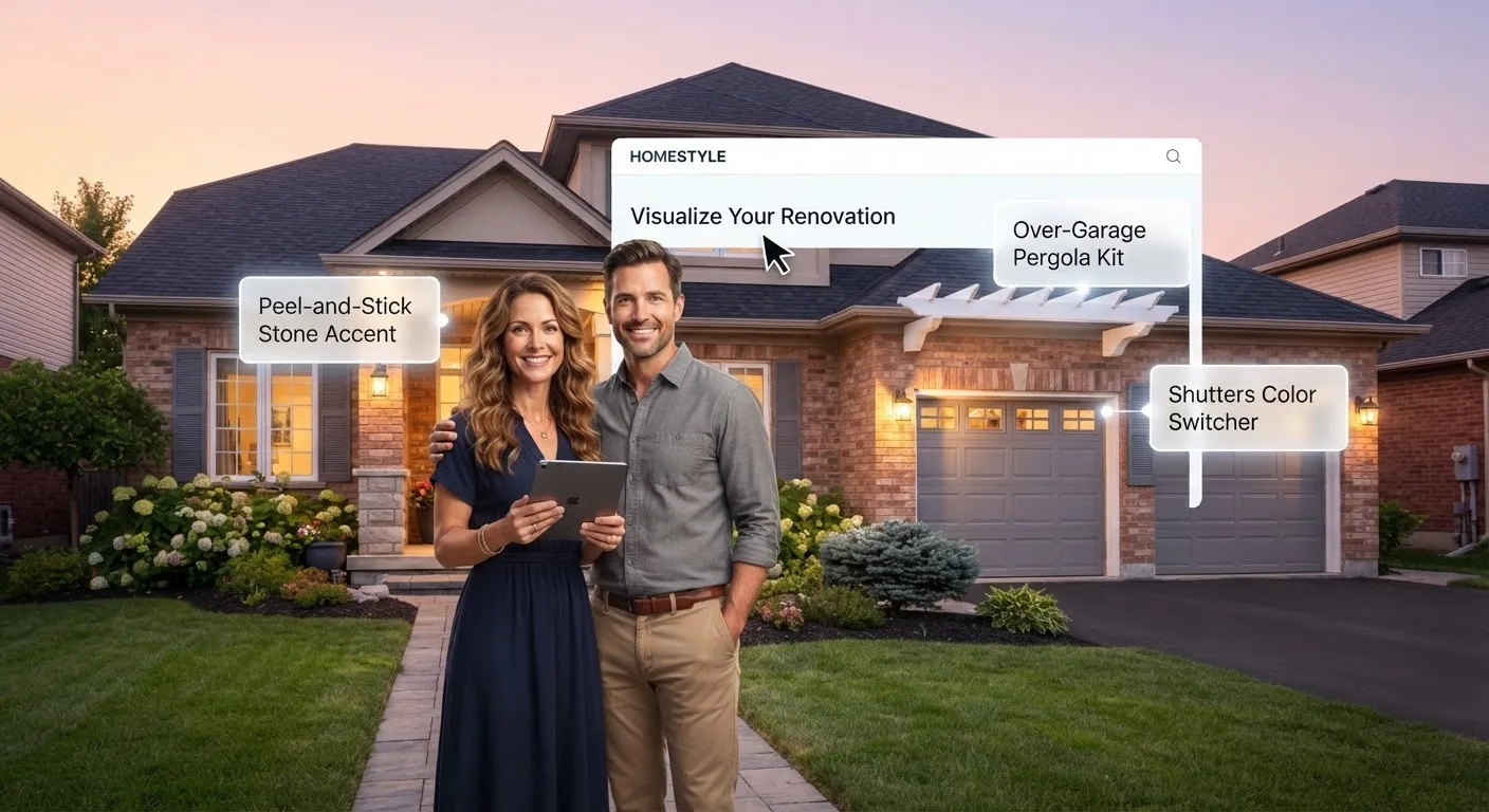
Tools like the interactive visualizer on DesignHome allow you to swap siding colors, test accent doors, and evaluate complete palettes on your actual house without touching a single paintbrush.
Choose the House Paint Colors That Look Right on Your Home
Once you see your top combinations digitally mapped onto your real walls, the right decision becomes obvious.
You no longer have to worry about pulling up to a color mistake, arguing over small swatches, or wasting money on gallons of paint you end up hating. You can hand your exact color codes to your contractor with complete confidence.
Take the guesswork out of your exterior remodel today. Upload your photo to DesignHome, test your favorite color combinations side by side, and lock in a stunning exterior look you will love coming home to every single day.
Questions Homeowners Ask When Visualizing House Paint Colors
1. How do I visualize house paint colors on my actual home before buying paint?
Taping a tiny two-inch paper swatch to your front porch gives you zero idea of how a shade will cover a full two-story exterior. The fastest way to see the real result is by uploading a high-resolution photograph of your home into a digital house paint color visualizer. An interactive tool like DesignHome lets you map your exact walls, window frames, and rooflines so you can visualize house paint colors on your actual property before spending a dime on raw materials or contractor deposits.
2. Why do exterior paint colors look completely different in direct sunlight versus shade?
Direct sunlight burns away color intensity by up to thirty percent, making deep shades look washed out and soft neutrals look stark white. In dark shade, that same paint absorbs surrounding shadows, bringing out hidden green, gray, or violet undertones you never noticed inside the store. Testing exterior paint colors in sunlight alongside shaded porch areas helps you verify that your shade remains grounded and attractive throughout changing daylight hours.
3. How do I choose exterior paint colors that work with unpainted red brick or stone?
Permanent architectural elements like red brick, honey fieldstone, or dark roof shingles dictate your palette because tearing them out costs a fortune. Instead of fighting your masonry, look closely at the secondary flecks of tan, charcoal, or cream inside the brick. Selecting house paint colors with brick or picking paint colors with stone that mirror those secondary accents ties your siding directly into your structural foundation.
4. What is the best way to test house paint colors without painting messy sample patches everywhere?
Painting four different two-foot squares on your front wall creates a patchy, distracting eye sore that still fails to show how the shade interacts with your roof and gutters. Using a digital exterior paint visualizer lets you test house paint colors on complete walls virtually. You can save five or six complete color versions side-by-side on screen, making it effortless to compare house colors without buying endless sample cans or scrubbing wet paint off your siding.
5. Which paint colors make a small house look larger from the street?
Dark siding combined with heavy, bright white border trim draws dark outlines around every wall, accentuating small dimensions and making a home feel boxy. To make a compact property look spacious, pick light off-white, soft ash, or pale greige body tones that reflect natural sunlight. Keeping your trim shade within one or two tones of your wall color removes hard visual breaks, expanding your home's horizon and highlighting the best exterior colors for small houses.
6. How do I pick the right main exterior house color without overwhelming the neighborhood?
Your main siding takes up roughly seventy percent of your home's visual surface, meaning it establishes the base for everything else. Choosing a main exterior house color works best when you start with muted, unsaturated tones rather than bright primary shades. A muted olive, charcoal slate, or warm beige sits comfortably against landscaping and neighboring driveways, giving you a strong foundation before you add bold personality to your front door.
7. How do I match trim, front door, and shutter colors with my main wall color?
A main siding color only delivers half the story; the rest comes from how your architectural accents frame the structure. Crisp white or deep iron ore trim defines window edges, while a rich stained wood or bold navy front door creates a direct focal point that draws eyes to your entrance. Testing exterior trim color ideas together with your body shade ensures every element builds a unified look instead of competing for attention.
8. Is a 3D house color visualizer better than holding up store paper swatches outdoors?
Store paper cards are printed with flat ink on paper, which behaves nothing like acrylic paint applied over rough cedar siding or textured stucco. A modern house color visualizer maps material textures, natural light angles, and roof shadows onto your photograph. When you visualize exterior house colors digitally, you see true visual depth across your entire elevation instead of guessing from a tiny piece of cardboard.
9. How many colors should I include in a complete house exterior color scheme?
The most successful home exteriors stick strictly to a three-part palette: a main body shade (sixty percent), a trim and gutter shade (thirty percent), and a high-impact accent tone for shutters or the front door (ten percent). Following this ratio keeps your house exterior color scheme balanced and sophisticated, preventing your elevation from looking busy or disorganized.
10. Where can I find realistic exterior house color ideas that fit my specific home style?
Scrolling through inspiration photos of coastal mansions rarely helps if you own a suburban split-level or a compact ranch home. Rather than copying generic photos, gather exterior house color ideas by testing palette directions directly on your property's actual shape. Exploring house exterior color combinations over your own windows and roofline ensures the final look fits your real architecture.
11. Can I use a paint visualizer to fix a house color mistake before hiring a painter?
Fixing an ugly paint choice after the crew finishes spraying costs thousands of dollars in labor and fresh materials. Using a digital paint color visualizer acts as complete insurance against costly mistakes. You can swap dark siding for pale cream, test different window casing shades, and verify every detail on screen long before signing a contract or buying materials.
12. What is the final step to select the best house paint colors for my home?
Once you narrow your top choices down to two or three digital mockups, review them on your screen at different times of the day to see how the palette holds up in bright sun and evening shade. When one combination consistently looks balanced against your roof and driveway, you have found your winning exterior paint color palette. You can hand the exact color codes to your contractor with complete confidence.


