

For generations, homeowners treated the ceiling as an afterthought—slapping on a coat of standard flat white paint and calling it a day. But interior designers have long recognized the ceiling for what it truly is: the "fifth wall" of your room.
Let's face it.
Trying to figure out choosing a ceiling color manually can give anyone a massive headache. You can easily spend weeks drowning in paint swatches, paying thousands to high-priced design consultants, and still end up completely disappointed with the final look.
If you are ready to eliminate the guesswork and transform your overhead space into an architectural asset, this guide will show you exactly how to pick the perfect shade for any room.
How to Choose the Right Ceiling Color
Look up right now. Does your ceiling feel like a seamless part of your room's design, or does it look like an unfinished white slab floating above your decor?
When a space feels incomplete or oddly proportioned, the ceiling paint is frequently the hidden problem. The ceiling reflects light downward, anchors your vertical visual space, and sets the boundary for the entire room.
Here's the honest truth: how to choose ceiling color doesn't require an interior design degree. It requires understanding four basic room factors:
- Ceiling Height: Determining whether you need to visually lift or lower the overhead plane.
- Natural Light: Evaluating how daylight bounces across the top surface of your room.
- Wall Palette: Coordinating your ceiling paint color with surrounding vertical tones.
- Room Function: Tailoring ceiling color ideas to match the energy of bedrooms, kitchens, or living areas.
To find the best ceiling colors for your home, start by re-evaluating the most common habit in home decorating: Should a Ceiling Be White?.

Should a Ceiling Be White?
Think about this for a second. Why are almost all ceilings painted white?
Historically, builders defaulted to flat white ceiling paint because it hid plaster tape seams and reflected light cheaply. But sticking strictly to traditional ceiling colors isn't always the best move for your home.
Design Fact: A pure, un-tinted white ceiling against warm, saturated walls can create a harsh horizontal cutoff line that actually draws attention to a room's lack of height.
Before following outdated ceiling color rules, consider what a alternative shade offers:
- Pure White: Works best when your walls are also bright white, or when you have heavy architectural crown molding you want to highlight.
- Warm Off-White: Softens the stark contrast against warm beige, tan, or sage walls.
- Tinted Wall Match: Diluting your wall color by 50% with white paint creates an elegant, custom finish without harsh color breaks.
If your space feels cramped or short, explore Best Ceiling Colors for Low Ceilings.
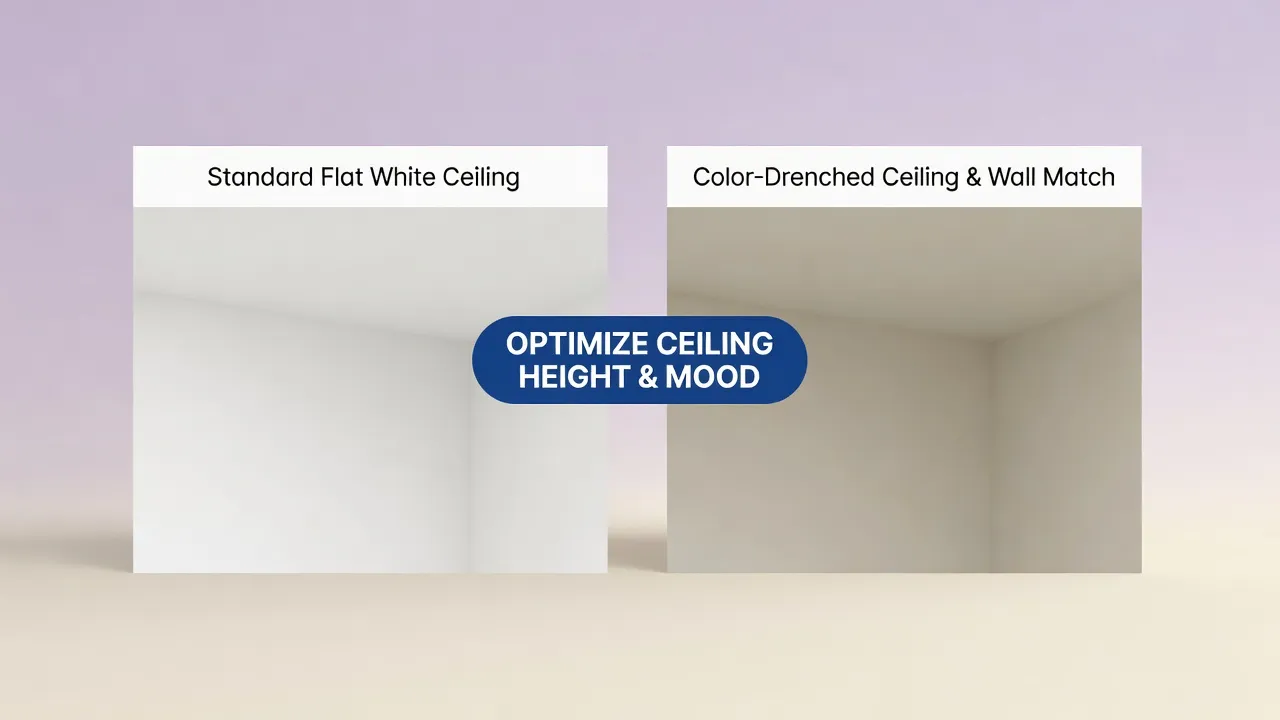
Best Ceiling Colors for Low Ceilings
Ever feel like your ceiling is closing in on you?
In rooms with standard 8-foot ceilings or basement conversion spaces, heavy overhead tones can make the room feel claustrophobic. Choosing the right ceiling color for low ceilings is all about using visual cues to stretch vertical height.
To make ceiling look higher, use these proven low ceiling paint colors:
- Pale Receding Hues: Soft ice blue, pale lavender, or watery seafoam recede from the human eye, making the ceiling feel farther away than it is.
- Monochromatic Wraps: Painting the walls and ceiling the exact same light shade erases the visual boundary where the wall ends, tricks the eye into seeing continuous height.
- Smart Sheen Application: Using a satin or semi-gloss finish on a low ceiling reflects ambient light across the room, brightening dark corners.
These ceiling colors for small rooms turn tight quarters into open, airy spaces. Explore more low ceiling ideas to optimize low-clearance areas.
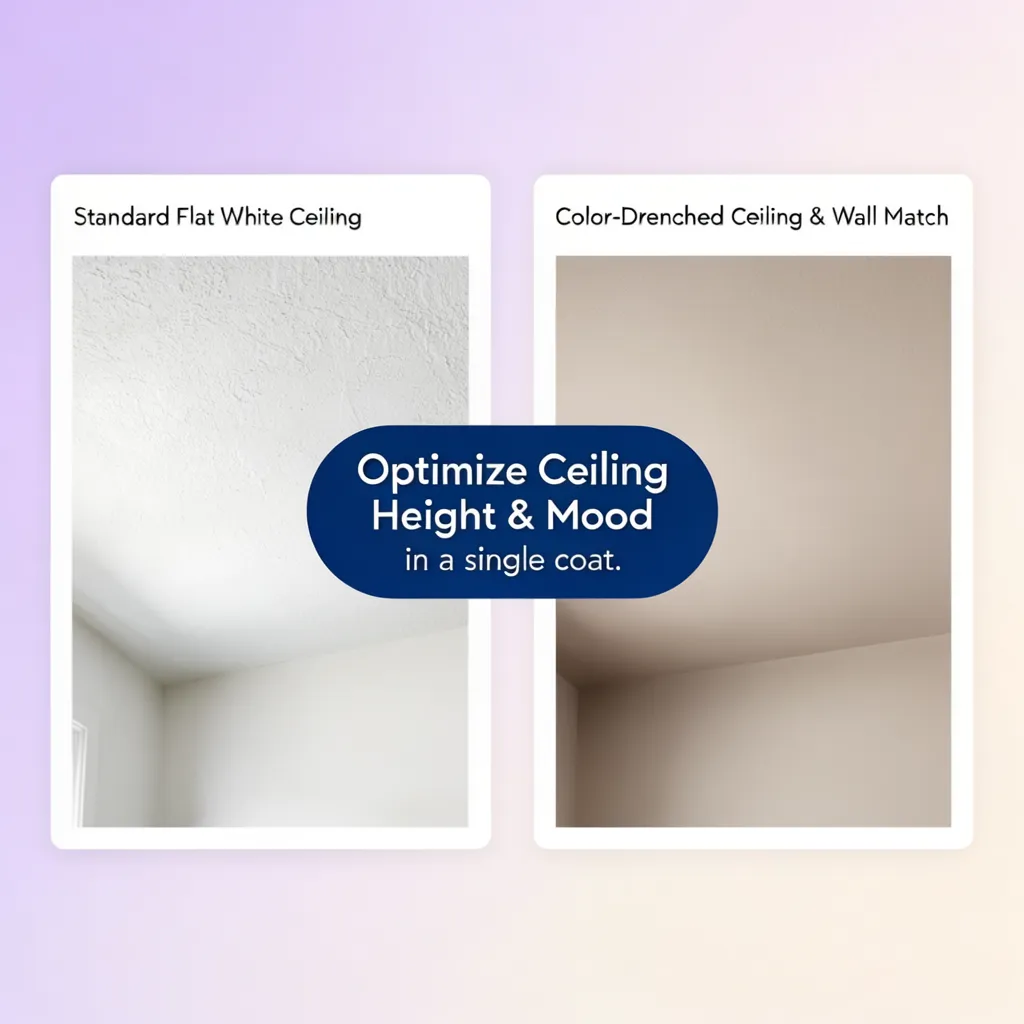
Ceiling Colors for High Ceilings
Here's the unexpected twist: towering 10-foot, vaulted, or cathedral ceilings can sometimes make a room feel cold, cavernous, and uninviting.
If your living room feels more like an echoing hotel lobby than a cozy retreat, exploring ceiling colors for high ceilings can ground the space and bring warm balance back into the room.
Consider these high ceiling paint colors for large spaces:
- Warm Charcoal & Cocoa: Deep neutral tones bring the ceiling plane down visually, creating an intimate setting in large dining rooms or primary suites.
- Rich Jewel Tones: Deep navy or hunter green paired with lighter walls creates a dramatic focal point for tall spaces.
- Textured Architectural Details: Combining dark ceiling shades with exposed wood beams or coffered trim adds warmth and character.
These tall room ceiling ideas prove that dark ceiling colors can make large spaces feel balanced and tailored.
Light Ceiling Colors for a Brighter Room
Want to know the secret to a luminous room? It starts above your head.
If your home lacks windows or sits in a shaded area, light ceiling colors act as giant reflectors, bouncing every ray of light back down into your living area.
Here's how to use bright ceiling colors effectively:
- Optimize Dark Rooms: Applying light ceiling paint in windowless bathrooms or dark basements maximizes artificial bulb output.
- Warm Up Cool Lighting: In rooms receiving cool northern light, choose a soft cream ceiling paint to neutralize cold blue shadows.
- Soften Ambient Light: A soft mineral tone prevents the ceiling from throwing harsh reflections off polished floors.
Selecting the right ceiling paint for low light keeps dark rooms feeling open and inviting.

Dark Ceiling Colors: When They Work and When They Don't
Let's clear up a huge myth right now: dark ceilings always make a room feel tiny.
That is simply untrue. When executed thoughtfully, dark ceiling colors add depth, mood, and high-end sophistication that light paint simply cannot replicate.
• Rooms with detailed crown molding
• Spaces with rich dark woodwork
• Rooms with zero light sources
• Unfurnished, empty spaces
How to incorporate dark ceiling paint safely:
- Create Contrast: Balance a midnight blue or black ceiling with crisp white walls, warm wood floors, and bright lighting fixtures.
- Anchor Cozy Spaces: Using dark tones in media rooms or den spaces creates an immersive theater atmosphere.
- Highlight Moldings: Frame a dark painted ceiling with thick white crown molding to create an architectural ceiling design statement.
Exploring these painted ceiling ideas gives you the confidence to use dark shades effectively.
For pairing ideas with your walls, jump to How to Match Ceiling Color With Wall Color.
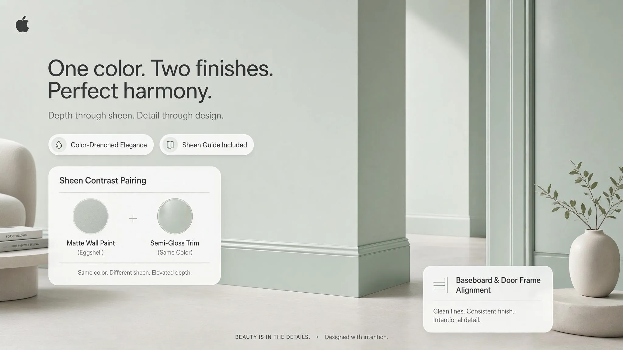
How to Match Ceiling Color With Wall Color
Here's where most DIY decorators stumble: picking a ceiling paint in isolation without considering the surrounding walls.
Your walls and ceiling interact directly along every upper corner of the room. Achieving a cohesive ceiling color with wall color combination ensures your room feels harmonious rather than pieced together.
Proven ceiling and wall color combinations:
- Diluted Tonal Match: Take your exact wall color formula and ask the paint store to mix it at 25% or 50% strength for the ceiling.
- Complementary Pairing: Pair soft warm beige walls with a pale buttery ceiling to create subtle, multi-dimensional warmth.
- High Contrast Framing: Combine deep charcoal walls with a pale light gray ceiling to create a clean, contemporary framework.
Mastering these matching ceiling and wall colors builds a smooth transition from vertical to horizontal surfaces.
Should the Ceiling Be Lighter or Darker Than the Walls?
It comes down to a simple choice: do you want the ceiling to blend into the background, or do you want it to anchor the room?
Understanding whether your ceiling lighter or darker than walls layout fits your goals makes decision-making simple.
• Makes room feel open & airy
• Traditional interior standard
• Creates a cozy, enclosed feel
• Modern, dramatic, custom
Guidelines for relative color values:
- Lighter Ceiling Than Walls: The most reliable choice for standard rooms. It lifts the ceiling plane and keeps the space feeling bright.
- Darker Ceiling Than Walls: Works best when walls are light neutrals and you want to draw attention to chandeliers, ceiling medallions, or architectural trim.
- Equal Tone Intensity: Painting walls and ceilings in the exact same color value creates an enveloping look that works great in bedrooms.
Balancing this ceiling and wall contrast ensures your room proportions feel natural.
How Lighting Affects Ceiling Paint Color
Here's something nobody tells you at the paint counter: paint on a horizontal ceiling looks darker than the exact same paint on a vertical wall.
Why? Because natural sunlight and ambient artificial light bounce upward from the floor, hitting the ceiling at a flat angle and creating subtle shadows overhead.
Keep these factors in mind when evaluating lighting and ceiling paint color:
- Shadowing Effects: Because ceilings sit in shadow, ceiling paint in natural light appears roughly one shade darker than it does on the color chip.
- Artificial Fixtures: Flush-mount ceiling lights cast light outward, while recessed cans cast light downward, leaving the ceiling surface darker.
- Floor Reflections: Red hardwood floors or bright blue rugs bounce their colors directly onto a white ceiling, shifting its apparent hue.
Testing your ceiling color under artificial light prevents unexpected color surprises after painting.
Best Ceiling Colors for Different Rooms
Different rooms serve different purposes, and your ceiling palette should reflect those functional needs.
Use this room-by-room cheat sheet for ceiling colors for rooms:
- Living Room Ceiling Colors: Keep it open with soft off-whites or pale greige that connect seamlessly to adjacent hallways.
- Bedroom Ceiling Colors: Choose restful blues, soft greens, or warm muted terracottas to create a relaxing view from the bed.
- Kitchen Ceiling Colors: Use bright, scrubbable white paint that resists moisture, reflects light over countertops, and cleans easily.
- Bathroom Ceiling Colors: Select moisture-resistant paint formulas in soft mineral shades to complement tile and vanity finishes.
Customizing your choices by space ensures your entire home feels intentional.
To test your favorite ideas instantly without buying paint, jump to Test Ceiling Colors Before You Paint.
Test Ceiling Colors Before You Paint
Here is the biggest headache in home decorating: trying to predict how a paint swatch will look when slapped onto an overhead ceiling.
Traditionally, testing meant buying multiple sample cans, balancing precariously on ladders, rolling awkward patches onto your drywall, and trying to guess how undertones would react at night.
Hiring interior designers isn't much better—they charge hefty fees and still leave you squinting at tiny 2-inch paper chips. Manual photo editing apps are equally frustrating, taking hours of tedious work only to produce flat, fake-looking images.
You don't have to deal with messy testing or expensive guesswork anymore.
• Pay thousands for designers
• Hours spent on fake software
• High risk of ruined ceilings
• Hit "Generate" for instant render
• Accurately renders shadows
• Zero mess, instant options
Instead of struggling with manual methods, DesignHome Synthesis™ does all the heavy lifting for you. Our spatial layout technology analyzes your uploaded room photo—evaluating ceiling heights, light sources, room angles, and wall pairings automatically.
Simply upload an image of your room and hit generate.
In seconds, DesignHome Synthesis™ applies realistic custom ceiling colors directly to your space. You can test crisp whites, soft receding blues, or dramatic dark shades instantly, letting you compare options and choose with total confidence.
Choose a Ceiling Color That Completes the Room
When you treat your ceiling as an active part of your design, your entire home feels more polished, thoughtful, and complete.
Use this final checklist to confirm your choice:
By choosing your best ceiling color for a room with intent, you unlock the full potential of your fifth wall.
Take the headache out of paint selection, protect your home improvement budget, and enjoy a cohesive space designed to perfection.
FAQs About Overhead Paint and Ceiling Color Selection
Does painting walls and ceilings the exact same color make a room feel smaller?
No, it usually creates the opposite effect. Eliminating the sharp contrast line where your walls meet the ceiling creates a continuous visual loop. This erases hard room boundaries, making small or low-ceilinged rooms feel larger, softer, and more open.
How do I pick an off-white ceiling paint that doesn't look yellow or dingy?
Match the underlying pigment family of your wall paint:
- Cool Walls (Gray, Blue, Green): Select a crisp white with subtle gray or slate undertones to prevent warmth from throwing off the palette.
- Warm Walls (Beige, Cream, Taupe): Choose a soft alabaster or warm white with subtle golden or taupe bases to maintain cozy warmth.
Rule of Thumb: Hold your ceiling swatch against a sheet of pure printer paper in daylight—if it looks muddy on the paper, it will look yellow overhead.
When is a dark ceiling a good design choice instead of a mistake?
Dark ceilings excel in rooms designed for rest, intimacy, or entertainment—such as primary bedrooms, home theaters, and formal dining rooms. They work best when paired with tall ceilings (9 feet or higher), strong ambient wall lighting, or light-colored furniture to balance the visual weight.
Can I use standard wall paint on my ceiling, or do I really need specific ceiling paint?
You should almost always use dedicated ceiling paint. Ceiling paint is formulated with an ultra-flat finish that eliminates glare from overhead light fixtures. It also features a thicker, non-drip consistency to minimize paint splatter when rolling overhead and provides higher opacity to cover water stains in fewer coats.
What paint colors make low 8-foot ceilings appear taller?
Light, cool-toned shades recede from the human eye, pushing the ceiling plane upward visually.
Why does ceiling paint look darker than the swatch once applied?
Because ceilings sit parallel to floor lighting, they receive indirect reflected light rather than direct sunlight. Horizontal overhead surfaces naturally sit in ambient shadow, causing any paint color to appear 10% to 15% darker overhead than it looks on a flat tabletop or vertical swatch card.
Should you paint the ceiling or walls first when redecorating?
Always paint the ceiling first. Overhead rolling inevitably creates microscopic paint splatter. By completing the ceiling surface, crown molding, and top cut-in edges first, you can easily roll over any stray ceiling drips when you paint the walls afterward.
What color should I paint the ceiling inside a tray or coffered ceiling?
It depends on the architectural statement you want to make:
- For Dramatic Depth: Paint the interior recessed tray 1 to 2 shades darker than your wall color to highlight the ceiling's depth.
- For Airy Height: Keep the recessed tray bright white or light cream while painting the surrounding crown molding to create high architectural contrast.
How do I coordinate ceiling colors with my floor rugs and furniture?
Pull a secondary accent undertone from your floor rug, window drapery, or accent cushions rather than matching furniture wood grains directly. A soft tinted ceiling that echoes a subtle accent shade in your rug unifies the room from top to bottom without overwhelming the eye.


